Visualizing Generative Adversarial Networks

UPDATE: Some cool people at Georgia Tech and Google Brain have developed an interactive visualization called GAN lab which is way more exciting than this which you can check out here: https://poloclub.github.io/ganlab/

Yesterday, I wrote about Generative Adversarial Networks being all the rage at NIPS this year. I created a toy model using Tensorflow to wrap my head around how the idea works. Building on that example, I created a video to visualize the adversarial training process.

The top left panel shows samples from both the training and generated (eg counterfeit) data. Remember that the goal is to have the generator produce samples that the discriminator can not distinguish from the real (training) data. Top right shows the predicted energy function from the discriminator.  The bottom row shows the loss function for the discriminator (D) and generator (G).

I don’t fully understand why the dynamics of the adversarial training process are transiently unstable, but it seems to work overall. Another interesting observation is that the loss seems to continue to fall overall, even as it goes though the transient phases of instability when the fit of the generated data is qualitatively poor.

Advertisement

Generative Adversarial Networks are the hotness at NIPS 2016

While they hit the scene two years ago, Generative Adversarial Networks (GANs) have become the darlings of this year’s NIPS conference. The term “Generative Adversarial” appears 170 times in the conference program. So far I’ve seen talks demonstrating their utility in everything from generating realistic images, predicting and filling in missing video segments, rooms, maps, and objects of various sorts. They are even being applied to the world of high energy particle physics, pushing the state of the art of inference within the language of quantum field theory.

The basic idea is to build two models and to pit them against each other (hence the adversarial part). The generative model takes random inputs and tries to generate output data that “look like” real data. The discriminative model takes as input data from both the generative model and real data and tries to correctly distinguish between them. By updating each model in turn iteratively, we hope to reach an equilibrium where neither the discriminator nor the generator can improve. At this point the generator is doing it’s best to fool the discriminator, and the discriminator is doing it’s best not to be fooled. The result (if everything goes well) is a generative model which, given some random inputs, will output data which appears to be a plausible sample from your dataset (eg cat faces).

As with any concept that I’m trying to wrap my head around, I took a moment to create a toy example of a GAN to try to get a feel for what is going on.

Let’s start with a simple distribution from which to draw our “real” data from.

screen-shot-2016-12-07-at-1-55-45-pmreal_data_gan

Next, we’ll create our generator and discriminator networks using tensorflow. Each will be a three layer, fully connected network with relu’s in the hidden layers. The loss function for the generative model is -1(loss function of discriminative). This is the adversarial part. The generator does better as the discriminator does worse. I’ve put the code for building this toy example here.

Next, we’ll fit each model in turn. Note in the code that we gave each optimizer a list of variables to update via gradient descent. This is because we don’t want to update the weights of the discriminator while we’re updating the weights of the generator, and visa versa.

loss at step 0: discriminative: 11.650652, generative: -9.347455

gan1.png

loss at step 200: discriminative: 8.815780, generative: -9.117246

gan2

loss at step 400: discriminative: 8.826855, generative: -9.462300

gan3.png

loss at step 600: discriminative: 8.893397, generative: -9.835464

gan4.png

loss at step 3600: discriminative: 6.724183, generative: -13.005814
 gan30.png
As we can see, the generator is learning to output data that looks more and more like a sample from the training data. At the same time, the discriminator is having a harder and harder dime telling them apart (as seen in the overlapping prediction histograms on the right).
Obviously this is a trivial example to put a GAN to work on, but when it comes to high-dimensional data with complex dependency structures, this approach starts to really shine. I’m sure the hotness of this approach won’t cool off any time soon.
All of the code for generating this GAN is available on github.

Weapons of Math Destruction – A Data Scientist’s Guide to Disarmament

I’ve had this book on pre-order since spring and it finally arrived on Friday. I subsequently devoured it over the weekend.

Long awaited Weapons of Math Destruction by Cathy O'Neil

The book lays out a clear and compelling case for how data-driven algorithms can become — in contrast to their promise of amoral objectivism — efficient means for reproducing and even exacerbating social inequalities and injustices. From predictive policing and recidivism risk models to targeted marketing for predatory loans and for-profit universities, O’Neil explains how to recognize WMDs by 3 distinct features:

  1. The model is either hidden, or opaque to the individuals affected by its calculations, restricting any possibility of seeking recourse against – or understanding of – its results or conclusions.
  2. The model works against the subject’s interest (eg. it is unfair).
  3. The model scales, giving it the opportunity to negatively affect a very large segment of the population.

The taxonomy provides a simple framework for identifying WMDs in the wild. However, importantly for data scientists and other data practitioners, it forms a checklist (or rather an anti-checklist) to keep in mind when developing models that will be deployed into the real world. As data scientists, many of us are strongly incentivized to achieve feature 3, and doing so only makes it increasingly important to be constantly questioning the degree to which our models could fall victim to features 2 and 1.

Feature 2, as O’Neil lays out, can occur despite the best intentions of a model’s creators. This can (and does!) happen in two ways: First, when a modeler seeks to create an objective system for rating individuals (say, for acceptance to a prestigious university, or for a payday loan), the data used to build the model is already encoded with the socially constructed biases of the conditions under which it was generated. Even when attempting to exclude potentially bias-laden factors such as race or gender, this information seeps into the model nonetheless via correlations to seemingly benign variables such as zip codes or the makeup of a subject’s social connections.

Second, when the outcome of the model results in the reinforcement of the unjust conditions from which it was created, a negative feedback loop is created. Such a negative feedback loop is particularly present and pernicious in the use of recidivism risk models to guide sentencing decisions. An individual may be labeled as high risk due not to qualities of the individual himself, but his circumstances of living in a poor, high crime neighborhood. Being incarcerated based on the results of this model renders him more likely to end up back in that neighborhood, subject to continued poverty and disproportionate policing. Thus the model has set up the conditions to fulfill its own prediction.

As machine learning algorithms become more and more accurate at a variety of tasks, their inner workings become harder and harder to understand. The trend will make it increasingly difficult to avoid feature 1 of the WMD taxonomy. Current advanced techniques like deep learning are creating models that are remarkably performant, yet not fully understood by the researchers creating them, much less the individuals affected by their results. In light of this, we need to think carefully as data scientists about how to communicate these models with as much transparency as possible. How to do so remains an open question. But the internal ‘black box’ nature of these algorithms does not obviate our responsibility to disclose exactly what input data went into a given model, what assumptions were made of that data, and on what criteria the model was trained.

Overall, WMD provides an incredibly important framework for thinking about the consequences of uncritically applying data and algorithms to people’s lives. For those of us, like O’Neil herself, who make our living using mathematics to create data-driven algorithms, taking to heart the lessons contained in Weapons Of Math Destruction will be our best defense against unwittingly creating the bomb ourselves.

Race and Police Shootings: Why Data Sampling Matters

When reading headlines about findings from data, always ask: “To what population does this conclusion apply?” Brian D’Alessandro explains eloquently why sampling matters.

mathbabe

This is a guest post by Brian D’Alessandro, who daylights as the Head of Data Science at Zocdoc and as an Adjunct Professor with NYU’s Center for Data Science. When not thinking probabilistically, he’s drumming with the indie surf rock quarter Coastgaard.

I’d like to address the recent study by Roland Fryer Jr  from Harvard University, and associated NY Times coverage, that claims to show zero racial bias in police shootings. While this paper certainly makes an honest attempt to study this very important and timely problem, it ultimately suffers from issues of data sampling and subjective data preparation. Given the media attention it is receiving, and the potential policy and public perceptual implications of this attention, we as a community of data people need to comb through this work and make sure the headlines are consistent with the underlying statistics.

First thing’s first: is there really zero…

View original post 1,204 more words

Introduction to Machine Learning Talk

There was an amazing turnout at last night’s DataPhilly meetup (~200 people!). I was completely delighted by the turnout and people’s engagement level. Here are the slides of the talk I gave to set up the evening with a high-level introduction to machine learning.


Speaking at DataPhilly February 2016

The next DataPhilly meetup will feature a medley of machine-learning talks, including an Intro to ML from yours truly. Check out the speakers list and be sure to RSVP. Hope to see you there!

Thursday, February 18, 2016

6:00 PM to 9:00 PM

Speakers:

  • Corey Chivers
  • Randy Olson
  • Austin Rochford

Corey Chivers (Penn Medicine)

Abstract: Corey will present a brief introduction to machine learning. In his talk he will demystify what is often seen as a dark art. Corey will describe how we “teach” machines to learn patterns from examples by breaking the process into its easy-to-understand component parts. By using examples from fields as diverse as biology, health-care, astrophysics, and NBA basketball, Corey will show how data (both big and small) is used to teach machines to predict the future so we can make better decisions.

Bio: Corey Chivers is a Senior Data Scientist at Penn Medicine where he is building machine learning systems to improve patient outcomes by providing real-time predictive applications that empower clinicians to identify at risk individuals. When he’s not pouring over data, he’s likely to be found cycling around his adoptive city of Philadelphia or blogging about all things probability and data at bayesianbiologist.com.

Randy Olson (University of Pennsylvania Institute for Biomedical Informatics):

Automating data science through tree-based pipeline optimization

Abstract: Over the past decade, data science and machine learning has grown from a mysterious art form to a staple tool across a variety of fields in business, academia, and government. In this talk, I’m going to introduce the concept of tree-based pipeline optimization for automating one of the most tedious parts of machine learning — pipeline design. All of the work presented in this talk is based on the open source Tree-based Pipeline Optimization Tool (TPOT), which is available on GitHub at https://github.com/rhiever/tpot.

Bio: Randy Olson is an artificial intelligence researcher at the University of Pennsylvania Institute for Biomedical Informatics, where he develops state-of-the-art machine learning algorithms to solve biomedical problems. He regularly writes about his latest adventures in data science at RandalOlson.com/blog, and tweets about the latest data science news at http://twitter.com/randal_olson.

Austin Rochford (Monetate):

Abstract: Bayesian optimization is a technique for finding the extrema of functions which are expensive, difficult, or time-consuming to evaluate. It has many applications to optimizing the hyperparameters of machine learning models, optimizing the inputs to real-world experiments and processes, etc. This talk will introduce the Gaussian process approach to Bayesian optimization, with sample code in Python.

Bio: Austin Rochford is a Data Scientist at Monetate. He is a former mathematician who is interested in Bayesian nonparametrics, multilevel models, probabilistic programming, and efficient Bayesian computation.

A probabilistic justification to carpe diem

There’s a curious thing about unlikely independent events: no matter how rare, they’re most likely to happen right away.

Let’s get hypothetical

You’ve taken a bet that pays off if you guess the exact date of the next occurrence of a rare event (p = 0.0001 on any given day i.i.d). What day do you choose? In other words, what is the most likely day for this rare event to occur?

Setting aside for now why in the world you’ve taken such a silly sounding bet, it would seem as though a reasonable way to think about it would be to ask: what is the expected number of days until the event? That must be the best bet, right?

We can work out the expected number of days quite easily as 1/p = 10000. So using the logic of expectation, we would choose day 10000 as our bet.

Let’s simulate to see how often we would win with this strategy. We’ll simulate the outcomes by flipping a weighted coin until it comes out heads. We’ll do this 100,000 times and record how many flips it took each time.

p0001

The event occurred on day 10,000 exactly 35 times. However, if we look at a histogram of our simulation experiment, we can see that the time it took for the rare event to happen was more often short, than long. In fact, the event occurred 103 times on the very first flip (the most common Time to Event in our set)!

So from the experiment it would seem that the most likely amount of time to pass until the rare event occurs is 0. Maybe our hypothetical event was just not rare enough. Let’s try it again with p=0.0000001, or an event with a 1 in 1million chance of occurring each day.

p0000001

While now our event is extremely unlikely to occur, it’s still most likely to occur right away.

Existential Risk

What does this all have to do with seizing the day? Everything we do in a given day comes with some degree of risk. The Stanford professor Ronald A. Howard conceived of a way of measuring the riskiness of various day-to-day activities, which he termed the micromort. One micromort is a unit of risk equal to p = 0.000001 (1 in a million chance) of death. We are all subject to a baseline level of risk in micromorts, and additional activities may add or subtract from that level (skiing, for instance adds 0.7 micromorts per day).

While minimizing the risks we assume in our day-to-day lives can increase our expected life span, the most likely exact day of our demise is always our next one. So carpe diem!!

Post Script:

Don’t get too freaked out by all of this. It’s just a bit of fun that comes from viewing the problem in a very specific way. That is, as a question of which exact day is most likely. The much more natural way to view it is to ask, what is the relative probability of the unlikely event occurring tomorrow vs any other day but tomorrow. I leave it to the reader to confirm that for events with p < 0.5, the latter is always more likely.

Categorizing NIPS papers using LDA topic modeling

The Annual Conference on Neural Information Processing Systems (NIPS) has recently listed this year’s accepted papers. There are 403 paper titles listed, which made for great morning coffee reading, trying to pick out the ones that most interest me.

Being a machine learning conference, it’s only reasonable that we apply a little machine learning to this (decidedly _small_) data.

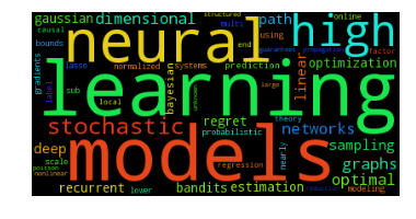
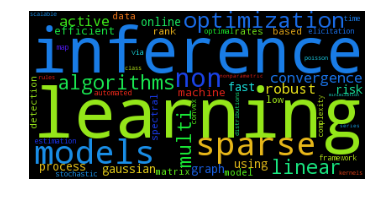
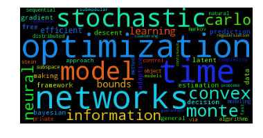
Building off of the great example code in a post by Jordan Barber on Latent Dirichlet Allocation (LDA) with Python, I scraped the paper titles and built an LDA topic model with 5 topics. All of the code to reproduce this post is available on github. Here are the top 10 most probable words from each of the derived topics:

0 1 2 3 4
0 learning learning optimization learning via
1 models inference networks bayesian models
2 neural sparse time sample inference
3 high models stochastic analysis networks
4 stochastic non model data deep
5 dimensional optimization convex inference learning
6 networks algorithms monte spectral fast
7 graphs multi carlo networks variational
8 optimal linear neural bandits neural
9 sampling convergence information methods convolutional

Normally, we might try to attach some kind of label to each topic using our beefy human brains and subject matter expertise, but I didn’t bother with this — nothing too obvious stuck out at me. If you think that you have appropriate names for them feel free to let me know. Given that we are only working with the titles (no abstracts or full paper text), I think that there aren’t obvious human-interpretable topics jumping out. But let’s not let that stop us from proceeding.

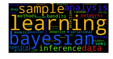
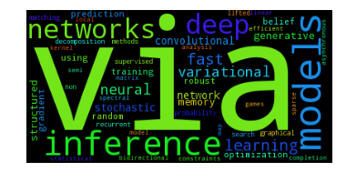
We can also represent the inferred topics with the much maligned, but handy-dandy wordcloud visualization:

Topic: 0
 topic_0
Topic: 1
 topic_1
Topic: 2
 topic_2
Topic: 3
 topic_3
Topic: 4
topic_4

Since we are modeling the paper title generating process as a probability distribution of topics, each of which is a probability distribution of words, we can use this generating process to suggest keywords for each title. These keywords may or may not show up in the title itself. Here are some from the first 10 titles:

================

Double or Nothing: Multiplicative Incentive Mechanisms for Crowdsourcing
Generated Keywords: [u'iteration', u'inference', u'theory']

================

Learning with Symmetric Label Noise: The Importance of Being Unhinged
Generated Keywords: [u'uncertainty', u'randomized', u'neural']

================

Algorithmic Stability and Uniform Generalization
Generated Keywords: [u'spatial', u'robust', u'dimensional']

================

Adaptive Low-Complexity Sequential Inference for Dirichlet Process Mixture Models
Generated Keywords: [u'rates', u'fast', u'based']

================

Covariance-Controlled Adaptive Langevin Thermostat for Large-Scale Bayesian Sampling
Generated Keywords: [u'monte', u'neural', u'stochastic']

================

Robust Portfolio Optimization
Generated Keywords: [u'learning', u'online', u'matrix']

================

Logarithmic Time Online Multiclass prediction
Generated Keywords: [u'complexity', u'problems', u'stein']

================

Planar Ultrametric Rounding for Image Segmentation
Generated Keywords: [u'deep', u'graphs', u'neural']

================

Expressing an Image Stream with a Sequence of Natural Sentences
Generated Keywords: [u'latent', u'process', u'stochastic']

================

Parallel Correlation Clustering on Big Graphs
Generated Keywords: [u'robust', u'learning', u'learning']

Entropy and the most “interdisciplinary” paper title

While some titles are strongly associated with a single topic, others seem to be generated from more even distributions over topics than others. Paper titles with more equal representation over topics could be considered to be, in some way, more interdisciplinary, or at least, intertopicular (yes, I just made that word up). To find these papers, we’ll find which paper titles have the highest information entropy in their inferred topic distribution.

Here are the top 10 along with their associated entropies:

1.22769364291 Where are they looking?
1.1794725784 Bayesian dark knowledge
1.11261338284 Stochastic Variational Information Maximisation
1.06836891546 Variational inference with copula augmentation
1.06224431711 Adaptive Stochastic Optimization: From Sets to Paths
1.04994413148 The Population Posterior and Bayesian Inference on Streams
1.01801236048 Revenue Optimization against Strategic Buyers
1.01652797194 Fast Convergence of Regularized Learning in Games
0.993789478925 Communication Complexity of Distributed Convex Learning and Optimization
0.990764728084 Local Expectation Gradients for Doubly Stochastic Variational Inference

So it looks like by this method, the ‘Where are they looking’ has the highest entropy as a result of topic uncertainty, more than any real multi-topic content.

Introducing Penn Signals at DataPhilly

Last week I had the pleasure of giving a talk to a great audience at DataPhilly about the Data Science mission at Penn Medicine. In the talk I introduced the framework we are building to accelerate the development and deployment of predictive applications in health care.

DataPhillyApril2015

Click for slides (pdf)

Also on the line-up was (sometimes contributor to bayesianbiologist) Matt Sunquist. He demo’d some of plot.ly‘s most recent features to audible gasps of delight for the audience.