The Treachery of Models

In Magritte’s famous 1929 painting The Treachery of Images, a pipe is depicted with the caption “Ceci n’est pas une pipe“, French for “This is not a pipe”. The seemingly dissonant statement under what is a very clearly depicted pipe forces the viewer to confront the distinction between the representation and the thing itself. The treachery refers to the danger involved in confusing the representation with the object.

Models – like images – are merely representations of the objects they depict. The modeler seeks to represent the relevant properties of the system being modeled in order to communicate some features of that system, or to manipulate it under ‘what-if’ scenarios.

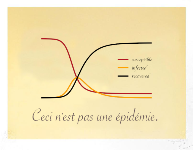
With the current plethora of models of COVID-19 spread, it seems important to remind ourselves of Magritte’s warning. Models can be incredible tools — abstractions of complex realities that allow us to reason about the data we’ve seen so far, and consider possible futures. But they are not the epidemic process itself.

Ceci n'est pas une épidémie.

This is not an argument that the models themselves are treacherous. I absolutely adore modeling and models, as Magritte adored painting and images. I consider modeling an essential tool to further our understanding of (and make predictions about) the world around us. Indeed I developed one of the aforementioned COVID-19 models with my colleagues at Penn Medicine. The treachery comes when we mistake the abstraction for reality.

Eigenvectors from Eigenvalues – a NumPy implementation

I was intrigued by the recent splashy result showing how eigenvectors can be computed from eigenvalues alone. The finding was covered in Quanta magazine and the original paper is pretty easy to understand, even for a non-mathematician.

Being a non-mathematician myself, I tend to look for insights and understanding via computation, rather than strict proofs. What seems cool about the result to me is that you can compute the directions from simply the stretches (along with the stretches of the sub-matrices). It seems kind of magical (of course, it’s not 😉 ). To get a feel for it, I implemented the key identity in the paper in python and NumPy and confirmed that it gives the right answer for a random (real-valued, symmetric) matrix.

I posted the Jupyter Notebook here.

Germination Project Fellows come to Penn

I was recently fortunate to be invited to speak with an impressive group of high-school students as a part of the Germination Project. They came to Penn to learn about innovation in health care and I spoke with them about how we’re using Data Science to improve patient outcomes.germination_talk_screenshot

Machine Learning for Health #NIPS2018 workshop call for proposals

The theme for this year’s workshop will be “Moving beyond supervised learning in healthcare”. This will be a great forum for those who work on computational solutions to the challenges facing clinical medicine. The submission deadline is Friday Oct 26, 2018. Hope to see you there!

https://ml4health.github.io/2018/pages/call-for-papers.html

Visualizing classifier thresholds

Lately I’ve been thinking a lot about the connection between prediction models and the decisions that they influence. There is a lot of theory around this, but communicating how the various pieces all fit together with the folks who will use and be impacted by these decisions can be challenging.

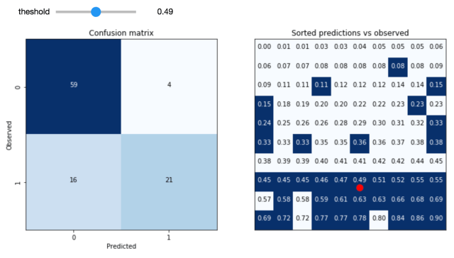
One of the important conceptual pieces is the link between the decision threshold (how high does the score need to be to predict positive) and the resulting distribution of outcomes (true positives, false positives, true negatives and false negatives). As a starting point, I’ve built this interactive tool for exploring this.

Screen Shot 2017-11-13 at 11.16.26 AM

The idea is to take a validation sample of predictions from a model and experiment with the consequences of varying the decision threshold. The hope is that the user will be able to develop an intuition around the tradeoffs involved by seeing the link to the individual data points involved.

Code for this experiment is available here. I hope to continue to build on this with other interactive, visual tools aimed at demystifying the concepts at the interface between predictions and decisions.

Weapons of Math Destruction – A Data Scientist’s Guide to Disarmament

I’ve had this book on pre-order since spring and it finally arrived on Friday. I subsequently devoured it over the weekend.

Long awaited Weapons of Math Destruction by Cathy O'Neil

The book lays out a clear and compelling case for how data-driven algorithms can become — in contrast to their promise of amoral objectivism — efficient means for reproducing and even exacerbating social inequalities and injustices. From predictive policing and recidivism risk models to targeted marketing for predatory loans and for-profit universities, O’Neil explains how to recognize WMDs by 3 distinct features:

  1. The model is either hidden, or opaque to the individuals affected by its calculations, restricting any possibility of seeking recourse against – or understanding of – its results or conclusions.
  2. The model works against the subject’s interest (eg. it is unfair).
  3. The model scales, giving it the opportunity to negatively affect a very large segment of the population.

The taxonomy provides a simple framework for identifying WMDs in the wild. However, importantly for data scientists and other data practitioners, it forms a checklist (or rather an anti-checklist) to keep in mind when developing models that will be deployed into the real world. As data scientists, many of us are strongly incentivized to achieve feature 3, and doing so only makes it increasingly important to be constantly questioning the degree to which our models could fall victim to features 2 and 1.

Feature 2, as O’Neil lays out, can occur despite the best intentions of a model’s creators. This can (and does!) happen in two ways: First, when a modeler seeks to create an objective system for rating individuals (say, for acceptance to a prestigious university, or for a payday loan), the data used to build the model is already encoded with the socially constructed biases of the conditions under which it was generated. Even when attempting to exclude potentially bias-laden factors such as race or gender, this information seeps into the model nonetheless via correlations to seemingly benign variables such as zip codes or the makeup of a subject’s social connections.

Second, when the outcome of the model results in the reinforcement of the unjust conditions from which it was created, a negative feedback loop is created. Such a negative feedback loop is particularly present and pernicious in the use of recidivism risk models to guide sentencing decisions. An individual may be labeled as high risk due not to qualities of the individual himself, but his circumstances of living in a poor, high crime neighborhood. Being incarcerated based on the results of this model renders him more likely to end up back in that neighborhood, subject to continued poverty and disproportionate policing. Thus the model has set up the conditions to fulfill its own prediction.

As machine learning algorithms become more and more accurate at a variety of tasks, their inner workings become harder and harder to understand. The trend will make it increasingly difficult to avoid feature 1 of the WMD taxonomy. Current advanced techniques like deep learning are creating models that are remarkably performant, yet not fully understood by the researchers creating them, much less the individuals affected by their results. In light of this, we need to think carefully as data scientists about how to communicate these models with as much transparency as possible. How to do so remains an open question. But the internal ‘black box’ nature of these algorithms does not obviate our responsibility to disclose exactly what input data went into a given model, what assumptions were made of that data, and on what criteria the model was trained.

Overall, WMD provides an incredibly important framework for thinking about the consequences of uncritically applying data and algorithms to people’s lives. For those of us, like O’Neil herself, who make our living using mathematics to create data-driven algorithms, taking to heart the lessons contained in Weapons Of Math Destruction will be our best defense against unwittingly creating the bomb ourselves.
Speaking at DataPhilly February 2016

The next DataPhilly meetup will feature a medley of machine-learning talks, including an Intro to ML from yours truly. Check out the speakers list and be sure to RSVP. Hope to see you there!

Thursday, February 18, 2016

6:00 PM to 9:00 PM

Speakers:

  • Corey Chivers
  • Randy Olson
  • Austin Rochford

Corey Chivers (Penn Medicine)

Abstract: Corey will present a brief introduction to machine learning. In his talk he will demystify what is often seen as a dark art. Corey will describe how we “teach” machines to learn patterns from examples by breaking the process into its easy-to-understand component parts. By using examples from fields as diverse as biology, health-care, astrophysics, and NBA basketball, Corey will show how data (both big and small) is used to teach machines to predict the future so we can make better decisions.

Bio: Corey Chivers is a Senior Data Scientist at Penn Medicine where he is building machine learning systems to improve patient outcomes by providing real-time predictive applications that empower clinicians to identify at risk individuals. When he’s not pouring over data, he’s likely to be found cycling around his adoptive city of Philadelphia or blogging about all things probability and data at bayesianbiologist.com.

Randy Olson (University of Pennsylvania Institute for Biomedical Informatics):

Automating data science through tree-based pipeline optimization

Abstract: Over the past decade, data science and machine learning has grown from a mysterious art form to a staple tool across a variety of fields in business, academia, and government. In this talk, I’m going to introduce the concept of tree-based pipeline optimization for automating one of the most tedious parts of machine learning — pipeline design. All of the work presented in this talk is based on the open source Tree-based Pipeline Optimization Tool (TPOT), which is available on GitHub at https://github.com/rhiever/tpot.

Bio: Randy Olson is an artificial intelligence researcher at the University of Pennsylvania Institute for Biomedical Informatics, where he develops state-of-the-art machine learning algorithms to solve biomedical problems. He regularly writes about his latest adventures in data science at RandalOlson.com/blog, and tweets about the latest data science news at http://twitter.com/randal_olson.

Austin Rochford (Monetate):

Abstract: Bayesian optimization is a technique for finding the extrema of functions which are expensive, difficult, or time-consuming to evaluate. It has many applications to optimizing the hyperparameters of machine learning models, optimizing the inputs to real-world experiments and processes, etc. This talk will introduce the Gaussian process approach to Bayesian optimization, with sample code in Python.

Bio: Austin Rochford is a Data Scientist at Monetate. He is a former mathematician who is interested in Bayesian nonparametrics, multilevel models, probabilistic programming, and efficient Bayesian computation.

R style default plot for Pandas DataFrame

The default plot method for dataframes in R is to show each numeric variable in a pair-wise scatter plot. I find this to be a really useful first look at a dataset, both to see correlations and joint distributions between variables, but also to quickly diagnose potential strangeness like bands of repeating values or outliers.

From what I can tell, there are no builtins in the python data ecosystem (numpy, pandas, matplotlib) for this so I coded up a function to emulate the R behaviour. You can get it in this gist (feedback welcomed).

Here’s an example of it in action showing derived time-series features (12 hour rates of change) for some clinical variables.

plot_correlogram(df)

ts_features