The theme for this year’s workshop will be “Moving beyond supervised learning in healthcare”. This will be a great forum for those who work on computational solutions to the challenges facing clinical medicine. The submission deadline is Friday Oct 26, 2018. Hope to see you there!
Tag Archives: healthcare
R style default plot for Pandas DataFrame
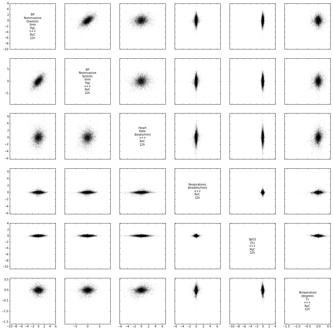
The default plot method for dataframes in R is to show each numeric variable in a pair-wise scatter plot. I find this to be a really useful first look at a dataset, both to see correlations and joint distributions between variables, but also to quickly diagnose potential strangeness like bands of repeating values or outliers.
From what I can tell, there are no builtins in the python data ecosystem (numpy, pandas, matplotlib) for this so I coded up a function to emulate the R behaviour. You can get it in this gist (feedback welcomed).
Here’s an example of it in action showing derived time-series features (12 hour rates of change) for some clinical variables.
plot_correlogram(df)