R style default plot for Pandas DataFrame

The default plot method for dataframes in R is to show each numeric variable in a pair-wise scatter plot. I find this to be a really useful first look at a dataset, both to see correlations and joint distributions between variables, but also to quickly diagnose potential strangeness like bands of repeating values or outliers.

From what I can tell, there are no builtins in the python data ecosystem (numpy, pandas, matplotlib) for this so I coded up a function to emulate the R behaviour. You can get it in this gist (feedback welcomed).

Here’s an example of it in action showing derived time-series features (12 hour rates of change) for some clinical variables.

plot_correlogram(df)

ts_features

Advertisement

Dark matter benchmarks: All over the map

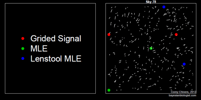
The three benchmark algorithms for predicting the location of dark matter halos are, for the most part, all over the map. Most of the test skies look something like this:

There are, however, some skies with rather strong halo signals that get a decent amount of agreement:

The Lenstool MLE algorithm is the current state of the art. As such, it’s the algo to beat. As of this morning, there was only one entry on the leader board with a score topping this benchmark.

*cracks fingers* – Let’s see if we can give it a run for it’s money.

Walmart Invasion

As an invasion biologist, the process of spatial spread is at the heart of what I do. When I came across this dataset of Walmart store openings since 1962 I couldn’t help but see it as an invasion front which looks a lot like a biological invasion or (albeit slow) epidemic.

The video shows monthly store openings (in red) between 1962 and 2006.

You can get the code I wrote for generating this visualization on my github page.

R Workshop: Reproducible Research using Sweave for Beginers

Monday, April 30, 2012  14h-16h. Stewart Biology Rm w6/12 (Montreal)

guRu: Denis Haine (Université de Montréal)

Topics

Reproducible research was first coined by Pr. Jon Claerbout, professor of geophysics at Stanford University, to describe that the results from researches can be replicated by other scientists by making available data, procedures, materials and the computational environment on which these results were produced from.

This workshop intends to describe reproducible research, what it is and why you should care about it, and how to do it with the combination of R, LATEX, Sweave and makefile. Tips and tricks will also be provided.

Learning Objectives

  • To get introduce to the concept of reproducible research
  • To get started with the implementation of reproducible research with R and Sweave,
  • To produce a first Sweave document in LATEX

This is a meeting of the Montreal R Users Group. We’re open to everyone! Sign up to RSVP!

Insights into Quantile Regression from Arthur Charpentier

At this Monday’s Montreal R User Group meeting, Arthur Charpentier gave an interesting talk on the subject of quantile regression.

One of the main messages I took away from the workshop was that quantile regression can be used to determine if extreme events are becoming more extreme. The example given was hurricane intensity since 1978. It may be that the average intensity is not increasing and therefore a standard linear regression would show no trend (since linear regression predicts expected, or mean values), but that’s not really what we are interested in anyway. If we are going to formulate proper risk models, what we want to know is whether the strong hurricanes are getting stronger. This is where quantile regression comes in.

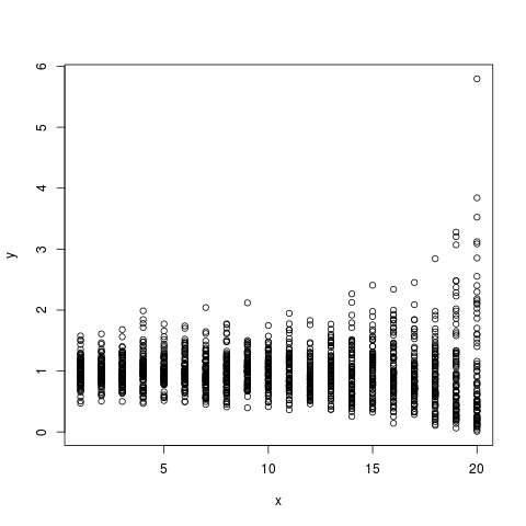
I always find that the best way for me to check my understanding is to simulate some data and check to see that things are behaving the way I expect them to. The advantage of doing this rather than just playing with data is that you know what the real process is, since you defined it.  To get a handle on this stuff, I simulated some non-gausian (gamma distributed) data to mimic the hurricane data. I set it up so that the mean intensity stays constant across years, and the variance increasing constantly over time such that the intense (simulated) hurricanes get more intense over time.

## Simulate some non-gausian data with constant mean
## and increasing variance
n_i<-80
d<-array(dim=c(n_i*20,2))
for(i in 1:20)
{
d[((i-1)*n_i+1):(i*n_i),2]<-rgamma(n_i,i,i)
d[((i-1)*n_i+1):(i*n_i),1]<-21-i
}
plot(d)

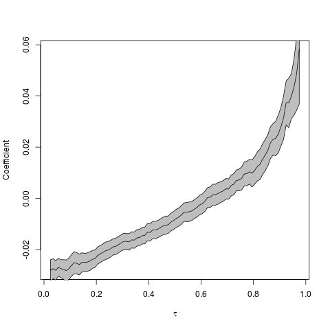
I then followed the procedure suggested by Arthur, which is to conduct quantile regressions across the quantile range  (0,1). The results can be plotted as quantile vs the regression coefficient in order to see the magnitude and direction of the relationship across the quantile range.

## Run quantile regression on the simulated data
## across a range of quantiles
u=seq(.025,.975,by=.01)

coefstd=function(u) summary(rq(d[,2]~d[,1],tau=u))$coefficients[,2]
coefest=function(u) summary(rq(d[,2]~d[,1],tau=u))$coefficients[,1]

CS=Vectorize(coefstd)(u)
CE=Vectorize(coefest)(u)

## Plot the results
k=2
plot(u,CE[k,],type='l',xlab=expression(tau),ylab='Coefficient')
polygon(c(u,rev(u)),c(CE[k,]+1.96*CS[k,],rev(CE[k,]-1.96*CS[k,])),col='grey')
lines(u,CE[k,])

So, the coefficient seems to be an increasing function of the quantile (tau). But how do we interpret this? Low intensity (simulated) storms are becoming less intense given that the regression coefficient at low quantiles is negative. More importantly, however, is that the high intensity (simulated) storms are becoming more intense. We can see this by noting that the regression coefficients in the high quantile range are positive, and increasing.

Another way to visualise the quantile regression results is by animating the regressions together to see how the relationship changes across the quantiles (tau).

Click the image to see the animated GIF.

Arthur has a prettier animation of this type using the actual hurricane data here.

Montreal R Workshop: Introduction to Bayesian Methods

Monday, March 26, 2012  14h-16h, Stewart Biology N4/17

Corey Chivers, Department of Biology McGill University

This is a meetup of the Montreal R User Group. Be sure to join the group and RSVP. More information about the workshop here.

Topics

Why would we want to be Bayesian in the first place?  In this workshop we will examine the types of questions which we are able to ask when we view the world through a Bayesian perspective.This workshop will introduce Bayesian approaches to both statistical inference and model based prediction/forecasting.  By starting with an examination of the theory behind this school of statistics through a simple example, the participant will then learn why we often need computationally intensive methods for solving Bayesian problems.  The participant will also be introduced to the mechanics behind these methods (MCMC), and will apply them in a biologically relevant example.

Learning Objectives

The participant will:
1) Contrast the underlying philosophies of the Frequentist and Bayesian perspectives.

2)
Estimate posterior distributions using Markov Chain Monte Carlo (MCMC).

3)
Conduct both inference and prediction using the posterior distribution.

Prerequisites

We will build on ideas presented in the workshop on Likelihood Methods.  If you did not attend this workshop, it may help to have a look at the slides and script provided on this page.

The goal of this workshop is to demystify the potentially ‘scary‘ topic of Bayesian Statistics, and empower participants (of any preexisting knowledge level) to engage in statistical reasoning when conducting their own research.  So come one, come all!

That being said, a basic working understanding of R is assumed.  Knowledge of functions and loops in R will be advantageous, but not a must.

Packages

This workshop will be conducted entirely in R.  We will not be using any external software such as winBUGS.

We will use a package I have written which is available on CRAN:
http://cran.r-project.org/web/packages/MHadaptive/

install.packages(“MHadaptive”)

New R User Group in Montreal

The Montreal R User Group is now official. You can join the group by visiting the meetup site.


The group has existed since 2010 in a narrower incarnation as the BGSA R/Stats Workshop Series. Previous workshops have featured invited facilitators on topics such as Causal Analysis, GLMs, GAMs, Multi-model inference, Phylogenetic analysis, Bayesian modeling, Meta-analysis, Ordination, Programming and more. Our goal is to broaden the scope of the workshops to incorporate topics from a wide variety of applied fields.

We are kicking off with a meetup on Monday, March 19th. At the meeting, I will be facilitating a workshop on building and estimating Maximum Likelihood models and doing model selection using AIC.

We look forward to seeing you at the next meetup!

Montreal R User Group Organizers
Corey Chivers
Etienne Low-Décarie
Zofia Ecaterina Taranu
Eric Pedersen

π Day Special! Estimating π using Monte Carlo

In honour of π day (03.14 – can’t wait until 2015~) , I thought I’d share this little script I wrote a while back for an introductory lesson I gave on using Monte Carlo methods for integration.

The concept is simple – we can estimate the area of an object which is inside another object of known area by drawing many points at random in the larger area and counting how many of those land inside the smaller one. The ratio of this count to the total number of points drawn will approximate the ratio of the areas as the number of points grows large.

If we do this with a unit circle inside of a unit square, we can re-arrange our area estimate to yield an estimate of  π!

This R script lets us see this Monte Carlo routine in action:

##############################################
### Monte Carlo Simulation estimation of pi ##
## Author: Corey Chivers                    ##
##############################################

rm(list=ls())

options(digits=4)

## initialize ##
N=500 # Number of MC points
points <- data.frame(x=numeric(N),y=numeric(N))
pi_est <- numeric(N)
inner <-0
outer <-0

## BUILD Circle ##
circle <- data.frame(x=1:360,y=1:360)

for(i in 1:360)
{
circle$x[i] <-0.5+cos(i/180*pi)*0.5
circle$y[i] <-0.5+sin(i/180*pi)*0.5
}

## SIMULATE ##
pdf('MCpiT.pdf')

layout(matrix(c(2,3,1,1), 2, 2, byrow = TRUE))
for(i in 1:N)
{

# Draw a new point at random
points$x[i] <-runif(1)
points$y[i] <-runif(1)

# Check if the point is inside
# the circle
if( (points$x[i]-0.5)^2 + (points$y[i]-0.5)^2 > 0.25 )
{
outer=outer+1
}else
{
inner=inner+1
}

current_pi<-(inner/(outer+inner))/(0.25)
pi_est[i]= current_pi
print(current_pi)

par(mar = c(5, 4, 4, 2),pty='m')
plot(pi_est[1:i],type='l',
main=i,col="blue",ylim=c(0,5),
lwd=2,xlab="# of points drawn",ylab="estimate")
# Draw true pi for reference
abline(pi,0,col="red",lwd=2)

par(mar = c(1, 4, 4, 1),pty='s')
plot(points$x[1:i],points$y[1:i],
col="red",
main=c('Estimate of pi: ',formatC(current_pi, digits=4, format="g", flag="#")),
cex=0.5,pch=19,ylab='',xlab='',xlim=c(0,1),ylim=c(0,1))
lines(circle$x,circle$y,lw=4,col="blue")
frame() #blank

}
dev.off()
##############################################
##############################################

The resulting plot (multi-page pdf) lets us watch the estimate of π converge toward the true value.
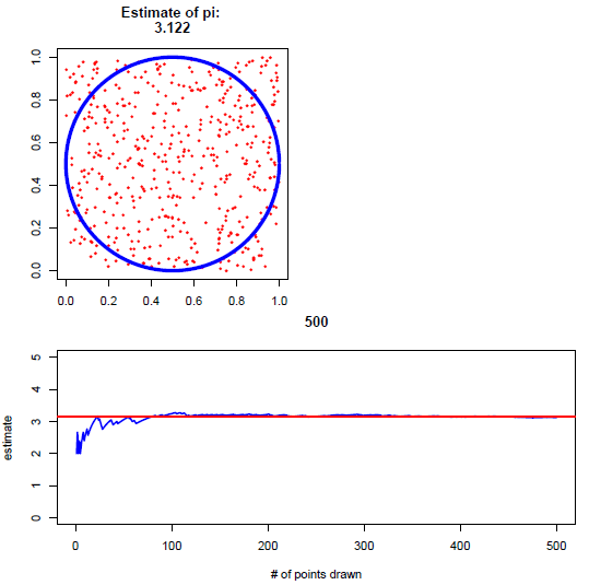
At 500 sample points, I got an estimate of 3.122 – not super great. If you want to give your computer a workout, you can ramp up the number of iterations (N) and see how close your estimate can get. It should be noted that this is not an efficient way of estimating π, but rather a nice and simple example of how Monte Carlo can be used for integration.

In the lesson, before showing the simulation, I started by having students pair up and manually draw points, plot them, and calculate their own estimate.

If you use this in your classroom, drop me a note and let me know how it went!

Montreal R workshop: Plyr, reshape and other data manipulation goodies

March 12, 2012 14h-16h N4/17 Stewart Biology Building, McGill University

Étienne Low-Decarie, McGill University


This workshop is organized by the BGSA and is free of charge (!), but space is limited. Register early to ensure your spot!

From Étienne:

  • Ever want to split your data according to factors, apply a function on each part and combine all the results into a consistent output?
  • Want a table of the slope for each year of your sampling data?
  • Want a plot for each level of your treatment?
  • Want to transform your data (e.g.: standardization)?
  • And want the high speed benefits of parallelization to boot?!

If yes, come out the the workshop!