Generative Adversarial Networks are the hotness at NIPS 2016

While they hit the scene two years ago, Generative Adversarial Networks (GANs) have become the darlings of this year’s NIPS conference. The term “Generative Adversarial” appears 170 times in the conference program. So far I’ve seen talks demonstrating their utility in everything from generating realistic images, predicting and filling in missing video segments, rooms, maps, and objects of various sorts. They are even being applied to the world of high energy particle physics, pushing the state of the art of inference within the language of quantum field theory.

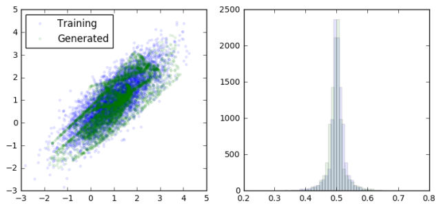
The basic idea is to build two models and to pit them against each other (hence the adversarial part). The generative model takes random inputs and tries to generate output data that “look like” real data. The discriminative model takes as input data from both the generative model and real data and tries to correctly distinguish between them. By updating each model in turn iteratively, we hope to reach an equilibrium where neither the discriminator nor the generator can improve. At this point the generator is doing it’s best to fool the discriminator, and the discriminator is doing it’s best not to be fooled. The result (if everything goes well) is a generative model which, given some random inputs, will output data which appears to be a plausible sample from your dataset (eg cat faces).

As with any concept that I’m trying to wrap my head around, I took a moment to create a toy example of a GAN to try to get a feel for what is going on.

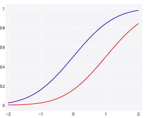
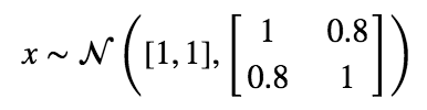
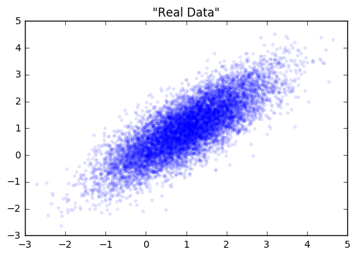
Let’s start with a simple distribution from which to draw our “real” data from.

screen-shot-2016-12-07-at-1-55-45-pmreal_data_gan

Next, we’ll create our generator and discriminator networks using tensorflow. Each will be a three layer, fully connected network with relu’s in the hidden layers. The loss function for the generative model is -1(loss function of discriminative). This is the adversarial part. The generator does better as the discriminator does worse. I’ve put the code for building this toy example here.

Next, we’ll fit each model in turn. Note in the code that we gave each optimizer a list of variables to update via gradient descent. This is because we don’t want to update the weights of the discriminator while we’re updating the weights of the generator, and visa versa.

loss at step 0: discriminative: 11.650652, generative: -9.347455

gan1.png

loss at step 200: discriminative: 8.815780, generative: -9.117246

gan2

loss at step 400: discriminative: 8.826855, generative: -9.462300

gan3.png

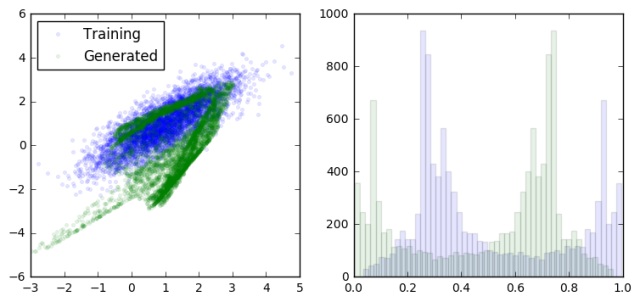
loss at step 600: discriminative: 8.893397, generative: -9.835464

gan4.png

loss at step 3600: discriminative: 6.724183, generative: -13.005814
 gan30.png
As we can see, the generator is learning to output data that looks more and more like a sample from the training data. At the same time, the discriminator is having a harder and harder dime telling them apart (as seen in the overlapping prediction histograms on the right).
Obviously this is a trivial example to put a GAN to work on, but when it comes to high-dimensional data with complex dependency structures, this approach starts to really shine. I’m sure the hotness of this approach won’t cool off any time soon.
All of the code for generating this GAN is available on github.
Advertisement

R style default plot for Pandas DataFrame

The default plot method for dataframes in R is to show each numeric variable in a pair-wise scatter plot. I find this to be a really useful first look at a dataset, both to see correlations and joint distributions between variables, but also to quickly diagnose potential strangeness like bands of repeating values or outliers.

From what I can tell, there are no builtins in the python data ecosystem (numpy, pandas, matplotlib) for this so I coded up a function to emulate the R behaviour. You can get it in this gist (feedback welcomed).

Here’s an example of it in action showing derived time-series features (12 hour rates of change) for some clinical variables.

plot_correlogram(df)

ts_features

Online R and Plotly Graphs: Canadian and U.S. Maps, Old Faithful with Multiple Axes, & Overlaid Histograms

Guest post by Matt Sundquist of plot.ly.

Plotly is a social graphing and analytics platform. Plotly’s R library lets you make and share publication-quality graphs online. Your work belongs to you, you control privacy and sharing, and public use is free (like GitHub). We are in beta, and would love your feedback, thoughts, and advice.

1. Installing Plotly

Let’s install Plotly. Our documentation has more details.

install.packages("devtools")
library("devtools")
devtools::install_github("R-api","plotly")

Then signup online or like this:

library(plotly)
response = signup (username = 'yourusername', email= 'youremail')


Thanks for signing up to plotly! Your username is: MattSundquist Your temporary password is: pw. You use this to log into your plotly account at https://plot.ly/plot. Your API key is: “API_Key”. You use this to access your plotly account through the API.

2. Canadian Population Bubble Chart

Our first graph was made at a Montreal R Meetup by Plotly’s own Chris Parmer. We’ll be using the maps package. You may need to load it:

install.packages("maps")

Then:

library(plotly)
p <- plotly(username="MattSundquist", key="4om2jxmhmn")
library(maps)
data(canada.cities)
trace1 <- list(x=map(regions="canada")$x,
  y=map(regions="canada")$y)

trace2 <- list(x= canada.cities$long,
  y=canada.cities$lat,
  text=canada.cities$name,
  type="scatter",
  mode="markers",
  marker=list(
    "size"=sqrt(canada.cities$pop/max(canada.cities$pop))*100,
    "opacity"=0.5)
  )

response <- p$plotly(trace1,trace2)
url <- response$url
filename <- response$filename
browseURL(response$url)

In our graph, the bubble size represents the city population size. Shown below is the GUI, where you can annotate, select colors, analyze and add data, style traces, place your legend, change fonts, and more.

map1

Editing from the GUI, we make a styled version. You can zoom in and hover on the points to find out about the cities. Want to make one for another country? We’d love to see it.

map2

And, here is said meetup, in action:

plotly_mtlRmeetup

You can also add in usa and us.cities:

map3

3. Old Faithful and Multiple Axes

Ben Chartoff’s graph shows the correlation between a bimodal eruption time and a bimodal distribution of eruption length. The key series are: a histogram scale of probability, Eruption Time scale in minutes, and a scatterplot showing points within each bin on the x axis. The graph was made with this gist.

old_faithful

4. Plotting Two Histograms Together

Suppose you are studying correlations in two series (Popular Stack Overflow ?). You want to find overlap. You can plot two histograms together, one for each series. The overlapping sections are the darker orange, automatically rendered if you set barmode to ‘overlay’.

library(plotly)
p <- plotly(username="Username", key="API_KEY")

x0 <- rnorm(500)
x1 <- rnorm(500)+1

data0 <- list(x=x0,
  name = "Series One",
  type='histogramx',
  opacity = 0.8)

data1 <- list(x=x1,
  name = "Series Two",
  type='histogramx',
  opacity = 0.8)

layout <- list(
  xaxis = list(
  ticks = "",
  gridcolor = "white",zerolinecolor = "white",
  linecolor = "white"
 ),
 yaxis = list(
  ticks = "",
  gridcolor = "white",
  zerolinecolor = "white",
  linecolor = "white"
 ),
 barmode='overlay',
 # style background color. You can set the alpha by adding an a.
 plot_bgcolor = 'rgba(249,249,251,.85)'
)

response <- p$plotly(data0, data1, kwargs=list(layout=layout))
url <- response$url
filename <- response$filename
browseURL(response$url)

plotly5

5. Plotting y1 and y2 in the Same Plot

Plotting two lines or graph types in Plotly is straightforward. Here we show y1 and y2 together (Popular SO ?). 

library(plotly)
p <- plotly(username="Username", key="API_KEY")

# enter data
x <- seq(-2, 2, 0.05)
y1 <- pnorm(x)
y2 <- pnorm(x,1,1)

# format, listing y1 as your y.
First <- list(
  x = x,
  y = y1,
  type = 'scatter',
  mode = 'lines',
  marker = list(
   color = 'rgb(0, 0, 255)',
   opacity = 0.5)
  )

# format again, listing y2 as your y.
Second <- list(
  x = x,
  y = y2,
  type = 'scatter',
  mode = 'lines',
  opacity = 0.8,
  marker = list(
   color = 'rgb(255, 0, 0)')
  )

plotly6

And a shot of the Plotly gallery, as seen at the Montreal meetup. Happy plotting!

plotly_mtlRmeetup2