The Treachery of Models

In Magritte’s famous 1929 painting The Treachery of Images, a pipe is depicted with the caption “Ceci n’est pas une pipe“, French for “This is not a pipe”. The seemingly dissonant statement under what is a very clearly depicted pipe forces the viewer to confront the distinction between the representation and the thing itself. The treachery refers to the danger involved in confusing the representation with the object.

Models – like images – are merely representations of the objects they depict. The modeler seeks to represent the relevant properties of the system being modeled in order to communicate some features of that system, or to manipulate it under ‘what-if’ scenarios.

With the current plethora of models of COVID-19 spread, it seems important to remind ourselves of Magritte’s warning. Models can be incredible tools — abstractions of complex realities that allow us to reason about the data we’ve seen so far, and consider possible futures. But they are not the epidemic process itself.

Ceci n'est pas une épidémie.

This is not an argument that the models themselves are treacherous. I absolutely adore modeling and models, as Magritte adored painting and images. I consider modeling an essential tool to further our understanding of (and make predictions about) the world around us. Indeed I developed one of the aforementioned COVID-19 models with my colleagues at Penn Medicine. The treachery comes when we mistake the abstraction for reality.

Advertisement

Visualizing classifier thresholds

Lately I’ve been thinking a lot about the connection between prediction models and the decisions that they influence. There is a lot of theory around this, but communicating how the various pieces all fit together with the folks who will use and be impacted by these decisions can be challenging.

One of the important conceptual pieces is the link between the decision threshold (how high does the score need to be to predict positive) and the resulting distribution of outcomes (true positives, false positives, true negatives and false negatives). As a starting point, I’ve built this interactive tool for exploring this.

Screen Shot 2017-11-13 at 11.16.26 AM

The idea is to take a validation sample of predictions from a model and experiment with the consequences of varying the decision threshold. The hope is that the user will be able to develop an intuition around the tradeoffs involved by seeing the link to the individual data points involved.

Code for this experiment is available here. I hope to continue to build on this with other interactive, visual tools aimed at demystifying the concepts at the interface between predictions and decisions.

Visualizing Generative Adversarial Networks

UPDATE: Some cool people at Georgia Tech and Google Brain have developed an interactive visualization called GAN lab which is way more exciting than this which you can check out here: https://poloclub.github.io/ganlab/

Yesterday, I wrote about Generative Adversarial Networks being all the rage at NIPS this year. I created a toy model using Tensorflow to wrap my head around how the idea works. Building on that example, I created a video to visualize the adversarial training process.

The top left panel shows samples from both the training and generated (eg counterfeit) data. Remember that the goal is to have the generator produce samples that the discriminator can not distinguish from the real (training) data. Top right shows the predicted energy function from the discriminator.  The bottom row shows the loss function for the discriminator (D) and generator (G).

I don’t fully understand why the dynamics of the adversarial training process are transiently unstable, but it seems to work overall. Another interesting observation is that the loss seems to continue to fall overall, even as it goes though the transient phases of instability when the fit of the generated data is qualitatively poor.

Categorizing NIPS papers using LDA topic modeling

The Annual Conference on Neural Information Processing Systems (NIPS) has recently listed this year’s accepted papers. There are 403 paper titles listed, which made for great morning coffee reading, trying to pick out the ones that most interest me.

Being a machine learning conference, it’s only reasonable that we apply a little machine learning to this (decidedly _small_) data.

Building off of the great example code in a post by Jordan Barber on Latent Dirichlet Allocation (LDA) with Python, I scraped the paper titles and built an LDA topic model with 5 topics. All of the code to reproduce this post is available on github. Here are the top 10 most probable words from each of the derived topics:

0 1 2 3 4
0 learning learning optimization learning via
1 models inference networks bayesian models
2 neural sparse time sample inference
3 high models stochastic analysis networks
4 stochastic non model data deep
5 dimensional optimization convex inference learning
6 networks algorithms monte spectral fast
7 graphs multi carlo networks variational
8 optimal linear neural bandits neural
9 sampling convergence information methods convolutional

Normally, we might try to attach some kind of label to each topic using our beefy human brains and subject matter expertise, but I didn’t bother with this — nothing too obvious stuck out at me. If you think that you have appropriate names for them feel free to let me know. Given that we are only working with the titles (no abstracts or full paper text), I think that there aren’t obvious human-interpretable topics jumping out. But let’s not let that stop us from proceeding.

We can also represent the inferred topics with the much maligned, but handy-dandy wordcloud visualization:

Topic: 0
 topic_0
Topic: 1
 topic_1
Topic: 2
 topic_2
Topic: 3
 topic_3
Topic: 4
topic_4

Since we are modeling the paper title generating process as a probability distribution of topics, each of which is a probability distribution of words, we can use this generating process to suggest keywords for each title. These keywords may or may not show up in the title itself. Here are some from the first 10 titles:

================

Double or Nothing: Multiplicative Incentive Mechanisms for Crowdsourcing
Generated Keywords: [u'iteration', u'inference', u'theory']

================

Learning with Symmetric Label Noise: The Importance of Being Unhinged
Generated Keywords: [u'uncertainty', u'randomized', u'neural']

================

Algorithmic Stability and Uniform Generalization
Generated Keywords: [u'spatial', u'robust', u'dimensional']

================

Adaptive Low-Complexity Sequential Inference for Dirichlet Process Mixture Models
Generated Keywords: [u'rates', u'fast', u'based']

================

Covariance-Controlled Adaptive Langevin Thermostat for Large-Scale Bayesian Sampling
Generated Keywords: [u'monte', u'neural', u'stochastic']

================

Robust Portfolio Optimization
Generated Keywords: [u'learning', u'online', u'matrix']

================

Logarithmic Time Online Multiclass prediction
Generated Keywords: [u'complexity', u'problems', u'stein']

================

Planar Ultrametric Rounding for Image Segmentation
Generated Keywords: [u'deep', u'graphs', u'neural']

================

Expressing an Image Stream with a Sequence of Natural Sentences
Generated Keywords: [u'latent', u'process', u'stochastic']

================

Parallel Correlation Clustering on Big Graphs
Generated Keywords: [u'robust', u'learning', u'learning']

Entropy and the most “interdisciplinary” paper title

While some titles are strongly associated with a single topic, others seem to be generated from more even distributions over topics than others. Paper titles with more equal representation over topics could be considered to be, in some way, more interdisciplinary, or at least, intertopicular (yes, I just made that word up). To find these papers, we’ll find which paper titles have the highest information entropy in their inferred topic distribution.

Here are the top 10 along with their associated entropies:

1.22769364291 Where are they looking?
1.1794725784 Bayesian dark knowledge
1.11261338284 Stochastic Variational Information Maximisation
1.06836891546 Variational inference with copula augmentation
1.06224431711 Adaptive Stochastic Optimization: From Sets to Paths
1.04994413148 The Population Posterior and Bayesian Inference on Streams
1.01801236048 Revenue Optimization against Strategic Buyers
1.01652797194 Fast Convergence of Regularized Learning in Games
0.993789478925 Communication Complexity of Distributed Convex Learning and Optimization
0.990764728084 Local Expectation Gradients for Doubly Stochastic Variational Inference

So it looks like by this method, the ‘Where are they looking’ has the highest entropy as a result of topic uncertainty, more than any real multi-topic content.

One datavis for you, ten for me

Over the years of my graduate studies I made a lot of plots. I mean tonnes. To get an extremely conservative estimate I grep’ed for every instance of “plot\(” in all of the many R scripts I wrote over the past five years.


find . -iname "*.R" -print0 | xargs -L1 -0 egrep -r "plot(" | wc -l

2922

The actual number is very likely orders of magnitude larger as 1) many of these plot statements are in loops, 2) it doesn’t capture how many times I may have ran a given script, 3) it doesn’t look at previous versions, 4) plot is not the only command to generate figures in R (eg hist), and 5) early in my graduate career I mainly used gnuplot and near the end I was using more and more matplotlib. But even at this lower bound, that’s nearly 3,000 plots. A quick look at the TOC of my thesis reveals a grand total of 33 figures. Were all the rest a waste? (Hint: No.)

The overwhelming majority of the plots that I created served a very different function than these final, publication-ready figures. Generally, visualizations are either:

  • A) Communication between you and data, or
  • B) Communication between you and someone else, through data.

These two modes serve very different purposes and can require taking different approaches in their creation. Visualizations in the first mode need only be quick and dirty. You can often forget about all that nice axis labeling, optimal color contrast, and whiz-bang interactivity. As per my estimates above, this made up at the very least 10:1 of visuals created. The important thing is that, in this mode, you already have all of the context. You know what the variables are, you know what the colors, shapes, sizes, and layouts mean – after all, you just coded it. The beauty of this is that you can iterate on these plots very quickly. The conversation between you and the data can dialogue back and forth as you intrepidly explore and shine your light into all of it’s dark little corners.

In the second mode, you are telling a story to someone else. Much more thought and care needs to be placed on ensuring that the whole story is being told with the visualization. It is all too easy to produce something that makes sense to you, but is completely unintelligible to your intended audience. I’ve learned the hard way that this kind of visual should always be test-driven by someone who, ideally, is a member of your intended audience. When you are as steeped in the data as you most likely are, your mind will fill in any missing pieces of the story – something your audience won’t do.

In my new role as part of the Data Science team at Penn Medicine, I’ll be making more and more data visualizations in the second mode. A little less talking to myself with data, and a little more communicating with others through data. I’ll be sharing some of my experiences, tools, wins, and disasters here. Stay tuned!

Plot with ggplot2, interact, collaborate, and share online

Editor’s note: This is a guest post by Marianne Corvellec from Plotly. This post is based on an interactive Notebook (click to view) she presented at the R User Conference on July 1st, 2014.

Plotly is a platform for making, editing, and sharing graphs. If you are used to making plots with ggplot2, you can call ggplotly() to make your plots interactive, web-based, and collaborative. For example, see plot.ly/~ggplot2examples/211, shown below and in this Notebook. Notice the hover text!

img1

0. Get started

Visit http://plot.ly. Here, you’ll find a GUI that lets you create graphs from data you enter manually, or upload as a spreadsheet (or CSV file). From there you can edit graphs! Change between types (from bar charts to scatter charts), change colors and formatting, add fits and annotations, try other themes…

img2

Our R API lets you use Plotly with R. Once you have your R visualization in Plotly, you can use the web interface to edit it, or to extract its data. Install and load package “plotly” in your favourite R environment. For a quick start, follow: https://plot.ly/ggplot2/getting-started/

Go social! Like, share, comment, fork and edit plots… Export them, embed them in your website. Collaboration has never been so sweet!

img3

Not ready to publish? Set detailed permissions for who can view and who can edit your project.

img4

1. Make a (static) plot with ggplot2

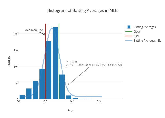
Baseball data is the best! Let’s plot a histogram of batting averages. I downloaded data here.

Load the CSV file of interest, take a look at the data, subset at will:


library(RCurl)

online_data <-
 getURL("https://raw.githubusercontent.com/mkcor/baseball-notebook/master/Batting.csv")

batting_table <-
 read.csv(textConnection(online_data))

head(batting_table)

summary(batting_table)

batting_table <- 
 subset(batting_table, yearID >= 2004)

The batting average is defined by the number of hits divided by at bats:

batting_table$Avg <- 
 with(batting_table, H / AB)

You may want to explore the distribution of your new variable as follows:


library(ggplot2)
ggplot(data=batting_table)
 + geom_histogram(aes(Avg), binwidth=0.05)

# Let's filter out entries where players were at bat less than 10 times.

batting_table <- 
 subset(batting_table, AB >= 10)
hist <-
 ggplot(data=batting_table) + geom_histogram(aes(Avg),
 binwidth=0.05)
hist

We have created a basic histogram; let us share it, so we can get input from others!

2. Save your R plot to plot.ly

# Install the latest version 
# of the “plotly” package and load it

library(devtools)
install_github("ropensci/plotly")
library(plotly)

# Open a Plotly connection

py <-
 plotly("ggplot2examples", "3gazttckd7")

Use your own credentials if you prefer. You can sign up for a Plotly account online.

Now call the `ggplotly()` method:


collab_hist <-
 py$ggplotly(hist)

And boom!

img5

You get a nice interactive version of your plot! Go ahead and hover…

Your plot lives at this URL (`collab_hist$response$url`) alongside the data. How great is that?!

If you wanted to keep your project private, you would use your own credentials and specify:

py <- plotly()

py$ggplotly(hist,
 kwargs=list(filename="private_project",
 world_readable=FALSE))

3. Edit your plot online


Now let us click “Fork and edit”. You (and whoever you’ve added as a collaborator) can make edits in the GUI. For instance, you can run a Gaussian fit on this distribution:

img6

You can give a title, edit the legend, add notes, etc.

img7

You can add annotations in a very flexible way, controlling what the arrow and text look like:

img8

When you’re happy with the changes, click “Share” to get your plot’s URL.

If you append a supported extension to the URL, Plotly will translate your plot into that format. Use this to export static images, embed your graph as an iframe, or translate the code between languages. Supported file types include:

Isn’t life wonderful?

4. Retrieve your plot.ly plot in R

The JSON file specifies your plot completely (it contains all the data and layout info). You can view it as your plot’s DNA. The R file (https://plot.ly/~mkcor/305.r) is a conversion of this JSON into a nested list in R. So we can interact with it by programming in R!

Access a plot which lives on plot.ly with the well-named method `get_figure()`:

enhanc_hist <-
 py$get_figure("mkcor", 305)

Take a look:

str(enhanc_hist)

# Data for second trace
enhanc_hist$data[[2]]

The second trace is a vertical line at 0.300 named “Good”. Say we get more ambitious and we want to show a vertical line at 0.350 named “Very Good”. We overwrite old values with our new values:

enhanc_hist$data[[2]]$name <- "VeryGood"
enhanc_hist$data[[2]]$x[[1]] <- 0.35
enhanc_hist$data[[2]]$x[[2]] <- 0.35

Send this new plot back to plot.ly!

enhanc_hist2 <-
 py$plotly(enhanc_hist$data, 
 kwargs=list(layout=enhanc_hist$layout))

enhanc_hist2$url

Visit the above URL (`enhanc_hist2$url`).

How do you like this workflow? Let us know!

Tutorials are at plot.ly/learn. You can see more examples and documentatation at plot.ly/ggplot2 and plot.ly/r. Our gallery has the following examples:

img9

Acknowledgments

This presentation benefited tremendously from comments by Matt Sundquist and Xavier Saint-Mleux.

Plotly’s R API is part of rOpenSci. It is under active development; you can find it on GitHub. Your thoughts, issues, and pull requests are always welcome!