Another great turnout at the DataPhilly meetup last night. Was great to see all you random data nerds!
Code snippets to generate animated examples here.
Another great turnout at the DataPhilly meetup last night. Was great to see all you random data nerds!
Code snippets to generate animated examples here.
There’s a curious thing about unlikely independent events: no matter how rare, they’re most likely to happen right away.
Let’s get hypothetical
You’ve taken a bet that pays off if you guess the exact date of the next occurrence of a rare event (p = 0.0001 on any given day i.i.d). What day do you choose? In other words, what is the most likely day for this rare event to occur?
Setting aside for now why in the world you’ve taken such a silly sounding bet, it would seem as though a reasonable way to think about it would be to ask: what is the expected number of days until the event? That must be the best bet, right?
We can work out the expected number of days quite easily as 1/p = 10000. So using the logic of expectation, we would choose day 10000 as our bet.
Let’s simulate to see how often we would win with this strategy. We’ll simulate the outcomes by flipping a weighted coin until it comes out heads. We’ll do this 100,000 times and record how many flips it took each time.
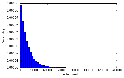
The event occurred on day 10,000 exactly 35 times. However, if we look at a histogram of our simulation experiment, we can see that the time it took for the rare event to happen was more often short, than long. In fact, the event occurred 103 times on the very first flip (the most common Time to Event in our set)!
So from the experiment it would seem that the most likely amount of time to pass until the rare event occurs is 0. Maybe our hypothetical event was just not rare enough. Let’s try it again with p=0.0000001, or an event with a 1 in 1million chance of occurring each day.

While now our event is extremely unlikely to occur, it’s still most likely to occur right away.
Existential Risk
What does this all have to do with seizing the day? Everything we do in a given day comes with some degree of risk. The Stanford professor Ronald A. Howard conceived of a way of measuring the riskiness of various day-to-day activities, which he termed the micromort. One micromort is a unit of risk equal to p = 0.000001 (1 in a million chance) of death. We are all subject to a baseline level of risk in micromorts, and additional activities may add or subtract from that level (skiing, for instance adds 0.7 micromorts per day).
While minimizing the risks we assume in our day-to-day lives can increase our expected life span, the most likely exact day of our demise is always our next one. So carpe diem!!
Post Script:
Don’t get too freaked out by all of this. It’s just a bit of fun that comes from viewing the problem in a very specific way. That is, as a question of which exact day is most likely. The much more natural way to view it is to ask, what is the relative probability of the unlikely event occurring tomorrow vs any other day but tomorrow. I leave it to the reader to confirm that for events with p < 0.5, the latter is always more likely.
The Area Under the Receiver Operator Curve is a commonly used metric of model performance in machine learning and many other binary classification/prediction problems. The idea is to generate a threshold independent measure of how well a model is able to distinguish between two possible outcomes. Threshold independent here just means that for any model which makes continuous predictions about binary outcomes, the conversion of the continuous predictions to binary requires making the choice of an arbitrary threshold above which will be a prediction of 1, below which will be 0.
AUC gets around this threshold problem by integrating across all possible thresholds. Typically, it is calculated by plotting the rate of false positives against false negatives across the range of possible thresholds (this is the Receiver Operator Curve) and then integrating (calculating the area under the curve). The result is typically something like this:
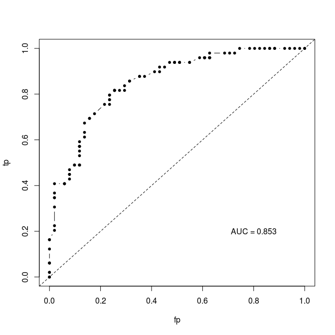
I’ve implemented this algorithm in an R script (https://gist.github.com/cjbayesian/6921118) which I use quite frequently. Whenever I am tasked with explaining the meaning of the AUC value however, I will usually just say that you want it to be 1 and that 0.5 is no better than random. This usually suffices, but if my interlocutor is of the particularly curious sort they will tend to want more. At which point I will offer the interpretation that the AUC gives you the probability that a randomly selected positive case (1) will be ranked higher in your predictions than a randomly selected negative case (0).
Which got me thinking – if this is true, why bother with all this false positive, false negative, ROC business in the first place? Why not just use Monte Carlo to estimate this probability directly?
So, of course, I did just that and by golly it works.
source("http://polaris.biol.mcgill.ca/AUC.R")
bs<-function(p)
{
 U<-runif(length(p),0,1)
 outcomes<-U<p
 return(outcomes)
}

# Simulate some binary outcomes #
n <- 100
x <- runif(n,-3,3)
p <- 1/(1+exp(-x))
y <- bs(p)

# Using my overly verbose code at https://gist.github.com/cjbayesian/6921118
AUC(d=y,pred=p,res=500,plot=TRUE)

## The hard way (but with fewer lines of code) ##
N <- 10000000
r_pos_p <- sample(p[y==1],N,replace=TRUE)
r_neg_p <- sample(p[y==0],N,replace=TRUE)

# Monte Carlo probability of a randomly drawn 1 having a higher score than
# a randomly drawn 0 (AUC by definition):

rAUC <- mean(r_pos_p > r_neg_p)
print(rAUC)
By randomly sampling positive and negative cases to see how often the positives have larger predicted probability than the negatives, the AUC can be calculated without the ROC or thresholds or anything. Now, before you object that this is necessarily an approximation, I’ll stop you right there – it is. And it is more computationally expensive too. The real value for me in this method is for my understanding of the meaning of AUC. I hope that it has helped yours too!
Why settle for just one realisation of this year’s UEFA Euro when you can let the tournament play out 10,000 times in silico?

Since I already had some code lying around from my submission to the Kaggle hosted 2010 Take on the Quants challenge, I figured I’d recycle it for the Euro this year. The model takes a simulation based approach, using Poisson distributed goals. The rate parameters in a given match are determined by the relative strength of each team as given by their ELO rating.
The advantage of this approach is that the tournament structure (which teams are assigned to which groups, how points are assigned, quarter final structure, etc) can be accounted for. If we wanted to take this into account when making probabilistic forecasts of tournament outcomes, we would need to calculate many conditional probability statements, following the extremely large number of possible outcomes. However, the downside is that it is only as reliable as the team ratings themselves. In my submission to Kaggle, I used a weighted average of ELO and FIFA ratings.
After simulating the tournament 10,000 times, the probability of victory for each team is just the number of times that team arose victorious divided by 10,000.

Feel free to get the code here and play around with it yourself. You can use your own rating system and see how the predicted outcomes change. If you are of a certain disposition, you might even find it more fun than the human version of the tournament itself!
In honour of π day (03.14 – can’t wait until 2015~) , I thought I’d share this little script I wrote a while back for an introductory lesson I gave on using Monte Carlo methods for integration.
The concept is simple – we can estimate the area of an object which is inside another object of known area by drawing many points at random in the larger area and counting how many of those land inside the smaller one. The ratio of this count to the total number of points drawn will approximate the ratio of the areas as the number of points grows large.
If we do this with a unit circle inside of a unit square, we can re-arrange our area estimate to yield an estimate of π!
This R script lets us see this Monte Carlo routine in action:
##############################################
### Monte Carlo Simulation estimation of pi ##
## Author: Corey Chivers                    ##
##############################################

rm(list=ls())

options(digits=4)

## initialize ##
N=500 # Number of MC points
points <- data.frame(x=numeric(N),y=numeric(N))
pi_est <- numeric(N)
inner <-0
outer <-0

## BUILD Circle ##
circle <- data.frame(x=1:360,y=1:360)

for(i in 1:360)
{
circle$x[i] <-0.5+cos(i/180*pi)*0.5
circle$y[i] <-0.5+sin(i/180*pi)*0.5
}

## SIMULATE ##
pdf('MCpiT.pdf')

layout(matrix(c(2,3,1,1), 2, 2, byrow = TRUE))
for(i in 1:N)
{

# Draw a new point at random
points$x[i] <-runif(1)
points$y[i] <-runif(1)

# Check if the point is inside
# the circle
if( (points$x[i]-0.5)^2 + (points$y[i]-0.5)^2 > 0.25 )
{
outer=outer+1
}else
{
inner=inner+1
}

current_pi<-(inner/(outer+inner))/(0.25)
pi_est[i]= current_pi
print(current_pi)

par(mar = c(5, 4, 4, 2),pty='m')
plot(pi_est[1:i],type='l',
main=i,col="blue",ylim=c(0,5),
lwd=2,xlab="# of points drawn",ylab="estimate")
# Draw true pi for reference
abline(pi,0,col="red",lwd=2)

par(mar = c(1, 4, 4, 1),pty='s')
plot(points$x[1:i],points$y[1:i],
col="red",
main=c('Estimate of pi: ',formatC(current_pi, digits=4, format="g", flag="#")),
cex=0.5,pch=19,ylab='',xlab='',xlim=c(0,1),ylim=c(0,1))
lines(circle$x,circle$y,lw=4,col="blue")
frame() #blank

}
dev.off()
##############################################
##############################################
The resulting plot (multi-page pdf) lets us watch the estimate of π converge toward the true value.

At 500 sample points, I got an estimate of 3.122 – not super great. If you want to give your computer a workout, you can ramp up the number of iterations (N) and see how close your estimate can get. It should be noted that this is not an efficient way of estimating π, but rather a nice and simple example of how Monte Carlo can be used for integration.
In the lesson, before showing the simulation, I started by having students pair up and manually draw points, plot them, and calculate their own estimate.
If you use this in your classroom, drop me a note and let me know how it went!
