Colouring book self-supervised learning

Self-Supervised Learning: Its child’s play

Recently at home with my mom and sister and I was explaining a bit about the work I’m going to be doing in AI for digital pathology. We got talking about how there is so much data, but a scarcity of good labels, what self-supervised learning is and how it can help overcome this. As I was describing how it works, my sister was like “oh, ya, like this!” and pulled out a coloring book my nieces had been working on. Exactly!

Advertisement

Generative Adversarial Networks are the hotness at NIPS 2016

While they hit the scene two years ago, Generative Adversarial Networks (GANs) have become the darlings of this year’s NIPS conference. The term “Generative Adversarial” appears 170 times in the conference program. So far I’ve seen talks demonstrating their utility in everything from generating realistic images, predicting and filling in missing video segments, rooms, maps, and objects of various sorts. They are even being applied to the world of high energy particle physics, pushing the state of the art of inference within the language of quantum field theory.

The basic idea is to build two models and to pit them against each other (hence the adversarial part). The generative model takes random inputs and tries to generate output data that “look like” real data. The discriminative model takes as input data from both the generative model and real data and tries to correctly distinguish between them. By updating each model in turn iteratively, we hope to reach an equilibrium where neither the discriminator nor the generator can improve. At this point the generator is doing it’s best to fool the discriminator, and the discriminator is doing it’s best not to be fooled. The result (if everything goes well) is a generative model which, given some random inputs, will output data which appears to be a plausible sample from your dataset (eg cat faces).

As with any concept that I’m trying to wrap my head around, I took a moment to create a toy example of a GAN to try to get a feel for what is going on.

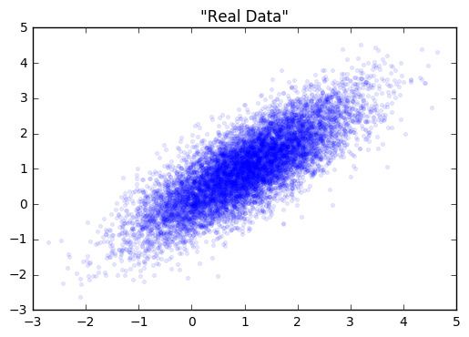
Let’s start with a simple distribution from which to draw our “real” data from.

screen-shot-2016-12-07-at-1-55-45-pmreal_data_gan

Next, we’ll create our generator and discriminator networks using tensorflow. Each will be a three layer, fully connected network with relu’s in the hidden layers. The loss function for the generative model is -1(loss function of discriminative). This is the adversarial part. The generator does better as the discriminator does worse. I’ve put the code for building this toy example here.

Next, we’ll fit each model in turn. Note in the code that we gave each optimizer a list of variables to update via gradient descent. This is because we don’t want to update the weights of the discriminator while we’re updating the weights of the generator, and visa versa.

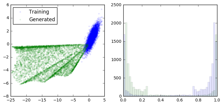
loss at step 0: discriminative: 11.650652, generative: -9.347455

gan1.png

loss at step 200: discriminative: 8.815780, generative: -9.117246

gan2

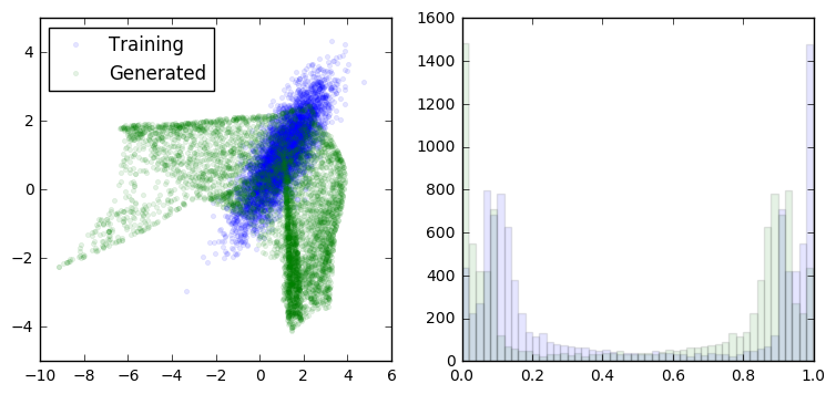
loss at step 400: discriminative: 8.826855, generative: -9.462300

gan3.png

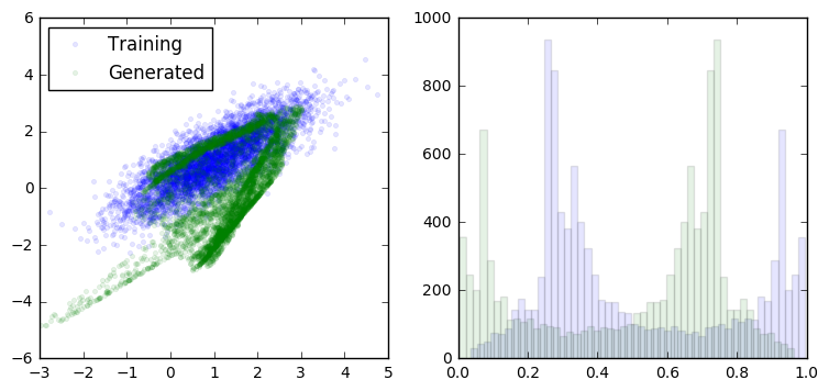
loss at step 600: discriminative: 8.893397, generative: -9.835464

gan4.png

loss at step 3600: discriminative: 6.724183, generative: -13.005814
 gan30.png
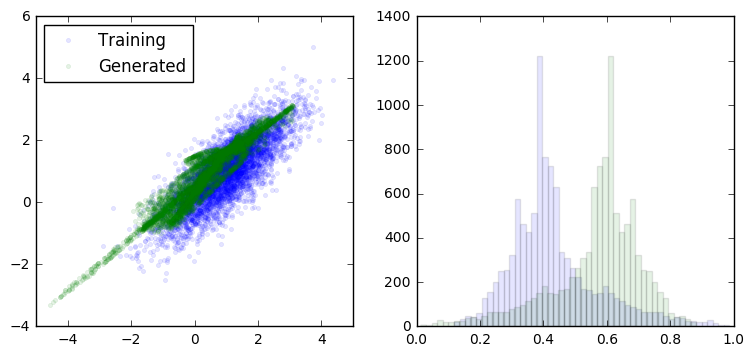
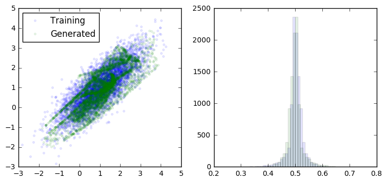
As we can see, the generator is learning to output data that looks more and more like a sample from the training data. At the same time, the discriminator is having a harder and harder dime telling them apart (as seen in the overlapping prediction histograms on the right).
Obviously this is a trivial example to put a GAN to work on, but when it comes to high-dimensional data with complex dependency structures, this approach starts to really shine. I’m sure the hotness of this approach won’t cool off any time soon.
All of the code for generating this GAN is available on github.

Introduction to Machine Learning Talk

There was an amazing turnout at last night’s DataPhilly meetup (~200 people!). I was completely delighted by the turnout and people’s engagement level. Here are the slides of the talk I gave to set up the evening with a high-level introduction to machine learning.


Categorizing NIPS papers using LDA topic modeling

The Annual Conference on Neural Information Processing Systems (NIPS) has recently listed this year’s accepted papers. There are 403 paper titles listed, which made for great morning coffee reading, trying to pick out the ones that most interest me.

Being a machine learning conference, it’s only reasonable that we apply a little machine learning to this (decidedly _small_) data.

Building off of the great example code in a post by Jordan Barber on Latent Dirichlet Allocation (LDA) with Python, I scraped the paper titles and built an LDA topic model with 5 topics. All of the code to reproduce this post is available on github. Here are the top 10 most probable words from each of the derived topics:

0 1 2 3 4
0 learning learning optimization learning via
1 models inference networks bayesian models
2 neural sparse time sample inference
3 high models stochastic analysis networks
4 stochastic non model data deep
5 dimensional optimization convex inference learning
6 networks algorithms monte spectral fast
7 graphs multi carlo networks variational
8 optimal linear neural bandits neural
9 sampling convergence information methods convolutional

Normally, we might try to attach some kind of label to each topic using our beefy human brains and subject matter expertise, but I didn’t bother with this — nothing too obvious stuck out at me. If you think that you have appropriate names for them feel free to let me know. Given that we are only working with the titles (no abstracts or full paper text), I think that there aren’t obvious human-interpretable topics jumping out. But let’s not let that stop us from proceeding.

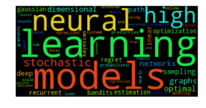
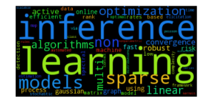
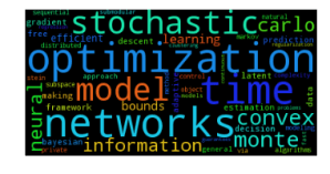
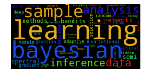
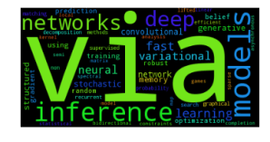
We can also represent the inferred topics with the much maligned, but handy-dandy wordcloud visualization:

Topic: 0
 topic_0
Topic: 1
 topic_1
Topic: 2
 topic_2
Topic: 3
 topic_3
Topic: 4
topic_4

Since we are modeling the paper title generating process as a probability distribution of topics, each of which is a probability distribution of words, we can use this generating process to suggest keywords for each title. These keywords may or may not show up in the title itself. Here are some from the first 10 titles:

================

Double or Nothing: Multiplicative Incentive Mechanisms for Crowdsourcing
Generated Keywords: [u'iteration', u'inference', u'theory']

================

Learning with Symmetric Label Noise: The Importance of Being Unhinged
Generated Keywords: [u'uncertainty', u'randomized', u'neural']

================

Algorithmic Stability and Uniform Generalization
Generated Keywords: [u'spatial', u'robust', u'dimensional']

================

Adaptive Low-Complexity Sequential Inference for Dirichlet Process Mixture Models
Generated Keywords: [u'rates', u'fast', u'based']

================

Covariance-Controlled Adaptive Langevin Thermostat for Large-Scale Bayesian Sampling
Generated Keywords: [u'monte', u'neural', u'stochastic']

================

Robust Portfolio Optimization
Generated Keywords: [u'learning', u'online', u'matrix']

================

Logarithmic Time Online Multiclass prediction
Generated Keywords: [u'complexity', u'problems', u'stein']

================

Planar Ultrametric Rounding for Image Segmentation
Generated Keywords: [u'deep', u'graphs', u'neural']

================

Expressing an Image Stream with a Sequence of Natural Sentences
Generated Keywords: [u'latent', u'process', u'stochastic']

================

Parallel Correlation Clustering on Big Graphs
Generated Keywords: [u'robust', u'learning', u'learning']

Entropy and the most “interdisciplinary” paper title

While some titles are strongly associated with a single topic, others seem to be generated from more even distributions over topics than others. Paper titles with more equal representation over topics could be considered to be, in some way, more interdisciplinary, or at least, intertopicular (yes, I just made that word up). To find these papers, we’ll find which paper titles have the highest information entropy in their inferred topic distribution.

Here are the top 10 along with their associated entropies:

1.22769364291 Where are they looking?
1.1794725784 Bayesian dark knowledge
1.11261338284 Stochastic Variational Information Maximisation
1.06836891546 Variational inference with copula augmentation
1.06224431711 Adaptive Stochastic Optimization: From Sets to Paths
1.04994413148 The Population Posterior and Bayesian Inference on Streams
1.01801236048 Revenue Optimization against Strategic Buyers
1.01652797194 Fast Convergence of Regularized Learning in Games
0.993789478925 Communication Complexity of Distributed Convex Learning and Optimization
0.990764728084 Local Expectation Gradients for Doubly Stochastic Variational Inference

So it looks like by this method, the ‘Where are they looking’ has the highest entropy as a result of topic uncertainty, more than any real multi-topic content.

Introducing Penn Signals at DataPhilly

Last week I had the pleasure of giving a talk to a great audience at DataPhilly about the Data Science mission at Penn Medicine. In the talk I introduced the framework we are building to accelerate the development and deployment of predictive applications in health care.

DataPhillyApril2015

Click for slides (pdf)

Also on the line-up was (sometimes contributor to bayesianbiologist) Matt Sunquist. He demo’d some of plot.ly‘s most recent features to audible gasps of delight for the audience.

Dark matter benchmarks: All over the map

The three benchmark algorithms for predicting the location of dark matter halos are, for the most part, all over the map. Most of the test skies look something like this:

There are, however, some skies with rather strong halo signals that get a decent amount of agreement:

The Lenstool MLE algorithm is the current state of the art. As such, it’s the algo to beat. As of this morning, there was only one entry on the leader board with a score topping this benchmark.

*cracks fingers* – Let’s see if we can give it a run for it’s money.

Observing Dark Worlds – Visualizing dark matter’s distorting effect on galaxies

Some people like to do crossword puzzles. I like to do machine learning puzzles.

Lucky for me, a new contest was just posted yesterday on Kaggle. So naturally, my lazy Saturday was spent getting elbow deep into the data.

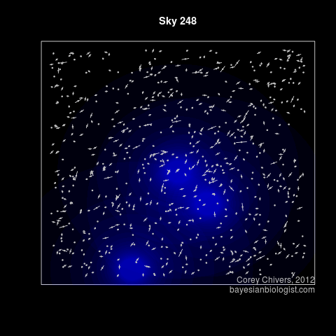
The training set consists of a series of ‘skies’, each containing a bunch of galaxies. Normally, these galaxies would exhibit random ellipticity. That is, if it weren’t for all that dark matter out there! The dark matter, while itself invisible (it is dark after all), tends to aggregate and do some pretty funky stuff. These aggregations of dark matter produce massive halos which bend the heck out of spacetime itself! The result is that any galaxies behind these halos (from our perspective here on earth) appear contorted around the halo.

The tricky bit is to distinguish between the background noise in the ellipticity of galaxies, and the regular effect of the dark matter halos. How hard could it be?

Step one, as always, is to have a look at what you’re working with using some visualization.

An example of the training data. This sky has 3 dark matter halos. I f you squint, you can kind of see the effect on the ellipticity of the surrounding galaxies.

If you want to try it yourself, I’ve posted the code here.

If you don’t feel like running it yourself, here are all 300 skies from the training set.


Now for the simple matter of the predictions. Looks like Sunday will be a fun day too! Stay tuned…

The essence of a handwritten digit

If you haven’t yet discovered the competitive machine learning site kaggle.com, please do so now. I’ll wait.

Great – so, you checked it out, fell in love and have made it back. I recently downloaded the data for the getting started competition. It consists of 42000 labelled images (28×28) of hand written digits 0-9. The competition is a straight forward supervised learning problem of OCR (Optical Character Recognition). There are two sample R scripts on the site to get you started. They implement the k-nearest neighbours and Random Forest algorithms.

I wanted to get  started by visualizing all of the training data by rendering some sort of an average of each character. Visualizing the data is a great first step to developing a model. Here’s how I did it:

## Read in data
train <- read.csv("../data/train.csv", header=TRUE)
train<-as.matrix(train)

##Color ramp def.
colors<-c('white','black')
cus_col<-colorRampPalette(colors=colors)

## Plot the average image of each digit
par(mfrow=c(4,3),pty='s',mar=c(1,1,1,1),xaxt='n',yaxt='n')
all_img<-array(dim=c(10,28*28))
for(di in 0:9)
{
print(di)
all_img[di+1,]<-apply(train[train[,1]==di,-1],2,sum)
all_img[di+1,]<-all_img[di+1,]/max(all_img[di+1,])*255

z<-array(all_img[di+1,],dim=c(28,28))
z<-z[,28:1] ##right side up
image(1:28,1:28,z,main=di,col=cus_col(256))
}

Which gives you:
Notice the wobbly looking ‘1’. You can see that there is some variance in the angle of the slant, with a tenancy toward leaning right. I imagine that this is due to the bias toward right handed individuals in the sample.

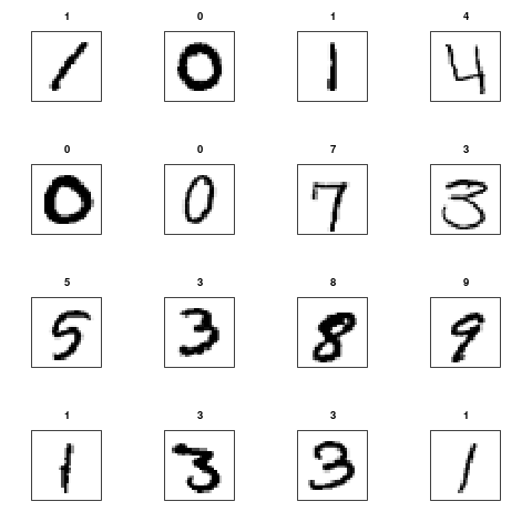
I also wanted to generate a pdf plot of all of the training set, to get myself an idea of what kind of anomalous instances I should expect.

If you are interested, dear reader, here is my code to do just that.

pdf('train_letters.pdf')
par(mfrow=c(4,4),pty='s',mar=c(3,3,3,3),xaxt='n',yaxt='n')
for(i in 1:nrow(train))
{
z<-array(train[i,-1],dim=c(28,28))
z<-z[,28:1] ##right side up
image(1:28,1:28,z,main=train[i,1],col=cus_col(256))
print(i)
}
dev.off()

Which will give you a 2625 page pdf of every character in the training set which you can, um, casually peruse.
As of the time of writing, the current leading submission has a classification accuracy of 99.27%. There is no cash for this competition, but the knowledge gained from taking a stab at it is priceless. So give it a shot!