One datavis for you, ten for me

Over the years of my graduate studies I made a lot of plots. I mean tonnes. To get an extremely conservative estimate I grep’ed for every instance of “plot\(” in all of the many R scripts I wrote over the past five years.


find . -iname "*.R" -print0 | xargs -L1 -0 egrep -r "plot(" | wc -l

2922

The actual number is very likely orders of magnitude larger as 1) many of these plot statements are in loops, 2) it doesn’t capture how many times I may have ran a given script, 3) it doesn’t look at previous versions, 4) plot is not the only command to generate figures in R (eg hist), and 5) early in my graduate career I mainly used gnuplot and near the end I was using more and more matplotlib. But even at this lower bound, that’s nearly 3,000 plots. A quick look at the TOC of my thesis reveals a grand total of 33 figures. Were all the rest a waste? (Hint: No.)

The overwhelming majority of the plots that I created served a very different function than these final, publication-ready figures. Generally, visualizations are either:

  • A) Communication between you and data, or
  • B) Communication between you and someone else, through data.

These two modes serve very different purposes and can require taking different approaches in their creation. Visualizations in the first mode need only be quick and dirty. You can often forget about all that nice axis labeling, optimal color contrast, and whiz-bang interactivity. As per my estimates above, this made up at the very least 10:1 of visuals created. The important thing is that, in this mode, you already have all of the context. You know what the variables are, you know what the colors, shapes, sizes, and layouts mean – after all, you just coded it. The beauty of this is that you can iterate on these plots very quickly. The conversation between you and the data can dialogue back and forth as you intrepidly explore and shine your light into all of it’s dark little corners.

In the second mode, you are telling a story to someone else. Much more thought and care needs to be placed on ensuring that the whole story is being told with the visualization. It is all too easy to produce something that makes sense to you, but is completely unintelligible to your intended audience. I’ve learned the hard way that this kind of visual should always be test-driven by someone who, ideally, is a member of your intended audience. When you are as steeped in the data as you most likely are, your mind will fill in any missing pieces of the story – something your audience won’t do.

In my new role as part of the Data Science team at Penn Medicine, I’ll be making more and more data visualizations in the second mode. A little less talking to myself with data, and a little more communicating with others through data. I’ll be sharing some of my experiences, tools, wins, and disasters here. Stay tuned!

Advertisement

Plot with ggplot2, interact, collaborate, and share online

Editor’s note: This is a guest post by Marianne Corvellec from Plotly. This post is based on an interactive Notebook (click to view) she presented at the R User Conference on July 1st, 2014.

Plotly is a platform for making, editing, and sharing graphs. If you are used to making plots with ggplot2, you can call ggplotly() to make your plots interactive, web-based, and collaborative. For example, see plot.ly/~ggplot2examples/211, shown below and in this Notebook. Notice the hover text!

img1

0. Get started

Visit http://plot.ly. Here, you’ll find a GUI that lets you create graphs from data you enter manually, or upload as a spreadsheet (or CSV file). From there you can edit graphs! Change between types (from bar charts to scatter charts), change colors and formatting, add fits and annotations, try other themes…

img2

Our R API lets you use Plotly with R. Once you have your R visualization in Plotly, you can use the web interface to edit it, or to extract its data. Install and load package “plotly” in your favourite R environment. For a quick start, follow: https://plot.ly/ggplot2/getting-started/

Go social! Like, share, comment, fork and edit plots… Export them, embed them in your website. Collaboration has never been so sweet!

img3

Not ready to publish? Set detailed permissions for who can view and who can edit your project.

img4

1. Make a (static) plot with ggplot2

Baseball data is the best! Let’s plot a histogram of batting averages. I downloaded data here.

Load the CSV file of interest, take a look at the data, subset at will:


library(RCurl)

online_data <-
 getURL("https://raw.githubusercontent.com/mkcor/baseball-notebook/master/Batting.csv")

batting_table <-
 read.csv(textConnection(online_data))

head(batting_table)

summary(batting_table)

batting_table <- 
 subset(batting_table, yearID >= 2004)

The batting average is defined by the number of hits divided by at bats:

batting_table$Avg <- 
 with(batting_table, H / AB)

You may want to explore the distribution of your new variable as follows:


library(ggplot2)
ggplot(data=batting_table)
 + geom_histogram(aes(Avg), binwidth=0.05)

# Let's filter out entries where players were at bat less than 10 times.

batting_table <- 
 subset(batting_table, AB >= 10)
hist <-
 ggplot(data=batting_table) + geom_histogram(aes(Avg),
 binwidth=0.05)
hist

We have created a basic histogram; let us share it, so we can get input from others!

2. Save your R plot to plot.ly

# Install the latest version 
# of the “plotly” package and load it

library(devtools)
install_github("ropensci/plotly")
library(plotly)

# Open a Plotly connection

py <-
 plotly("ggplot2examples", "3gazttckd7")

Use your own credentials if you prefer. You can sign up for a Plotly account online.

Now call the `ggplotly()` method:


collab_hist <-
 py$ggplotly(hist)

And boom!

img5

You get a nice interactive version of your plot! Go ahead and hover…

Your plot lives at this URL (`collab_hist$response$url`) alongside the data. How great is that?!

If you wanted to keep your project private, you would use your own credentials and specify:

py <- plotly()

py$ggplotly(hist,
 kwargs=list(filename="private_project",
 world_readable=FALSE))

3. Edit your plot online


Now let us click “Fork and edit”. You (and whoever you’ve added as a collaborator) can make edits in the GUI. For instance, you can run a Gaussian fit on this distribution:

img6

You can give a title, edit the legend, add notes, etc.

img7

You can add annotations in a very flexible way, controlling what the arrow and text look like:

img8

When you’re happy with the changes, click “Share” to get your plot’s URL.

If you append a supported extension to the URL, Plotly will translate your plot into that format. Use this to export static images, embed your graph as an iframe, or translate the code between languages. Supported file types include:

Isn’t life wonderful?

4. Retrieve your plot.ly plot in R

The JSON file specifies your plot completely (it contains all the data and layout info). You can view it as your plot’s DNA. The R file (https://plot.ly/~mkcor/305.r) is a conversion of this JSON into a nested list in R. So we can interact with it by programming in R!

Access a plot which lives on plot.ly with the well-named method `get_figure()`:

enhanc_hist <-
 py$get_figure("mkcor", 305)

Take a look:

str(enhanc_hist)

# Data for second trace
enhanc_hist$data[[2]]

The second trace is a vertical line at 0.300 named “Good”. Say we get more ambitious and we want to show a vertical line at 0.350 named “Very Good”. We overwrite old values with our new values:

enhanc_hist$data[[2]]$name <- "VeryGood"
enhanc_hist$data[[2]]$x[[1]] <- 0.35
enhanc_hist$data[[2]]$x[[2]] <- 0.35

Send this new plot back to plot.ly!

enhanc_hist2 <-
 py$plotly(enhanc_hist$data, 
 kwargs=list(layout=enhanc_hist$layout))

enhanc_hist2$url

Visit the above URL (`enhanc_hist2$url`).

How do you like this workflow? Let us know!

Tutorials are at plot.ly/learn. You can see more examples and documentatation at plot.ly/ggplot2 and plot.ly/r. Our gallery has the following examples:

img9

Acknowledgments

This presentation benefited tremendously from comments by Matt Sundquist and Xavier Saint-Mleux.

Plotly’s R API is part of rOpenSci. It is under active development; you can find it on GitHub. Your thoughts, issues, and pull requests are always welcome!

Online R and Plotly Graphs: Canadian and U.S. Maps, Old Faithful with Multiple Axes, & Overlaid Histograms

Guest post by Matt Sundquist of plot.ly.

Plotly is a social graphing and analytics platform. Plotly’s R library lets you make and share publication-quality graphs online. Your work belongs to you, you control privacy and sharing, and public use is free (like GitHub). We are in beta, and would love your feedback, thoughts, and advice.

1. Installing Plotly

Let’s install Plotly. Our documentation has more details.

install.packages("devtools")
library("devtools")
devtools::install_github("R-api","plotly")

Then signup online or like this:

library(plotly)
response = signup (username = 'yourusername', email= 'youremail')


Thanks for signing up to plotly! Your username is: MattSundquist Your temporary password is: pw. You use this to log into your plotly account at https://plot.ly/plot. Your API key is: “API_Key”. You use this to access your plotly account through the API.

2. Canadian Population Bubble Chart

Our first graph was made at a Montreal R Meetup by Plotly’s own Chris Parmer. We’ll be using the maps package. You may need to load it:

install.packages("maps")

Then:

library(plotly)
p <- plotly(username="MattSundquist", key="4om2jxmhmn")
library(maps)
data(canada.cities)
trace1 <- list(x=map(regions="canada")$x,
  y=map(regions="canada")$y)

trace2 <- list(x= canada.cities$long,
  y=canada.cities$lat,
  text=canada.cities$name,
  type="scatter",
  mode="markers",
  marker=list(
    "size"=sqrt(canada.cities$pop/max(canada.cities$pop))*100,
    "opacity"=0.5)
  )

response <- p$plotly(trace1,trace2)
url <- response$url
filename <- response$filename
browseURL(response$url)

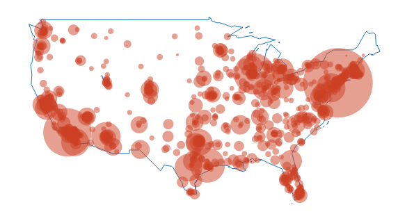
In our graph, the bubble size represents the city population size. Shown below is the GUI, where you can annotate, select colors, analyze and add data, style traces, place your legend, change fonts, and more.

map1

Editing from the GUI, we make a styled version. You can zoom in and hover on the points to find out about the cities. Want to make one for another country? We’d love to see it.

map2

And, here is said meetup, in action:

plotly_mtlRmeetup

You can also add in usa and us.cities:

map3

3. Old Faithful and Multiple Axes

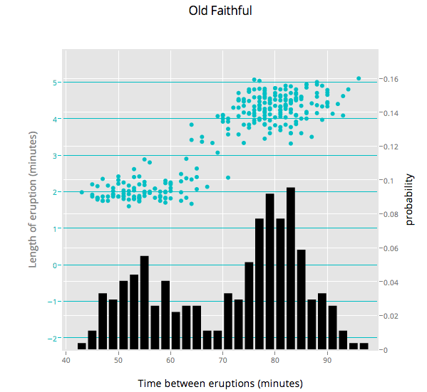
Ben Chartoff’s graph shows the correlation between a bimodal eruption time and a bimodal distribution of eruption length. The key series are: a histogram scale of probability, Eruption Time scale in minutes, and a scatterplot showing points within each bin on the x axis. The graph was made with this gist.

old_faithful

4. Plotting Two Histograms Together

Suppose you are studying correlations in two series (Popular Stack Overflow ?). You want to find overlap. You can plot two histograms together, one for each series. The overlapping sections are the darker orange, automatically rendered if you set barmode to ‘overlay’.

library(plotly)
p <- plotly(username="Username", key="API_KEY")

x0 <- rnorm(500)
x1 <- rnorm(500)+1

data0 <- list(x=x0,
  name = "Series One",
  type='histogramx',
  opacity = 0.8)

data1 <- list(x=x1,
  name = "Series Two",
  type='histogramx',
  opacity = 0.8)

layout <- list(
  xaxis = list(
  ticks = "",
  gridcolor = "white",zerolinecolor = "white",
  linecolor = "white"
 ),
 yaxis = list(
  ticks = "",
  gridcolor = "white",
  zerolinecolor = "white",
  linecolor = "white"
 ),
 barmode='overlay',
 # style background color. You can set the alpha by adding an a.
 plot_bgcolor = 'rgba(249,249,251,.85)'
)

response <- p$plotly(data0, data1, kwargs=list(layout=layout))
url <- response$url
filename <- response$filename
browseURL(response$url)

plotly5

5. Plotting y1 and y2 in the Same Plot

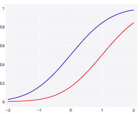
Plotting two lines or graph types in Plotly is straightforward. Here we show y1 and y2 together (Popular SO ?). 

library(plotly)
p <- plotly(username="Username", key="API_KEY")

# enter data
x <- seq(-2, 2, 0.05)
y1 <- pnorm(x)
y2 <- pnorm(x,1,1)

# format, listing y1 as your y.
First <- list(
  x = x,
  y = y1,
  type = 'scatter',
  mode = 'lines',
  marker = list(
   color = 'rgb(0, 0, 255)',
   opacity = 0.5)
  )

# format again, listing y2 as your y.
Second <- list(
  x = x,
  y = y2,
  type = 'scatter',
  mode = 'lines',
  opacity = 0.8,
  marker = list(
   color = 'rgb(255, 0, 0)')
  )

plotly6

And a shot of the Plotly gallery, as seen at the Montreal meetup. Happy plotting!

plotly_mtlRmeetup2

What’s Warren Buffett’s $1 Billion Basketball Bet Worth?

A friend of mine just alerted me to a story on NPR describing a prize on offer from Warren Buffett and Quicken Loans. The prize is a billion dollars (1B USD) for correctly predicting all 63 games in the men’s Division I college basketball tournament this March. The facebook page announcing the contest puts the odds at 1:9,223,372,036,854,775,808, which they note “may vary depending upon the knowledge and skill of entrant”.

Being curious, I thought I’d see what the assumptions were that went into that number. It would make sense to start with the assumption that you don’t know a lick about college basketball and you just guess using a coin flip for every match-up. In this scenario you’re pretty bad, but you are no worse than random. If we take this assumption, we can calculate the odds as 1/(0.5)^63.  To get precision down to a whole integer I pulled out trusty bc for the heavy lifting:

$ echo "scale=50;  1/(0.5^63)" | bc
9223372036854775808.000000

Well, that was easy. So if you were to just guess randomly, your odds of winning the big prize would be those published on the contest page. We can easily calculate the expected value of entering the contest as P(win)*prize, or 9,223,372,036ths of a dollar (that’s 9 nano dollars, if you’re paying attention). You’ve literally already spent that (and then some) in opportunity cost sunk into the time you are spending thinking about this contest and reading this post (but read on, ’cause it’s fun!).

But of course, you’re cleverer than that. You know everything about college basketball – or more likely if you are reading this blog – you have a kickass predictive model that is going to up your game and get your hands into the pocket of the Oracle from Omaha.

What level of predictiveness would you need to make this bet worth while? Let’s have a look at the expected value as a function of our individual game probability of being correct.

buffet1

And if you think that you’re really good, we can look at the 0.75 to 0.85 range:

buffet2

So it’s starting to look enticing, you might even be willing to take off work for a while if you thought you could get your model up to a consistent 85% correct game predictions, giving you an expected return of ~$35,000. A recent paper found that even after observing the first 40 scoring events, the outcome of NBA games is only predictable at 80%. In order to be eligible to win, you’ve obviously got to submit your picks before the playoff games begin, but even at this herculean level of accuracy, the expected value of an entry in the contest plummets down to $785.

Those are the odds for an individual entrant, but what are the chances that Buffet and co will have to pay out? That, of course, depends on the number of entrants. Lets assume that the skill of all entrants is the same, though they all have unique models which make different predictions. In this case we can get the probability of at least one of them hitting it big. It will be the complement of no one winning. We already know the odds for a single entrant with a given level of accuracy, so we can just take the probability that each one doesn’t win, then take 1 minus that value.

buffet3

Just as we saw that the expected value is very sensitive to the predictive accuracy of the participant, so too is the probability that the prize will be awarded at all. If 1 million super talented sporting sages with 80%  game-level accuracy enter the contest, there will only be a slightly greater than 50% chance of anyone actually winning. If we substitute in a more reasonable (but let’s face it, still wildly high) figure for participants’ accuracy of 70%, the chance becomes only 1 in 5739  (0.017%) that the top prize will even be awarded even with a 1 million strong entrant pool.

tl;dr You’re not going to win, but you’re still going to play.

If you want to reproduce the numbers and plots in this post, check out this gist.

Simudidactic

auto·di·dact n.
A self-taught person.
From Greek autodidaktosself-taught : auto-auto- + didaktostaught;

+

sim·u·late v.
To create a representation or model of (a physical system or particular situation, for example).
From Latin simulre, simult-, from similislike;

=
(If you can get past the mixing of Latin and Greek roots)

sim·u·di·dactic adj.
To learn by creating a representation or model of a physical system or particular situation. Particularly, using in silico computation to understand complex systems and phenomena.

———————————————————————

This concept has been floating around in my head for a little while. I’ve written before on how I believe that simulation can be used to improve one’s understanding of just about anything, but have never had a nice shorthand for this process.

Simudidactic inquiry is the process of understanding aspects of the world by abstracting them into a computational model, then conducting experiments in this model world by changing the underlying properties and parameters. In this way, one can ask questions like:

  1. What type of observations might we make if x were true?
  2. If my model of the process is accurate, can I recapture the underlying parameters given the type of observations I can make in the real world? How often will I be wrong?
  3. Will I be able to distinguish between competing models given the observations I can make in the real world?

In addition to being able to ask these types of questions, the simudidact solidifies their understanding of the model by actually building it.

So go on, get simudidactic and learn via simulation!

simudidactic

Montreal R User Group – Dr. Ramnath Vaidyanathan on his rCharts package

Monday, October 28, 2013. 6:00pm at Notman House 51 Sherbrooke W., Montreal, QC.

We are very pleased to welcome back Dr. Ramnath Vaidyanathan for a talk on interactive documents as it relates to his excellent rCharts package.

Bringing a laptop to follow along is highly encouraged. I would recommend installing rCharts prior to the workshop.

library(devtools)

pkgs <- c(‘rCharts’, ‘slidify’, ‘slidifyLibraries’)

install_github(pkgs, ‘ramnathv’, ref = ‘dev’)

Alternately, you would also be able to try out rCharts online at

http://public.opencpu.org/ocpu/github/rcharts/rCharts/www/

RSVP at http://www.meetup.com/Montreal-R-User-Group/events/144636812/

Calculating AUC the hard way

The Area Under the Receiver Operator Curve is a commonly used metric of model performance in machine learning and many other binary classification/prediction problems. The idea is to generate a threshold independent measure of how well a model is able to distinguish between two possible outcomes. Threshold independent here just means that for any model which makes continuous predictions about binary outcomes, the conversion of the continuous predictions to binary requires making the choice of an arbitrary threshold above which will be a prediction of 1, below which will be 0.

AUC gets around this threshold problem by integrating across all possible thresholds. Typically, it is calculated by plotting the rate of false positives against false negatives across the range of possible thresholds (this is the Receiver Operator Curve)  and then integrating (calculating the area under the curve). The result is typically something like this:

auc

I’ve implemented this algorithm in an R script (https://gist.github.com/cjbayesian/6921118) which I use quite frequently. Whenever I am tasked with explaining the meaning of the AUC value however, I will usually just say that you want it to be 1 and that 0.5 is no better than random. This usually suffices, but if my interlocutor is of the particularly curious sort they will tend to want more. At which point I will offer the interpretation that the AUC gives you the probability that a randomly selected positive case (1) will be ranked higher in your predictions than a randomly selected negative case (0).

Which got me thinking – if this is true, why bother with all this false positive, false negative, ROC business in the first place? Why not just use Monte Carlo to estimate this probability directly?

So, of course, I did just that and by golly it works.

source("http://polaris.biol.mcgill.ca/AUC.R")
bs<-function(p)
{
 U<-runif(length(p),0,1)
 outcomes<-U<p
 return(outcomes)
}

# Simulate some binary outcomes #
n <- 100
x <- runif(n,-3,3)
p <- 1/(1+exp(-x))
y <- bs(p)

# Using my overly verbose code at https://gist.github.com/cjbayesian/6921118
AUC(d=y,pred=p,res=500,plot=TRUE)

## The hard way (but with fewer lines of code) ##
N <- 10000000
r_pos_p <- sample(p[y==1],N,replace=TRUE)
r_neg_p <- sample(p[y==0],N,replace=TRUE)

# Monte Carlo probability of a randomly drawn 1 having a higher score than
# a randomly drawn 0 (AUC by definition):

rAUC <- mean(r_pos_p > r_neg_p)
print(rAUC)

By randomly sampling positive and negative cases to see how often the positives have larger predicted probability than the negatives, the AUC can be calculated without the ROC or thresholds or anything. Now, before you object that this is necessarily an approximation, I’ll stop you right there – it is.  And it is more computationally expensive too. The real value for me in this method is for my understanding of the meaning of AUC. I hope that it has helped yours too!

Time-series forecasting: Bike Accidents

About a year ago I posted this video visualization of all the reported accidents involving bicycles in Montreal between 2006 and 2010. In the process I also calculated and plotted the accident rate using a monthly moving average. The results followed a pattern that was for the most part to be expected. The rate shoots up in the spring, and declines to only a handful during the winter months.

It’s now 2013 and unfortunately our data ends in 2010. However, the pattern does seem to be quite regular (that is, exhibits annual periodicity) so I decided to have a go at forecasting the time series for the missing years. I used a seasonal decomposition of time series by LOESS to accomplish this.

You can see the code on github but here are the results. First, I looked at the four components of the decomposition:

decomp_collisions

Indeed the seasonal component is quite regular and does contain the intriguing dip in the middle of the summer that I mentioned in the first post.

seasonal_collisions


This figure shows just the seasonal deviation from the average rates. The peaks seem to be early July and again in late September. Before doing any seasonal aggregation I thought that the mid-summer dip may correspond with the mid-August construction holiday, however it looks now like it is a broader summer-long reprieve. It could be a population wide vacation effect.

Finally, I used an exponential smoothing model to project the accident rates into the 2011-2013 seasons.

forecast_collisions

It would be great to get the data from these years to validate the forecast, but for now lets just hope that we’re not pushing up against those upper confidence bounds.

From Whale Calls to Dark Matter: Competitive Data Science with R and Python

Back in June I gave a fun talk at Montreal Python on some of my dabbling in the competitive data science scene. The good people at Savior-fair Linux recorded the talk and have edited it all together into a pretty slick video. If you can spare twenty-minutes or so, have a look.

If you want the slides, head on over to my speakerdeck page.

whaledarkmattercover

How likely is the NSA PRISM program to catch a terrorist?

Recent revelations about PRISM, the NSA’s massive program of surveillance of civilian communications have caused quite a stir. And rightfully so, as it appears that the agency has been granted warrantless direct access to just about any form of digital communication engaged in by American citizens, and that their access to such data has been growing significantly over the past few years.

Some may argue that there is a necessary trade-off between civil liberties and public safety, and that others should just quit their whining. Lets take a look at this proposition (not the whining part). Specifically, let’s ask: how much benefit, in terms of thwarted would-be attacks, does this level of surveillance confer?

Lets start by recognizing that terrorism is extremely rare. So the probability that an individual under surveillance (and now everyone is under surveillance) is also a terrorist is also extremely low. Lets also assume that the neck-beards at the NSA are fairly clever, if exceptionally creepy. We assume that they have devised an algorithm that can detect ‘terrorist communications’ (as opposed to, for instance, pizza orders) with 99% accuracy.

P(+ |  bad guy) = 0.99

A job well done, and Murica lives to fight another day. Well, not quite. What we really want to know is: what is the probability that they’ve found a bad guy, given that they’ve gotten a hit on their screen? Or,

P(bad guy | +) =??

Which is quite a different question altogether. To figure this out, we need a bit more information. Recall that bad guys (specifically terrorists) are extremely rare, say on the order of one in a million (this is a wild over estimate with the true rate being much lower, of course – but lets not let that stop us). So,

P(bad guy) = 1/1,000,000

Further, lets say that the spooks have a pretty good algorithm that only comes up falsely positive (ie when the person under surveillance is a good guy) one in one hundred times.

P(+ |  good guy) = 0.01

And now we have all that we need. Apply a little special Bayes sauce:

P(bad guy | +) = P(+ | bad guy) P(bad guy)  /  [ P(+ |  bad guy) P(bad guy) + P(+ |  good guy) P(good guy) ]

and we get:

P(bad guy | +) = 1/10,102

That is, for every positive (the NSA calls these ‘reports’) there is only a 1 in 10,102 chance (using our rough assumptions) that they’ve found a real bad guy.

UPDATE: While former NSA analyst turned whistle blower William Binney thinks this is a plausible estimate, the point here is not that this is the ‘correct probability‘ involved (remember that we based our calculations on very rough assumptions). The take away message is simply that whenever the rate of an event of interest is extremely low, even a very accurate test will fail very often.

UPDATE 2: The Wall Street Journal’s Numbers Guy has written a piece on this in which several statisticians and security experts respond.

UPDATE 3: If you can read German, a reader reached me to point out that Der Spiegel technology section picked up the story.

Big brother is always watching, but he’s still got a needle in a haystack problem.

Big Brother 11

The television series doesn’t have this problem. On the show, they’re all bad guys.