Race and Police Shootings: Why Data Sampling Matters

When reading headlines about findings from data, always ask: “To what population does this conclusion apply?” Brian D’Alessandro explains eloquently why sampling matters.

mathbabe

This is a guest post by Brian D’Alessandro, who daylights as the Head of Data Science at Zocdoc and as an Adjunct Professor with NYU’s Center for Data Science. When not thinking probabilistically, he’s drumming with the indie surf rock quarter Coastgaard.

I’d like to address the recent study by Roland Fryer Jr  from Harvard University, and associated NY Times coverage, that claims to show zero racial bias in police shootings. While this paper certainly makes an honest attempt to study this very important and timely problem, it ultimately suffers from issues of data sampling and subjective data preparation. Given the media attention it is receiving, and the potential policy and public perceptual implications of this attention, we as a community of data people need to comb through this work and make sure the headlines are consistent with the underlying statistics.

First thing’s first: is there really zero…

View original post 1,204 more words

Advertisement

Introduction to Machine Learning Talk

There was an amazing turnout at last night’s DataPhilly meetup (~200 people!). I was completely delighted by the turnout and people’s engagement level. Here are the slides of the talk I gave to set up the evening with a high-level introduction to machine learning.


Speaking at DataPhilly February 2016

The next DataPhilly meetup will feature a medley of machine-learning talks, including an Intro to ML from yours truly. Check out the speakers list and be sure to RSVP. Hope to see you there!

Thursday, February 18, 2016

6:00 PM to 9:00 PM

Speakers:

  • Corey Chivers
  • Randy Olson
  • Austin Rochford

Corey Chivers (Penn Medicine)

Abstract: Corey will present a brief introduction to machine learning. In his talk he will demystify what is often seen as a dark art. Corey will describe how we “teach” machines to learn patterns from examples by breaking the process into its easy-to-understand component parts. By using examples from fields as diverse as biology, health-care, astrophysics, and NBA basketball, Corey will show how data (both big and small) is used to teach machines to predict the future so we can make better decisions.

Bio: Corey Chivers is a Senior Data Scientist at Penn Medicine where he is building machine learning systems to improve patient outcomes by providing real-time predictive applications that empower clinicians to identify at risk individuals. When he’s not pouring over data, he’s likely to be found cycling around his adoptive city of Philadelphia or blogging about all things probability and data at bayesianbiologist.com.

Randy Olson (University of Pennsylvania Institute for Biomedical Informatics):

Automating data science through tree-based pipeline optimization

Abstract: Over the past decade, data science and machine learning has grown from a mysterious art form to a staple tool across a variety of fields in business, academia, and government. In this talk, I’m going to introduce the concept of tree-based pipeline optimization for automating one of the most tedious parts of machine learning — pipeline design. All of the work presented in this talk is based on the open source Tree-based Pipeline Optimization Tool (TPOT), which is available on GitHub at https://github.com/rhiever/tpot.

Bio: Randy Olson is an artificial intelligence researcher at the University of Pennsylvania Institute for Biomedical Informatics, where he develops state-of-the-art machine learning algorithms to solve biomedical problems. He regularly writes about his latest adventures in data science at RandalOlson.com/blog, and tweets about the latest data science news at http://twitter.com/randal_olson.

Austin Rochford (Monetate):

Abstract: Bayesian optimization is a technique for finding the extrema of functions which are expensive, difficult, or time-consuming to evaluate. It has many applications to optimizing the hyperparameters of machine learning models, optimizing the inputs to real-world experiments and processes, etc. This talk will introduce the Gaussian process approach to Bayesian optimization, with sample code in Python.

Bio: Austin Rochford is a Data Scientist at Monetate. He is a former mathematician who is interested in Bayesian nonparametrics, multilevel models, probabilistic programming, and efficient Bayesian computation.

A probabilistic justification to carpe diem

There’s a curious thing about unlikely independent events: no matter how rare, they’re most likely to happen right away.

Let’s get hypothetical

You’ve taken a bet that pays off if you guess the exact date of the next occurrence of a rare event (p = 0.0001 on any given day i.i.d). What day do you choose? In other words, what is the most likely day for this rare event to occur?

Setting aside for now why in the world you’ve taken such a silly sounding bet, it would seem as though a reasonable way to think about it would be to ask: what is the expected number of days until the event? That must be the best bet, right?

We can work out the expected number of days quite easily as 1/p = 10000. So using the logic of expectation, we would choose day 10000 as our bet.

Let’s simulate to see how often we would win with this strategy. We’ll simulate the outcomes by flipping a weighted coin until it comes out heads. We’ll do this 100,000 times and record how many flips it took each time.

p0001

The event occurred on day 10,000 exactly 35 times. However, if we look at a histogram of our simulation experiment, we can see that the time it took for the rare event to happen was more often short, than long. In fact, the event occurred 103 times on the very first flip (the most common Time to Event in our set)!

So from the experiment it would seem that the most likely amount of time to pass until the rare event occurs is 0. Maybe our hypothetical event was just not rare enough. Let’s try it again with p=0.0000001, or an event with a 1 in 1million chance of occurring each day.

p0000001

While now our event is extremely unlikely to occur, it’s still most likely to occur right away.

Existential Risk

What does this all have to do with seizing the day? Everything we do in a given day comes with some degree of risk. The Stanford professor Ronald A. Howard conceived of a way of measuring the riskiness of various day-to-day activities, which he termed the micromort. One micromort is a unit of risk equal to p = 0.000001 (1 in a million chance) of death. We are all subject to a baseline level of risk in micromorts, and additional activities may add or subtract from that level (skiing, for instance adds 0.7 micromorts per day).

While minimizing the risks we assume in our day-to-day lives can increase our expected life span, the most likely exact day of our demise is always our next one. So carpe diem!!

Post Script:

Don’t get too freaked out by all of this. It’s just a bit of fun that comes from viewing the problem in a very specific way. That is, as a question of which exact day is most likely. The much more natural way to view it is to ask, what is the relative probability of the unlikely event occurring tomorrow vs any other day but tomorrow. I leave it to the reader to confirm that for events with p < 0.5, the latter is always more likely.

Heartbeat of a Cycling City: Bixi data at Hack/Reduce

With spring finally making it’s presence known, I thought I’d re-share this cycling data analysis and visualization I did with some great people a while back. Get out there and feel that wind in your hair!

bayesianbiologist

The recent Hack/Reduce hackathon in Montreal was a tonne of fun. Our team tackled a data set of consisting of Bixi (Montreal’s bicycle share system) station states at one minute temporal resolution. We used Hadoop and mapreduce to pull out some features of user behaviours. One of the things we extracted was the flux at each station, which we defined as the number of bikes arriving and departing from a given station per unit time. When you plot the total system flux across all stations against time, you can see the pulse of the city. Here are the first few weeks of this year’s Bixi season.(click to enlarge)

A few things jump out: 1) There are clearly defined peaks at both the morning and evening rush hours, but it looks like the evening rush is typically a little stronger. I guess cycling home is a great way to relax after…

View original post 231 more words

Online R and Plotly Graphs: Canadian and U.S. Maps, Old Faithful with Multiple Axes, & Overlaid Histograms

Guest post by Matt Sundquist of plot.ly.

Plotly is a social graphing and analytics platform. Plotly’s R library lets you make and share publication-quality graphs online. Your work belongs to you, you control privacy and sharing, and public use is free (like GitHub). We are in beta, and would love your feedback, thoughts, and advice.

1. Installing Plotly

Let’s install Plotly. Our documentation has more details.

install.packages("devtools")
library("devtools")
devtools::install_github("R-api","plotly")

Then signup online or like this:

library(plotly)
response = signup (username = 'yourusername', email= 'youremail')


Thanks for signing up to plotly! Your username is: MattSundquist Your temporary password is: pw. You use this to log into your plotly account at https://plot.ly/plot. Your API key is: “API_Key”. You use this to access your plotly account through the API.

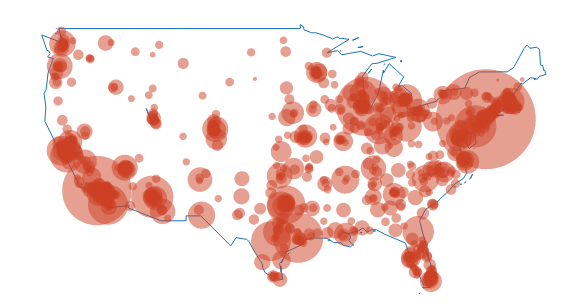
2. Canadian Population Bubble Chart

Our first graph was made at a Montreal R Meetup by Plotly’s own Chris Parmer. We’ll be using the maps package. You may need to load it:

install.packages("maps")

Then:

library(plotly)
p <- plotly(username="MattSundquist", key="4om2jxmhmn")
library(maps)
data(canada.cities)
trace1 <- list(x=map(regions="canada")$x,
  y=map(regions="canada")$y)

trace2 <- list(x= canada.cities$long,
  y=canada.cities$lat,
  text=canada.cities$name,
  type="scatter",
  mode="markers",
  marker=list(
    "size"=sqrt(canada.cities$pop/max(canada.cities$pop))*100,
    "opacity"=0.5)
  )

response <- p$plotly(trace1,trace2)
url <- response$url
filename <- response$filename
browseURL(response$url)

In our graph, the bubble size represents the city population size. Shown below is the GUI, where you can annotate, select colors, analyze and add data, style traces, place your legend, change fonts, and more.

map1

Editing from the GUI, we make a styled version. You can zoom in and hover on the points to find out about the cities. Want to make one for another country? We’d love to see it.

map2

And, here is said meetup, in action:

plotly_mtlRmeetup

You can also add in usa and us.cities:

map3

3. Old Faithful and Multiple Axes

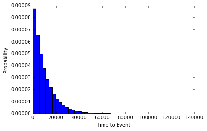
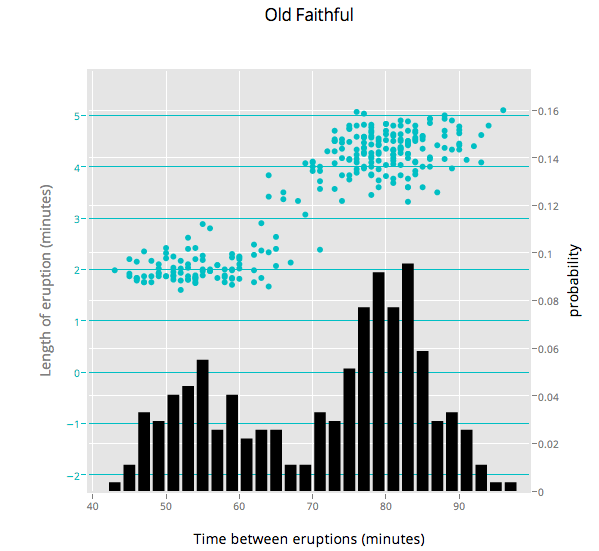
Ben Chartoff’s graph shows the correlation between a bimodal eruption time and a bimodal distribution of eruption length. The key series are: a histogram scale of probability, Eruption Time scale in minutes, and a scatterplot showing points within each bin on the x axis. The graph was made with this gist.

old_faithful

4. Plotting Two Histograms Together

Suppose you are studying correlations in two series (Popular Stack Overflow ?). You want to find overlap. You can plot two histograms together, one for each series. The overlapping sections are the darker orange, automatically rendered if you set barmode to ‘overlay’.

library(plotly)
p <- plotly(username="Username", key="API_KEY")

x0 <- rnorm(500)
x1 <- rnorm(500)+1

data0 <- list(x=x0,
  name = "Series One",
  type='histogramx',
  opacity = 0.8)

data1 <- list(x=x1,
  name = "Series Two",
  type='histogramx',
  opacity = 0.8)

layout <- list(
  xaxis = list(
  ticks = "",
  gridcolor = "white",zerolinecolor = "white",
  linecolor = "white"
 ),
 yaxis = list(
  ticks = "",
  gridcolor = "white",
  zerolinecolor = "white",
  linecolor = "white"
 ),
 barmode='overlay',
 # style background color. You can set the alpha by adding an a.
 plot_bgcolor = 'rgba(249,249,251,.85)'
)

response <- p$plotly(data0, data1, kwargs=list(layout=layout))
url <- response$url
filename <- response$filename
browseURL(response$url)

plotly5

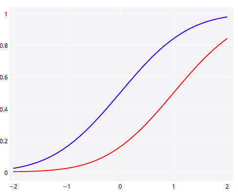
5. Plotting y1 and y2 in the Same Plot

Plotting two lines or graph types in Plotly is straightforward. Here we show y1 and y2 together (Popular SO ?). 

library(plotly)
p <- plotly(username="Username", key="API_KEY")

# enter data
x <- seq(-2, 2, 0.05)
y1 <- pnorm(x)
y2 <- pnorm(x,1,1)

# format, listing y1 as your y.
First <- list(
  x = x,
  y = y1,
  type = 'scatter',
  mode = 'lines',
  marker = list(
   color = 'rgb(0, 0, 255)',
   opacity = 0.5)
  )

# format again, listing y2 as your y.
Second <- list(
  x = x,
  y = y2,
  type = 'scatter',
  mode = 'lines',
  opacity = 0.8,
  marker = list(
   color = 'rgb(255, 0, 0)')
  )

plotly6

And a shot of the Plotly gallery, as seen at the Montreal meetup. Happy plotting!

plotly_mtlRmeetup2

What’s Warren Buffett’s $1 Billion Basketball Bet Worth?

A friend of mine just alerted me to a story on NPR describing a prize on offer from Warren Buffett and Quicken Loans. The prize is a billion dollars (1B USD) for correctly predicting all 63 games in the men’s Division I college basketball tournament this March. The facebook page announcing the contest puts the odds at 1:9,223,372,036,854,775,808, which they note “may vary depending upon the knowledge and skill of entrant”.

Being curious, I thought I’d see what the assumptions were that went into that number. It would make sense to start with the assumption that you don’t know a lick about college basketball and you just guess using a coin flip for every match-up. In this scenario you’re pretty bad, but you are no worse than random. If we take this assumption, we can calculate the odds as 1/(0.5)^63.  To get precision down to a whole integer I pulled out trusty bc for the heavy lifting:

$ echo "scale=50;  1/(0.5^63)" | bc
9223372036854775808.000000

Well, that was easy. So if you were to just guess randomly, your odds of winning the big prize would be those published on the contest page. We can easily calculate the expected value of entering the contest as P(win)*prize, or 9,223,372,036ths of a dollar (that’s 9 nano dollars, if you’re paying attention). You’ve literally already spent that (and then some) in opportunity cost sunk into the time you are spending thinking about this contest and reading this post (but read on, ’cause it’s fun!).

But of course, you’re cleverer than that. You know everything about college basketball – or more likely if you are reading this blog – you have a kickass predictive model that is going to up your game and get your hands into the pocket of the Oracle from Omaha.

What level of predictiveness would you need to make this bet worth while? Let’s have a look at the expected value as a function of our individual game probability of being correct.

buffet1

And if you think that you’re really good, we can look at the 0.75 to 0.85 range:

buffet2

So it’s starting to look enticing, you might even be willing to take off work for a while if you thought you could get your model up to a consistent 85% correct game predictions, giving you an expected return of ~$35,000. A recent paper found that even after observing the first 40 scoring events, the outcome of NBA games is only predictable at 80%. In order to be eligible to win, you’ve obviously got to submit your picks before the playoff games begin, but even at this herculean level of accuracy, the expected value of an entry in the contest plummets down to $785.

Those are the odds for an individual entrant, but what are the chances that Buffet and co will have to pay out? That, of course, depends on the number of entrants. Lets assume that the skill of all entrants is the same, though they all have unique models which make different predictions. In this case we can get the probability of at least one of them hitting it big. It will be the complement of no one winning. We already know the odds for a single entrant with a given level of accuracy, so we can just take the probability that each one doesn’t win, then take 1 minus that value.

buffet3

Just as we saw that the expected value is very sensitive to the predictive accuracy of the participant, so too is the probability that the prize will be awarded at all. If 1 million super talented sporting sages with 80%  game-level accuracy enter the contest, there will only be a slightly greater than 50% chance of anyone actually winning. If we substitute in a more reasonable (but let’s face it, still wildly high) figure for participants’ accuracy of 70%, the chance becomes only 1 in 5739  (0.017%) that the top prize will even be awarded even with a 1 million strong entrant pool.

tl;dr You’re not going to win, but you’re still going to play.

If you want to reproduce the numbers and plots in this post, check out this gist.

Simulation and Likelihood Methods Workshop in Kananaskis

I can think of worse places to get down and dirty with R than Kananaskis, Alberta.

Zero to R Hero

CAISN_Primary_trans

Canadian Aquatic Invasive Species Networks Annual General Meeting in Kananaskis, Alberta. May 03, 3:25-5:30.

This 2-hour workshop will focus on how and why we do numerical simulation in R. Time permitting, we will also look at how to build and fit likelihood based statistical models.

We ask that you bring your laptop with both R and R-Studio installed. If you’ve never worked with R before, please have a look at the getting started with R document. You can
also check out the slides from our more introductory workshops.

Outline

Section 1: Introduction to Simulation (script)

  •     What is (numerical) simulation?
  •     Drawing random samples from a set
  •     Drawing random samples from a probability distribution
  •     Describing models in terms of their deterministic and stochastic parts
  •     Simulating data from a model

Section 2: Likelihood Methods(script)

  •     The Likelihood Principle
  •     The Ecologist’s Quarter
  •     Maximum…

View original post 30 more words