With spring finally making it’s presence known, I thought I’d re-share this cycling data analysis and visualization I did with some great people a while back. Get out there and feel that wind in your hair!
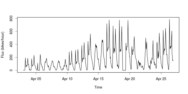
The recent Hack/Reduce hackathon in Montreal was a tonne of fun. Our team tackled a data set of consisting of Bixi (Montreal’s bicycle share system) station states at one minute temporal resolution. We used Hadoop and mapreduce to pull out some features of user behaviours. One of the things we extracted was the flux at each station, which we defined as the number of bikes arriving and departing from a given station per unit time. When you plot the total system flux across all stations against time, you can see the pulse of the city. Here are the first few weeks of this year’s Bixi season.(click to enlarge)
A few things jump out: 1) There are clearly defined peaks at both the morning and evening rush hours, but it looks like the evening rush is typically a little stronger. I guess cycling home is a great way to relax after…
View original post 231 more words
