Colouring book self-supervised learning

Self-Supervised Learning: Its child’s play

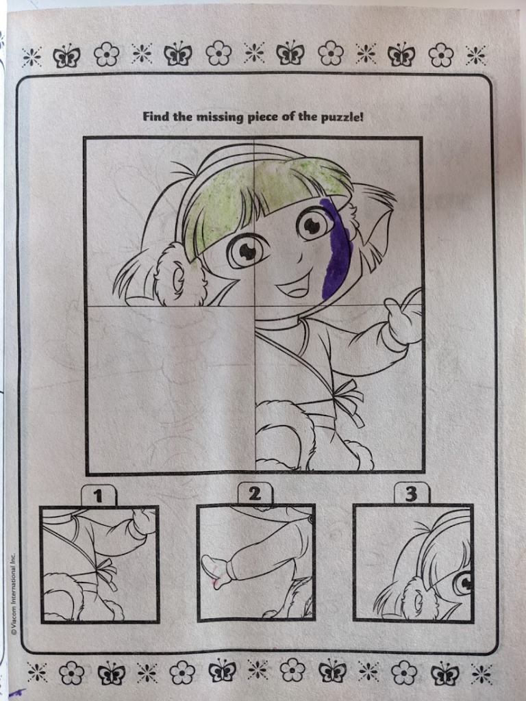
Recently at home with my mom and sister and I was explaining a bit about the work I’m going to be doing in AI for digital pathology. We got talking about how there is so much data, but a scarcity of good labels, what self-supervised learning is and how it can help overcome this. As I was describing how it works, my sister was like “oh, ya, like this!” and pulled out a coloring book my nieces had been working on. Exactly!

The Treachery of Models

In Magritte’s famous 1929 painting The Treachery of Images, a pipe is depicted with the caption “Ceci n’est pas une pipe“, French for “This is not a pipe”. The seemingly dissonant statement under what is a very clearly depicted pipe forces the viewer to confront the distinction between the representation and the thing itself. The treachery refers to the danger involved in confusing the representation with the object.

Models – like images – are merely representations of the objects they depict. The modeler seeks to represent the relevant properties of the system being modeled in order to communicate some features of that system, or to manipulate it under ‘what-if’ scenarios.

With the current plethora of models of COVID-19 spread, it seems important to remind ourselves of Magritte’s warning. Models can be incredible tools — abstractions of complex realities that allow us to reason about the data we’ve seen so far, and consider possible futures. But they are not the epidemic process itself.

Ceci n'est pas une épidémie.

This is not an argument that the models themselves are treacherous. I absolutely adore modeling and models, as Magritte adored painting and images. I consider modeling an essential tool to further our understanding of (and make predictions about) the world around us. Indeed I developed one of the aforementioned COVID-19 models with my colleagues at Penn Medicine. The treachery comes when we mistake the abstraction for reality.
Eigenvectors from Eigenvalues – a NumPy implementation

I was intrigued by the recent splashy result showing how eigenvectors can be computed from eigenvalues alone. The finding was covered in Quanta magazine and the original paper is pretty easy to understand, even for a non-mathematician.

Being a non-mathematician myself, I tend to look for insights and understanding via computation, rather than strict proofs. What seems cool about the result to me is that you can compute the directions from simply the stretches (along with the stretches of the sub-matrices). It seems kind of magical (of course, it’s not 😉 ). To get a feel for it, I implemented the key identity in the paper in python and NumPy and confirmed that it gives the right answer for a random (real-valued, symmetric) matrix.

I posted the Jupyter Notebook here.

Germination Project Fellows come to Penn

I was recently fortunate to be invited to speak with an impressive group of high-school students as a part of the Germination Project. They came to Penn to learn about innovation in health care and I spoke with them about how we’re using Data Science to improve patient outcomes.germination_talk_screenshot

Machine Learning for Health #NIPS2018 workshop call for proposals

The theme for this year’s workshop will be “Moving beyond supervised learning in healthcare”. This will be a great forum for those who work on computational solutions to the challenges facing clinical medicine. The submission deadline is Friday Oct 26, 2018. Hope to see you there!

https://ml4health.github.io/2018/pages/call-for-papers.html

Visualizing classifier thresholds

Lately I’ve been thinking a lot about the connection between prediction models and the decisions that they influence. There is a lot of theory around this, but communicating how the various pieces all fit together with the folks who will use and be impacted by these decisions can be challenging.

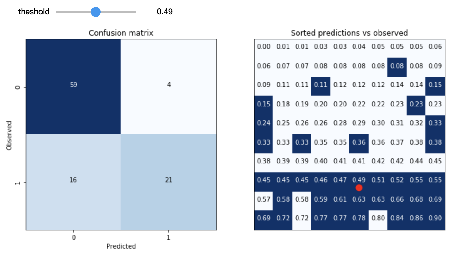
One of the important conceptual pieces is the link between the decision threshold (how high does the score need to be to predict positive) and the resulting distribution of outcomes (true positives, false positives, true negatives and false negatives). As a starting point, I’ve built this interactive tool for exploring this.

Screen Shot 2017-11-13 at 11.16.26 AM

The idea is to take a validation sample of predictions from a model and experiment with the consequences of varying the decision threshold. The hope is that the user will be able to develop an intuition around the tradeoffs involved by seeing the link to the individual data points involved.

Code for this experiment is available here. I hope to continue to build on this with other interactive, visual tools aimed at demystifying the concepts at the interface between predictions and decisions.