R Workshop: Introducing Slidify – HTML5 slides from R markdown

Thursday, June 28th, 2012  19h. <–  new evening time!

Tomson House: 650 McTavish, H3A 1Y2, Montréal, QC <– new social setting!

guRu: Ramnath Vaidyanathan (McGill University)

Ramnath Vaidyanathan will introduce the group to slidify, his brand new R package.

From the slidify website:

“The objective of slidify is to make it easy to create reproducible HTML5 presentations from .Rmd files. The guiding philosophy of slidify is to completely separate writing of content from its rendering, so that content can be written once in R Markdown, and rendered as an HTML5 presentation using any of the HTML5 slide frameworks supported.”

The package is currently in alpha and therefore not yet available on cran. You can find install instructions here.

Ramnath Vaidyanathan is Assistant Professor of Operations Management at McGill University’s Desautels Faculty of Management.

This is a meeting of the Montreal R Users Group. We’re open to everyone! Sign up to RSVP!

Simulating Euro 2012

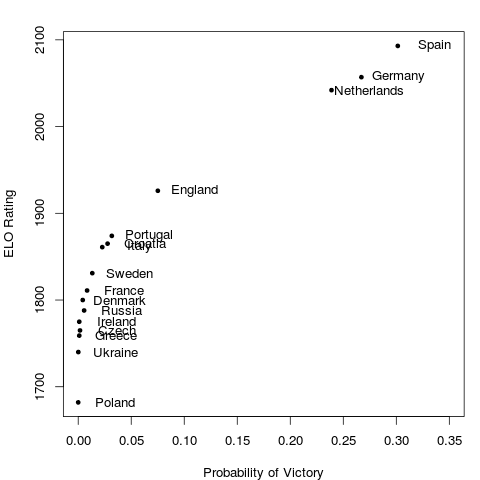
Why settle for just one realisation of this year’s UEFA Euro when you can let the tournament play out 10,000 times in silico?

Since I already had some code lying around from my submission to the Kaggle hosted 2010 Take on the Quants challenge, I figured I’d recycle it for the Euro this year. The model takes a simulation based approach, using Poisson distributed goals. The rate parameters in a given match are determined by the relative strength of each team as given by their ELO rating.

The advantage of this approach is that the tournament structure (which teams are assigned to which groups, how points are assigned, quarter final structure, etc) can be accounted for. If we wanted to take this into account when making probabilistic forecasts of tournament outcomes, we would need to calculate many conditional probability statements, following the extremely large number of possible outcomes. However, the downside is that it is only as reliable as the team ratings themselves. In my submission to Kaggle, I used a weighted average of ELO and FIFA ratings.

After simulating the tournament 10,000 times, the probability of victory for each team is just the number of times that team arose victorious divided by 10,000.

Feel free to get the code here and play around with it yourself. You can use your own rating system and see how the predicted outcomes change. If you are of a certain disposition, you might even find it more fun than the human version of the tournament itself!

Distribution of Oft-Used Bash Commands

Browsing commandlinefu.com today, I came across this little one-liner to display which commands I use most often.

$ history | awk '{a[$2]++}END{for(i in a){print a[i] " " i}}' \
| sort -rn | head

Here’s what I got:

283 ls
236 cd
52 cat
40 vim
36 sudo
27 ssh
27 rm
23 git
21 screen
21 R

Yep, seems legit. I navigate and look at files a whole bunch (ls, cd, cat), and I do a butt tonne of editing (vim). I sudo like a boss, hop onto various servers (ssh), clean up after myself (rm), commit commit commit (git), tuck away interactive sessions for later (screen), and of course, do mad stats (R).

Now, my bash.rc set up is set to save the 1000 most recent commands. Given that it is Friday afternoon and I’m avoiding real work while waiting for the softball game to start, I thought I’d have a look at my whole usage distribution. So, lets just collect it up into a file comme ca:

$history | awk '{a[$2]++}END{for(i in a){print a[i] " " i}}' \
| sort -rn > cmd_hist.txt

Then crack open an R session and have a look:

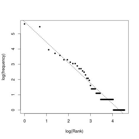
Image

Cool. Looks like my command usage pattern is roughly power-law distributed! Now, to . publish . my findings . in . Nature!

The R bits:

cmd<-read.table('cmd_hist.txt')
par(cex=1.2)
plot(log(1:length(cmd[,1])),log(cmd[,1]),
pch=20,
xlab='log(Rank)',
ylab='log(frequency)')
fit<-lm(log(cmd[,1])~log(1:length(cmd[,1])))
abline(fit,lty=2)

More Bixi Data Visualization

I mentioned in a previous post that our team at the recent Hack/Reduce hackathon had some fun with a data set which consisted of Bixi station states at minute level temporal resolution. In addition to pulling out and plotting the flux at each station on an hourly basis, we also plotted the system state (number of bikes at each station) at each time-step we had. This totalled to 24,217 individual plots. Each plot was generated using an R script which took in the system state at each time-step, and output a png.

Team member Kamal Marhubi also did some nice post-processing to overlay the information on a map. The results are a little mesmerising. Things don’t get fun until about 40s into the video, as the first part mostly just shows the stations coming online for the first part of the season.

And for the non-Montrealers out there, here’s an image of a Bixi bike; our durable, data generating little hero.

Heartbeat of a Cycling City: Bixi data at Hack/Reduce

The recent Hack/Reduce hackathon in Montreal was a tonne of fun. Our team tackled a data set of consisting of Bixi (Montreal’s bicycle share system) station states at one minute temporal resolution. We used Hadoop and mapreduce to pull out some features of user behaviours. One of the things we extracted was the flux at each station, which we defined as the number of bikes arriving and departing from a given station per unit time. When you plot the total system flux across all stations against time, you can see the pulse of the city. Here are the first few weeks of this year’s Bixi season.(click to enlarge)

A few things jump out: 1) There are clearly defined peaks at both the morning and evening rush hours, but it looks like the evening rush is typically a little stronger. I guess cycling home is a great way to relax after a day at work. 2) The data collector seems to have gone offline in the night on April 18th. 3) Related to the first point, weekdays and weekends have distinct signatures. In fact, you can see a clear signal of Easter Monday, in that it looks like a weekend day. (click to enlarge)

When the system was first being installed, I had the impression that it would be used primarily by tourists. Owning a bike myself, I figured that if other Montrealers wanted to cycle in the city, that they would do so with their own rides. From this data, it really seems as though Montrealers themselves are using the Bixi system, substituting alternative modes of transit for commuting.

We also took the spatial information in the data and plotted the flux at the site level, then animated this across time. Here, I used a kernel smoother from the KernSmooth package to estimate the flux density in space. This allows us to be able to see the spatial configuration of flux a little better than with points, as the spatial density of stations is heterogeneous. The result is this pulsating video:

For the R users out there, I also found the package lubridate to be extremely helpful for wrangling the dates in this project.


Credits (Team Ctr-Freak)

Julia Evans
Kamal Marhubi
Victor Parmar
Pierre-Alexandre Lacerte
Mansoor Siddiqui
Rafik Draoui
Corey Chivers


R Workshop: Reproducible Research using Sweave for Beginers

Monday, April 30, 2012  14h-16h. Stewart Biology Rm w6/12 (Montreal)

guRu: Denis Haine (Université de Montréal)

Topics

Reproducible research was first coined by Pr. Jon Claerbout, professor of geophysics at Stanford University, to describe that the results from researches can be replicated by other scientists by making available data, procedures, materials and the computational environment on which these results were produced from.

This workshop intends to describe reproducible research, what it is and why you should care about it, and how to do it with the combination of R, LATEX, Sweave and makefile. Tips and tricks will also be provided.

Learning Objectives

  • To get introduce to the concept of reproducible research
  • To get started with the implementation of reproducible research with R and Sweave,
  • To produce a first Sweave document in LATEX

This is a meeting of the Montreal R Users Group. We’re open to everyone! Sign up to RSVP!

Insights into Quantile Regression from Arthur Charpentier

At this Monday’s Montreal R User Group meeting, Arthur Charpentier gave an interesting talk on the subject of quantile regression.

One of the main messages I took away from the workshop was that quantile regression can be used to determine if extreme events are becoming more extreme. The example given was hurricane intensity since 1978. It may be that the average intensity is not increasing and therefore a standard linear regression would show no trend (since linear regression predicts expected, or mean values), but that’s not really what we are interested in anyway. If we are going to formulate proper risk models, what we want to know is whether the strong hurricanes are getting stronger. This is where quantile regression comes in.

I always find that the best way for me to check my understanding is to simulate some data and check to see that things are behaving the way I expect them to. The advantage of doing this rather than just playing with data is that you know what the real process is, since you defined it.  To get a handle on this stuff, I simulated some non-gausian (gamma distributed) data to mimic the hurricane data. I set it up so that the mean intensity stays constant across years, and the variance increasing constantly over time such that the intense (simulated) hurricanes get more intense over time.

## Simulate some non-gausian data with constant mean
## and increasing variance
n_i<-80
d<-array(dim=c(n_i*20,2))
for(i in 1:20)
{
d[((i-1)*n_i+1):(i*n_i),2]<-rgamma(n_i,i,i)
d[((i-1)*n_i+1):(i*n_i),1]<-21-i
}
plot(d)
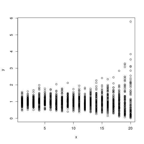
I then followed the procedure suggested by Arthur, which is to conduct quantile regressions across the quantile range  (0,1). The results can be plotted as quantile vs the regression coefficient in order to see the magnitude and direction of the relationship across the quantile range.

## Run quantile regression on the simulated data
## across a range of quantiles
u=seq(.025,.975,by=.01)

coefstd=function(u) summary(rq(d[,2]~d[,1],tau=u))$coefficients[,2]
coefest=function(u) summary(rq(d[,2]~d[,1],tau=u))$coefficients[,1]

CS=Vectorize(coefstd)(u)
CE=Vectorize(coefest)(u)

## Plot the results
k=2
plot(u,CE[k,],type='l',xlab=expression(tau),ylab='Coefficient')
polygon(c(u,rev(u)),c(CE[k,]+1.96*CS[k,],rev(CE[k,]-1.96*CS[k,])),col='grey')
lines(u,CE[k,])
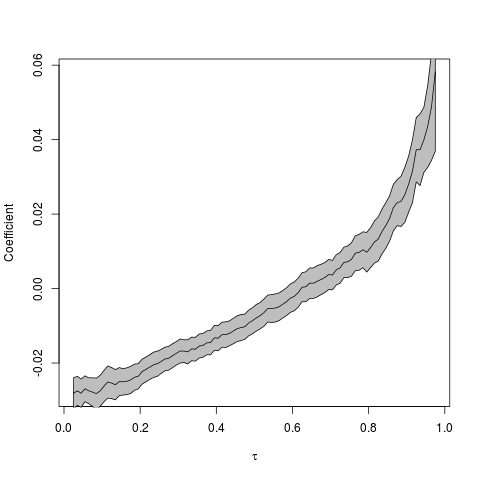
So, the coefficient seems to be an increasing function of the quantile (tau). But how do we interpret this? Low intensity (simulated) storms are becoming less intense given that the regression coefficient at low quantiles is negative. More importantly, however, is that the high intensity (simulated) storms are becoming more intense. We can see this by noting that the regression coefficients in the high quantile range are positive, and increasing.

Another way to visualise the quantile regression results is by animating the regressions together to see how the relationship changes across the quantiles (tau).

Click the image to see the animated GIF.

Arthur has a prettier animation of this type using the actual hurricane data here.

Montreal R Workshop: Quantile Regression

Stewart Biology Building, McGill University (Rm N4/17) Monday, April 24, 2012  14h-16h
Dr. Arthur Charpentier (UQàM)

In this workshop we will examine difference concepts related to quantiles, and practical issues based on R codes.

This workshop will present quantile regression, and the idea of iterative least square estimation. It will present an illustration on climate change and hurricanes.

Learning Objectives

The participant will:
1) Basics on quantiles: definition, use of quantiles for monte carlo simulation, boxplots, confidence intervals, etc.

2)
Present quantile regression and estimation issues. Application to hurricanes.

3)
Get an introduction of outliers, bagplot and multivariate quantiles

Prerequisites

We will build on ideas presented in the workshop on Likelihood Methods, on least square regression.

The goal of this workshop is to present nice application of quantiles, and outlier detection.

That being said, a basic working understanding of R is assumed.  Knowledge of functions and loops in R will be advantageous, but not a must. There will be connections at the end of the workshop with principal component analysis.

For more info go here, or register here.

Montreal R Workshop: Introduction to Bayesian Methods

Monday, March 26, 2012  14h-16h, Stewart Biology N4/17

Corey Chivers, Department of Biology McGill University

This is a meetup of the Montreal R User Group. Be sure to join the group and RSVP. More information about the workshop here.

Topics

Why would we want to be Bayesian in the first place?  In this workshop we will examine the types of questions which we are able to ask when we view the world through a Bayesian perspective.This workshop will introduce Bayesian approaches to both statistical inference and model based prediction/forecasting.  By starting with an examination of the theory behind this school of statistics through a simple example, the participant will then learn why we often need computationally intensive methods for solving Bayesian problems.  The participant will also be introduced to the mechanics behind these methods (MCMC), and will apply them in a biologically relevant example.

Learning Objectives

The participant will:
1) Contrast the underlying philosophies of the Frequentist and Bayesian perspectives.

2)
Estimate posterior distributions using Markov Chain Monte Carlo (MCMC).

3)
Conduct both inference and prediction using the posterior distribution.

Prerequisites

We will build on ideas presented in the workshop on Likelihood Methods.  If you did not attend this workshop, it may help to have a look at the slides and script provided on this page.

The goal of this workshop is to demystify the potentially ‘scary‘ topic of Bayesian Statistics, and empower participants (of any preexisting knowledge level) to engage in statistical reasoning when conducting their own research.  So come one, come all!

That being said, a basic working understanding of R is assumed.  Knowledge of functions and loops in R will be advantageous, but not a must.

Packages

This workshop will be conducted entirely in R.  We will not be using any external software such as winBUGS.

We will use a package I have written which is available on CRAN:
http://cran.r-project.org/web/packages/MHadaptive/

install.packages(“MHadaptive”)

Montreal R Workshop: Likelihood Methods and Model Selection

Monday, March 19, 2012  14h-16h, Stewart Biology N4/17

Corey Chivers, McGill University Department of Biology

This workshop will introduce participants to the likelihood principal and its utility in statistical inference.  By learning how to formalize models through their likelihood function, participants will learn how to confront these models with data in order to make statistical inference.

The concepts of using maximum likelihood to fit model parameters, and model comparison using information theoretic approaches will also be covered.

The workshop will explore these topics through worked examples and exercises using the R statistical computing environment.

This is the first official meetup of the Montreal R User Group. Be sure to join the group and RSVP. More information about the workshop here.