More Bixi Data Visualization

I mentioned in a previous post that our team at the recent Hack/Reduce hackathon had some fun with a data set which consisted of Bixi station states at minute level temporal resolution. In addition to pulling out and plotting the flux at each station on an hourly basis, we also plotted the system state (number of bikes at each station) at each time-step we had. This totalled to 24,217 individual plots. Each plot was generated using an R script which took in the system state at each time-step, and output a png.

Team member Kamal Marhubi also did some nice post-processing to overlay the information on a map. The results are a little mesmerising. Things don’t get fun until about 40s into the video, as the first part mostly just shows the stations coming online for the first part of the season.

And for the non-Montrealers out there, here’s an image of a Bixi bike; our durable, data generating little hero.

Advertisement

Heartbeat of a Cycling City: Update

I recently posted about some Bixi data our group analysed at the Hack/Reduce Montreal 2 event. One of the observations I made was that it seemed as though the evening rush was generally stronger than the morning rush. This seemed to be true at least for the week of April 11th to 14th. I even speculated that this was because riding home might be a great way to relax after work. Reader Joey Berger contacted me with an alternative take on this:

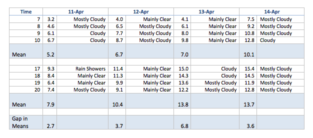
You were surprised (as I was) by this, in part I think because downtown is downhill for a lot of Bixi users. When I used to commute downtown I always rode in the morning and took the bus in the evening.
 
Anyway, I got curious so I looked up some Environment Canada data.

As you can see, there wasn’t much rain to affect bike use, but April mornings are a lot cooler than April evenings. I suspect two things.  First, below about 12 degrees, riding a Bixi isn’t as comfortable as it needs to be for mass use. Especially if it’s windy and you don’t have gloves on. Second, I assume there’s a lot more downtown traffic in the evening, especially among pedestrians/bikers who are both commuting from work and entering downtown for dinner, movies, etc.
——
Keep the comments coming and check back here for an analysis of Bixi traffic during the STM outage on Thursday morning.

Heartbeat of a Cycling City: Bixi data at Hack/Reduce

The recent Hack/Reduce hackathon in Montreal was a tonne of fun. Our team tackled a data set of consisting of Bixi (Montreal’s bicycle share system) station states at one minute temporal resolution. We used Hadoop and mapreduce to pull out some features of user behaviours. One of the things we extracted was the flux at each station, which we defined as the number of bikes arriving and departing from a given station per unit time. When you plot the total system flux across all stations against time, you can see the pulse of the city. Here are the first few weeks of this year’s Bixi season.(click to enlarge)

A few things jump out: 1) There are clearly defined peaks at both the morning and evening rush hours, but it looks like the evening rush is typically a little stronger. I guess cycling home is a great way to relax after a day at work. 2) The data collector seems to have gone offline in the night on April 18th. 3) Related to the first point, weekdays and weekends have distinct signatures. In fact, you can see a clear signal of Easter Monday, in that it looks like a weekend day. (click to enlarge)

When the system was first being installed, I had the impression that it would be used primarily by tourists. Owning a bike myself, I figured that if other Montrealers wanted to cycle in the city, that they would do so with their own rides. From this data, it really seems as though Montrealers themselves are using the Bixi system, substituting alternative modes of transit for commuting.

We also took the spatial information in the data and plotted the flux at the site level, then animated this across time. Here, I used a kernel smoother from the KernSmooth package to estimate the flux density in space. This allows us to be able to see the spatial configuration of flux a little better than with points, as the spatial density of stations is heterogeneous. The result is this pulsating video:

For the R users out there, I also found the package lubridate to be extremely helpful for wrangling the dates in this project.


Credits (Team Ctr-Freak)

Julia Evans
Kamal Marhubi
Victor Parmar
Pierre-Alexandre Lacerte
Mansoor Siddiqui
Rafik Draoui
Corey Chivers