The future of Artificial Intelligence – as imagined in 1989

This image comes from the cover of Preliminary Papers of the Second International Workshop on Artificial Intelligence and Statistics (1989). Someone abandoned it in the lobby of my building at school. Whatever for, I’ll never know.

I just love the idea of machine learning/AI/Statistics evoking a robot hand drawing a best fit line through some points on graph paper with a pen.

What other funny, or interesting, metaphorical visual representations of machine learning have you seen? Drop a link in the comments and I’ll get my robot arm to compile the results.

An update on visualizing Bayesian updating

A while ago I wrote this post with some R code to visualize the updating of a beta distribution as the outcome of Bernoulli trials are observed. The code provided a single plot of this process, with all the curves overlayed on top of one another. Then John Myles White (co-author of Machine Learning for Hackers) piped up on twitter and said that he’d like to see it as an animation. Challenge accepted – and with an additional twist.

The video shows how two observers who approach the problem with different beliefs (priors) converge toward the same conclusion about the value of the unknown parameter after making enough observations.

I’ve posted the code here.

Simulation: The modeller’s laboratory

In his 2004 paper in Trends in Ecology and Evolution, Steven Peck argues:

Simulation models can be used to mimic complex systems, but unlike nature, can be manipulated in ways that would be impossible, too costly or unethical to do in natural systems. Simulation can add to theory development and testing, can offer hypotheses about the way the world works and can give guidance as to which data are most important to gather experimentally.

A sentiment I agree with fully. However, another important use of simulation is in the experimentation phase of model development before confronting models with data. In ecology, epidemiology and related fields, it is common to have observational data (as opposed to controlled, randomized experiments). In these situations, two questions need to be asked:

  1. What can we observe about the system? (ie what will the data look like?)
  2. Given what we can observe (1), will our model(s) be able to capture the underlying process and parameters?

In order to answer these questions, we need to be able to simulate the hypothesized processes and use the simulated observations to fit our model(s). This process has the additional benefit of forcing us to understand the process that we are modelling. In fact, I find that the act of formalizing the hypothesized process into a coded simulation makes the formulation of the likelihood function more straightforward.

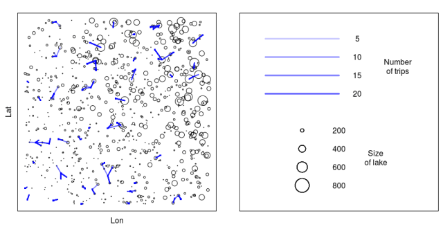
Let’s look at an example. In a recent paper in the Journal of Applied Ecology, we model the trip taking behaviour of recreational boaters in Ontario. Through a survey, we observed the trip outcomes of a sample of boaters. We wanted to compare two models of the trip taking process (see the paper for model descriptions).


###############################
##### RUM v GM sim tests ######
##
## Corey Chivers, 2012
##
###############################

n_boaters<-50
n_lakes<-750
n_trips<-rpois(n_boaters,16)

euclidian<-function(from_x,from_y,to_x,to_y)
{
return( sqrt( (from_x-to_x)^2 + (from_y-to_y)^2 ) )
}
sim_boaters<-function(N=n_boaters)
{
##Home locations
return(as.matrix(cbind(runif(N,0,100),runif(N,0,100)) ))
}
sim_lakes<-function(N=n_lakes)
{
x<-cbind(runif(N,0,100))
y<-cbind(runif(N,0,100))
size<-abs(rnorm(N,x+y,x+y))
return(cbind(x,y,size))
}
get_d_mat<-function()
{
## matrix of boaterxlake distances
d_mat<-array(dim=c(n_boaters,n_lakes))
for(b in 1:n_boaters)
{
d_mat[b,]<-euclidian( boater[b,1],boater[b,2],lakes[,1],lakes[,2] )
}
return(d_mat)
}
sim_trips<-function(par,M)
{
trips<-list()
for(b in 1:n_boaters)
{
P<-M(par,b)
trips[[b]]<-sample(1:n_lakes,n_trips[b],p=P,replace=TRUE)
}
return(trips)
}

RUM<-function(par,b) ## par{b1,b2}
{
exp_sum_V<-sum(exp(par[1]*lakes[,3]+par[2]*d_mat[b,]) )
V<-exp(par[1]*lakes[,3]+par[2]*d_mat[b,])
p_j<-V/exp_sum_V
return(p_j)
}
GM<-function(par,b) ## par{e,d}
{
Ai<-sum(lakes[,3]^(par[1]) * d_mat[b,]^(-par[2]))
WD<-lakes[,3]^(par[1]) * d_mat[b,]^(-par[2])
p_j<-WD/Ai
return(p_j)
}
ll<-function(par,M,data,give_neg=-1)
{
ll<-0
ll<-sapply(1:n_boaters,function(b){
P_b<-M(par,b)
l_tmp<-0
for(t in 1:length(data[[b]]))
l_tmp<-l_tmp+log(P_b[ data[[b]][t] ] )
return(l_tmp)
})
return(give_neg*sum(ll))
}
dAIC<-function(ll)
{
delta_aic<-numeric(length(ll[,1]))
for(i in 1:length(ll[,1]))
{
delta_aic[i]<-(2*ll[i,2]+(2*n_par))-(2*ll[i,1]+(2*n_par))
}
return(delta_aic)
}
plot_trips<-function(col='green',add_trips=TRUE,pdffile=NULL)
{
if(!is.null(pdffile))
pdf(pdffile)

par(mgp=c(0.5,0,0),cex=1.2,mfrow=c(1,2),mar=c(1,2,1,0.5),pty='s')
col=rgb(0,0,1,0.05)
plot(lakes[,1],lakes[,2],cex=lakes[,3]/200, xlab='Lon', ylab='Lat',xaxt='n',yaxt='n')
if(add_trips)
{
for(i in 1:n_boaters)
{
for(tr in 1:length(trips[[i]]))
{
segments(boater[i,1],boater[i,2],lakes[trips[[i]],1],lakes[trips[[i]],2],col=col,lwd=2)
}
points(boater[i,1],boater[i,2],pch=15,col='blue',cex=0.5)
}
}

### Make a legend ###
plot(1,1,col='white', xlab='', ylab='',xaxt='n',yaxt='n',xlim=c(0,1),ylim=c(0,1))
yloc<-c(0.9,0.8,0.7,0.6)
n_tr<-c(5,10,15,20)
for(i in 1:4)
{
for(n in 1:n_tr[i])
segments(0.1,yloc[i],0.5,yloc[i],col=col,lwd=3)
text(0.6,yloc[i],n_tr[i])
}
text(0.82,0.75,"Number\nof trips")

yloc<-c(0.4,0.3,0.2,0.1)
l_size<-c(200,400,600,800)
for(i in 1:4)
{
for(n in 1:n_tr[i])
points(0.3,yloc[i],cex=l_size[i]/200)
text(0.5,yloc[i],l_size[i])
}
text(0.7,0.25,"Size\nof lake")

if(!is.null(pdffile))
dev.off()
}

With all of the relevant functions defined, we then simulate behaviour under each model, fit to each model and compare our ability to both capture the generating parameter values and to distinguish between the competing models.

boater<-sim_boaters()
lakes<-sim_lakes()
d_mat<-get_d_mat()

n_sims<-1000
n_par<-2

save_par<-array(dim=c(n_sims,2*n_par))
ll_save<-array(dim=c(n_sims,2))

### RUM GENERATING ###
for(i in 1:n_sims)
{
lakes<-sim_lakes()
d_mat<-get_d_mat()
## pars{b1,b2}
pars<-c(runif(1,0.01,0.1),runif(1,-10.5,-1.5))
trips<-sim_trips(pars,RUM)
opt<-optim(pars,ll,M=RUM,data=trips)

save_par[i,]<-c(pars,opt$par)

pars<-c(0.5,1,0,0) #seeds
opt2<-optim(pars,ll,M=GM,data=trips)

ll_save[i,]<-c(opt$value,opt2$value)
print(i)
}
par(mfrow=c(1,2),pty='s')
plot(ll_save)
abline(0,1,lty=2)

hist(dAIC(ll_save))
ll_saveRUM<-ll_save
save_parRUM<-save_par

par(mfrow=c(2,2),pty='s')
param_names<-c('B1','B2')
for(i in 1:n_par)
{
plot(save_parRUM[,i],save_parRUM[,i+n_par],xlab=paste('Generating ',param_names[i]),ylab=paste('Fit ',param_names[i]))
abline(0,1)
}

### GM GENERATING ###
for(i in 1:n_sims)
{
lakes<-sim_lakes()
d_mat<-get_d_mat()
## par{e,d}
e<-runif(1,0.1,0.9)
d<-runif(1,1,5)
pars<-c(e,d)
trips<-sim_trips(pars,GM)
opt<-optim(pars,ll,M=GM,data=trips)

save_par[i,]<-c(pars,opt$par)

pars<-c(0.001,-2) #seeds
opt2<-optim(pars,ll,M=RUM,data=trips)

ll_save[i,]<-c(opt$value,opt2$value)
print(i)
}

x11()
par(mfrow=c(1,2),pty='s')
plot(ll_save)
abline(0,1,lty=2)

hist(dAIC(ll_save))
ll_saveGM<-ll_save
save_parGM<-save_par

par(mfrow=c(2,2),pty='s')
param_names<-c('e','d')
for(i in 1:n_par)
{
plot(save_parGM[,i],save_parGM[,i+n_par],xlab=paste('Generating ',param_names[i]),ylab=paste('Fit ',param_names[i]))
abline(0,1)
}

### Plot deltaAIC distributions ###
par(mfrow=c(1,2),pty='s')
hist(dAIC(ll_saveGM),breaks=30)
hist(dAIC(ll_saveRUM),breaks=30)

plot_trips()

After verifying that we can both distinguish between the two models, and can recapture the generating parameters, we then use simulation, in the manner described by Peck (2004), to analyse the implications of using alternative models of boater behaviour on the spread of invasive species.

Insights derived from simulation need to be complimented with controlled, randomized experiments. However, the use of simulation as a laboratory for the statistical modeller is indispensable, and you can do it all without putting a white coat on – unless you’re into that kind of thing.
Simulating Euro 2012

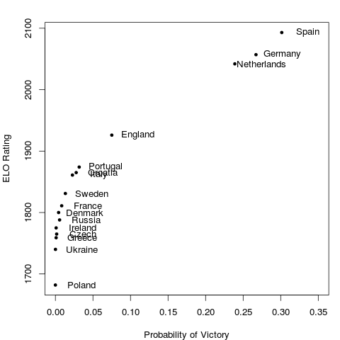
Why settle for just one realisation of this year’s UEFA Euro when you can let the tournament play out 10,000 times in silico?

Since I already had some code lying around from my submission to the Kaggle hosted 2010 Take on the Quants challenge, I figured I’d recycle it for the Euro this year. The model takes a simulation based approach, using Poisson distributed goals. The rate parameters in a given match are determined by the relative strength of each team as given by their ELO rating.

The advantage of this approach is that the tournament structure (which teams are assigned to which groups, how points are assigned, quarter final structure, etc) can be accounted for. If we wanted to take this into account when making probabilistic forecasts of tournament outcomes, we would need to calculate many conditional probability statements, following the extremely large number of possible outcomes. However, the downside is that it is only as reliable as the team ratings themselves. In my submission to Kaggle, I used a weighted average of ELO and FIFA ratings.

After simulating the tournament 10,000 times, the probability of victory for each team is just the number of times that team arose victorious divided by 10,000.

Feel free to get the code here and play around with it yourself. You can use your own rating system and see how the predicted outcomes change. If you are of a certain disposition, you might even find it more fun than the human version of the tournament itself!

R Workshop: Reproducible Research using Sweave for Beginers

Monday, April 30, 2012  14h-16h. Stewart Biology Rm w6/12 (Montreal)

guRu: Denis Haine (Université de Montréal)

Topics

Reproducible research was first coined by Pr. Jon Claerbout, professor of geophysics at Stanford University, to describe that the results from researches can be replicated by other scientists by making available data, procedures, materials and the computational environment on which these results were produced from.

This workshop intends to describe reproducible research, what it is and why you should care about it, and how to do it with the combination of R, LATEX, Sweave and makefile. Tips and tricks will also be provided.

Learning Objectives

  • To get introduce to the concept of reproducible research
  • To get started with the implementation of reproducible research with R and Sweave,
  • To produce a first Sweave document in LATEX

This is a meeting of the Montreal R Users Group. We’re open to everyone! Sign up to RSVP!

Insights into Quantile Regression from Arthur Charpentier

At this Monday’s Montreal R User Group meeting, Arthur Charpentier gave an interesting talk on the subject of quantile regression.

One of the main messages I took away from the workshop was that quantile regression can be used to determine if extreme events are becoming more extreme. The example given was hurricane intensity since 1978. It may be that the average intensity is not increasing and therefore a standard linear regression would show no trend (since linear regression predicts expected, or mean values), but that’s not really what we are interested in anyway. If we are going to formulate proper risk models, what we want to know is whether the strong hurricanes are getting stronger. This is where quantile regression comes in.

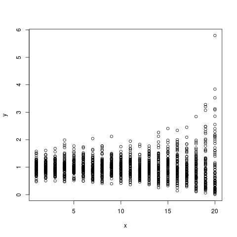
I always find that the best way for me to check my understanding is to simulate some data and check to see that things are behaving the way I expect them to. The advantage of doing this rather than just playing with data is that you know what the real process is, since you defined it.  To get a handle on this stuff, I simulated some non-gausian (gamma distributed) data to mimic the hurricane data. I set it up so that the mean intensity stays constant across years, and the variance increasing constantly over time such that the intense (simulated) hurricanes get more intense over time.

## Simulate some non-gausian data with constant mean
## and increasing variance
n_i<-80
d<-array(dim=c(n_i*20,2))
for(i in 1:20)
{
d[((i-1)*n_i+1):(i*n_i),2]<-rgamma(n_i,i,i)
d[((i-1)*n_i+1):(i*n_i),1]<-21-i
}
plot(d)

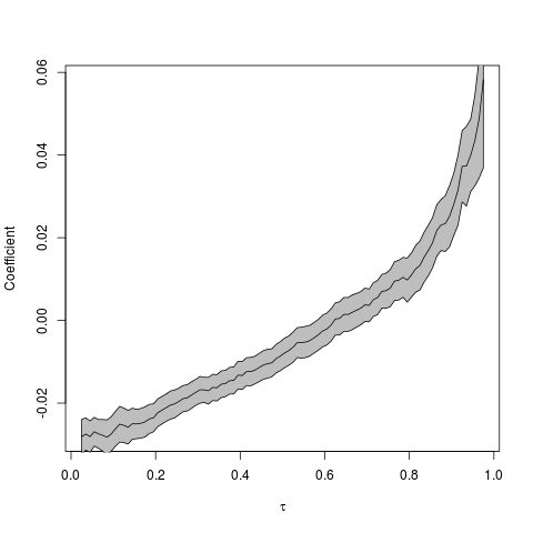
I then followed the procedure suggested by Arthur, which is to conduct quantile regressions across the quantile range  (0,1). The results can be plotted as quantile vs the regression coefficient in order to see the magnitude and direction of the relationship across the quantile range.

## Run quantile regression on the simulated data
## across a range of quantiles
u=seq(.025,.975,by=.01)

coefstd=function(u) summary(rq(d[,2]~d[,1],tau=u))$coefficients[,2]
coefest=function(u) summary(rq(d[,2]~d[,1],tau=u))$coefficients[,1]

CS=Vectorize(coefstd)(u)
CE=Vectorize(coefest)(u)

## Plot the results
k=2
plot(u,CE[k,],type='l',xlab=expression(tau),ylab='Coefficient')
polygon(c(u,rev(u)),c(CE[k,]+1.96*CS[k,],rev(CE[k,]-1.96*CS[k,])),col='grey')
lines(u,CE[k,])

So, the coefficient seems to be an increasing function of the quantile (tau). But how do we interpret this? Low intensity (simulated) storms are becoming less intense given that the regression coefficient at low quantiles is negative. More importantly, however, is that the high intensity (simulated) storms are becoming more intense. We can see this by noting that the regression coefficients in the high quantile range are positive, and increasing.

Another way to visualise the quantile regression results is by animating the regressions together to see how the relationship changes across the quantiles (tau).

Click the image to see the animated GIF.

Arthur has a prettier animation of this type using the actual hurricane data here.

Montreal R Workshop: Quantile Regression

Stewart Biology Building, McGill University (Rm N4/17) Monday, April 24, 2012  14h-16h
Dr. Arthur Charpentier (UQàM)

In this workshop we will examine difference concepts related to quantiles, and practical issues based on R codes.

This workshop will present quantile regression, and the idea of iterative least square estimation. It will present an illustration on climate change and hurricanes.

Learning Objectives

The participant will:
1) Basics on quantiles: definition, use of quantiles for monte carlo simulation, boxplots, confidence intervals, etc.

2)
Present quantile regression and estimation issues. Application to hurricanes.

3)
Get an introduction of outliers, bagplot and multivariate quantiles

Prerequisites

We will build on ideas presented in the workshop on Likelihood Methods, on least square regression.

The goal of this workshop is to present nice application of quantiles, and outlier detection.

That being said, a basic working understanding of R is assumed.  Knowledge of functions and loops in R will be advantageous, but not a must. There will be connections at the end of the workshop with principal component analysis.

For more info go here, or register here.

Montreal R Workshop: Introduction to Bayesian Methods

Monday, March 26, 2012  14h-16h, Stewart Biology N4/17

Corey Chivers, Department of Biology McGill University

This is a meetup of the Montreal R User Group. Be sure to join the group and RSVP. More information about the workshop here.

Topics

Why would we want to be Bayesian in the first place?  In this workshop we will examine the types of questions which we are able to ask when we view the world through a Bayesian perspective.This workshop will introduce Bayesian approaches to both statistical inference and model based prediction/forecasting.  By starting with an examination of the theory behind this school of statistics through a simple example, the participant will then learn why we often need computationally intensive methods for solving Bayesian problems.  The participant will also be introduced to the mechanics behind these methods (MCMC), and will apply them in a biologically relevant example.

Learning Objectives

The participant will:
1) Contrast the underlying philosophies of the Frequentist and Bayesian perspectives.

2)
Estimate posterior distributions using Markov Chain Monte Carlo (MCMC).

3)
Conduct both inference and prediction using the posterior distribution.

Prerequisites

We will build on ideas presented in the workshop on Likelihood Methods.  If you did not attend this workshop, it may help to have a look at the slides and script provided on this page.

The goal of this workshop is to demystify the potentially ‘scary‘ topic of Bayesian Statistics, and empower participants (of any preexisting knowledge level) to engage in statistical reasoning when conducting their own research.  So come one, come all!

That being said, a basic working understanding of R is assumed.  Knowledge of functions and loops in R will be advantageous, but not a must.

Packages

This workshop will be conducted entirely in R.  We will not be using any external software such as winBUGS.

We will use a package I have written which is available on CRAN:
http://cran.r-project.org/web/packages/MHadaptive/

install.packages(“MHadaptive”)

π Day Special! Estimating π using Monte Carlo

In honour of π day (03.14 – can’t wait until 2015~) , I thought I’d share this little script I wrote a while back for an introductory lesson I gave on using Monte Carlo methods for integration.

The concept is simple – we can estimate the area of an object which is inside another object of known area by drawing many points at random in the larger area and counting how many of those land inside the smaller one. The ratio of this count to the total number of points drawn will approximate the ratio of the areas as the number of points grows large.

If we do this with a unit circle inside of a unit square, we can re-arrange our area estimate to yield an estimate of  π!

This R script lets us see this Monte Carlo routine in action:

##############################################
### Monte Carlo Simulation estimation of pi ##
## Author: Corey Chivers                    ##
##############################################

rm(list=ls())

options(digits=4)

## initialize ##
N=500 # Number of MC points
points <- data.frame(x=numeric(N),y=numeric(N))
pi_est <- numeric(N)
inner <-0
outer <-0

## BUILD Circle ##
circle <- data.frame(x=1:360,y=1:360)

for(i in 1:360)
{
circle$x[i] <-0.5+cos(i/180*pi)*0.5
circle$y[i] <-0.5+sin(i/180*pi)*0.5
}

## SIMULATE ##
pdf('MCpiT.pdf')

layout(matrix(c(2,3,1,1), 2, 2, byrow = TRUE))
for(i in 1:N)
{

# Draw a new point at random
points$x[i] <-runif(1)
points$y[i] <-runif(1)

# Check if the point is inside
# the circle
if( (points$x[i]-0.5)^2 + (points$y[i]-0.5)^2 > 0.25 )
{
outer=outer+1
}else
{
inner=inner+1
}

current_pi<-(inner/(outer+inner))/(0.25)
pi_est[i]= current_pi
print(current_pi)

par(mar = c(5, 4, 4, 2),pty='m')
plot(pi_est[1:i],type='l',
main=i,col="blue",ylim=c(0,5),
lwd=2,xlab="# of points drawn",ylab="estimate")
# Draw true pi for reference
abline(pi,0,col="red",lwd=2)

par(mar = c(1, 4, 4, 1),pty='s')
plot(points$x[1:i],points$y[1:i],
col="red",
main=c('Estimate of pi: ',formatC(current_pi, digits=4, format="g", flag="#")),
cex=0.5,pch=19,ylab='',xlab='',xlim=c(0,1),ylim=c(0,1))
lines(circle$x,circle$y,lw=4,col="blue")
frame() #blank

}
dev.off()
##############################################
##############################################

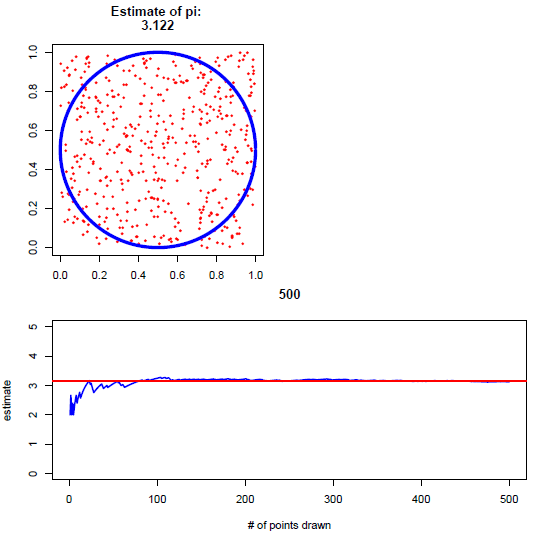
The resulting plot (multi-page pdf) lets us watch the estimate of π converge toward the true value.

At 500 sample points, I got an estimate of 3.122 – not super great. If you want to give your computer a workout, you can ramp up the number of iterations (N) and see how close your estimate can get. It should be noted that this is not an efficient way of estimating π, but rather a nice and simple example of how Monte Carlo can be used for integration.

In the lesson, before showing the simulation, I started by having students pair up and manually draw points, plot them, and calculate their own estimate.

If you use this in your classroom, drop me a note and let me know how it went!