New R User Group in Montreal

The Montreal R User Group is now official. You can join the group by visiting the meetup site.


The group has existed since 2010 in a narrower incarnation as the BGSA R/Stats Workshop Series. Previous workshops have featured invited facilitators on topics such as Causal Analysis, GLMs, GAMs, Multi-model inference, Phylogenetic analysis, Bayesian modeling, Meta-analysis, Ordination, Programming and more. Our goal is to broaden the scope of the workshops to incorporate topics from a wide variety of applied fields.

We are kicking off with a meetup on Monday, March 19th. At the meeting, I will be facilitating a workshop on building and estimating Maximum Likelihood models and doing model selection using AIC.

We look forward to seeing you at the next meetup!

Montreal R User Group Organizers
Corey Chivers
Etienne Low-Décarie
Zofia Ecaterina Taranu
Eric Pedersen

Montreal R workshop on Causal Inference

Monday, March 05, 2012  14h-16h N4/17 Stewart Biology Building, McGill University
Prof. Bill Shipley from Université de Sherbrooke

Topics

  • Structural equation modelling
  • Graphical models for understanding causal analysis
  • Testing for goodness of fit of causal models
This workshop is organized by the BGSA and is free to attend. Arrive early to ensure your seat!

Visualising the Metropolis-Hastings algorithm

In a previous post, I demonstrated how to use my R package MHadapive to do general MCMC to estimate Bayesian models. The functions in this package are an implementation of  the Metropolis-Hastings algorithm. In this post, I want to provide an intuitive way to picture what is going on ‘under the hood’ in this algorithm.

The main idea is to draw samples from a distribution which you can evaluate at any point, but not necessarily  integrate (or at least, you don’t want to). The reason that integration is important come from Bayes theorem itself:

P(θ|D)=P(D|θ)P(θ)/P(D)

Where P(D) is the unconditional probability of observing the data. Since this is not dependant on the parameters of the model (θ) on which we wish to perform inference, P(D) is effectively a normalising constant which makes P(θ|D) a proper probability density function (ie. integrates to 1).

So, we have a non-normalised probability density function which we wish to estimate by taking random samples. The process of taking random samples itself is often difficult for complex models, so instead we explore the distribution using a Markov chain. We need a chain which, if run long enough, will consist as a whole of random samples from our distribution of interest (lets call that distribution π). This property of the Markov chain we are constructing is called ergodicity. The Metropolis-Hastings algorithm is a way to construct such a chain.

It works like this:

  1. Choose some starting point in the parameter space k_X
  2. Choose a candidate point k_Y ~ N(k_X, σ). This is often referred to as the proposal distribution.
  3. Move to the candidate point with probability:  min( π(k_Y)/π(K_X), 1)
  4. Repeat.

The following code demonstrates this process in action for a simple normal target distribution.

################################################################
###     Metropolis-Hastings Visualization                #######
###      Created by Corey Chivers, 2012                #########
################################################################

mh_vis<-function(prop_sd=0.1,target_mu=0,
target_sd=1,seed=1,iter=5000,plot_file='MH.pdf')
{
plot_range=c(target_mu-3*target_sd,target_mu+3*target_sd)
track <- NULL
k_X = seed; ## set k_X to the seed position

pdf(plot_file)
par(mfrow=c(3,1),mgp = c(1, 0.5, 0))

for(i in 1:iter)
{
track<-c(track,k_X)    ## The chain
k_Y = rnorm(1,k_X,prop_sd) ## Candidate point

## -- plot kernal density estimation of the Chain
par(mar=c(0,3,2,3),xaxt='n',yaxt='n')

curve(dnorm(x,target_mu,target_sd),col='blue',lty=2,lwd=2,xlim=plot_range)
if(i > 2)
lines(density(track,adjust=1.5),col='red',lwd=2)

## -- plot the chain
par(mar=c(0,3,0,3))
plot(track,1:i,xlim=plot_range,main='',type='l',ylab='Trace')

pi_Y = dnorm(k_Y,target_mu,target_sd,log=TRUE)
pi_X = dnorm(k_X,target_mu,target_sd,log=TRUE)

## -- plot the target distribution and propsal distribution actions
par(mar=c(3,3,0,3),xaxt='s')
curve(dnorm(x,target_mu,target_sd),xlim=plot_range,col='blue',lty=2,ylab='Metropolis-Hastings',lwd=2)
curve(dnorm(x,k_X,prop_sd),col='black',add=TRUE)
abline(v=k_X,lwd=2)
points(k_Y,0,pch=19,cex=2)
abline(v=k_Y)

a_X_Y = (pi_Y)-(pi_X)
a_X_Y = a_X_Y

if (a_X_Y > 0)
a_X_Y = 0

## Accept move with a probability a_X_Y
if (log(runif(1))<=a_X_Y)
{
k_X = k_Y;
points(k_Y,0,pch=19,col='green',cex=2)
abline( v=k_X,col='black',lwd=2)
}
## Adapt the poposal
if(i>100)
prop_sd=sd(track[floor(i/2):i])

if(i%%100==0)
print(paste(i,'of',iter))
}
dev.off()
}

mh_vis()

A common problem in the implementation of this algorithm is the selection of σ. Efficient mixing (the rate at which the chain converges to the  target distribution) occurs when σ approximates the standard deviation of the target distribution. When we don’t know this value in advance. we can allow σ to adapt based on the history of the chain so far. In the above example, σ is simply updated to take the value of the standard deviation of some previous points in the chain.

The output is a multipage pdf which you can scroll through to animate the MCMC.

The top panel shows the target distribution (blue dotted) and a kernel smoothed estimate of the target via the MCMC samples. The second panel shows a trace of the chain, and the bottom panel illustrates the steps of the algorithm itself.

Note: notice the first 100 or so iterations were a rather poor representation of the target distribution. In practice, we would ‘burn’ the first n iterations of the chain – typically the first 100-1000.

Visualizing Sampling Distributions

Teacher: “How variable is your estimate of the mean?”

Student: “Uhhh, it’s not. I took a sample and calculated the sample mean. I only have one number.”

Teacher: “Yes, but what is the standard deviation of sample means?”

Student: “What do you mean means, I only have the one friggin number.”

Statisticians have a habit of talking about single events as though they’ve happened (or could happen) over and over again.  This is the basis of the Frequentist paradigm, and I’ve found that it really irks early students of statistics. Questions of the type: “How variable is that estimate?” asked by a statistician translates to “How variable would our collection of estimates be if we were to draw samples of the same size from the population, over and over again?”

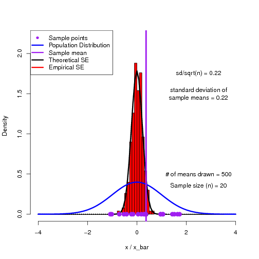
As a way to help students get into this way of thinking, I have found simulations to be quite useful.  Here is an R script to demonstrate the sampling distribution of means and how we can reproduce the theoretical standard error of the mean.


## This script plots a histogram of sample means from a known population and compares this
## distribution against the theoretical Standard Error of the Means distribution.

## You can play around with sample size (n) to see how the standard error distribution changes.

rm(list=ls())

var_ <- new.env()
n<-20            ## Sample n individuals at a time
p_mean<-0        ## Population mean
p_sd<-1            ## Population standard deviation
N<-500            ## Number of times the experiment (sampling) is replicated

pdf('SE.pdf')

for(i in 1:N)                                ## do the experiment N times
{
smp<-rnorm(n,p_mean,p_sd)                 ## sample n data points from the population

var_$x_bar<-c(var_$x_bar,mean(smp))         ## keep track of the mean (x_bar) from each sample

hist(var_$x_bar,probability=TRUE,col="red",xlim=c(-4,4),xlab="x / x_bar",main="",ylim=c(0,2.2))  # Plot a histogram of x_bar values
points(mean(smp),0,pch=19,cex=1.5,col='black')
curve(dnorm(x,p_mean,p_sd/sqrt(n)),lwd=3,add=TRUE)

text(2.5,1.75,labels=paste('sd/sqrt(n) = ',round(p_sd/sqrt(n),2),sep=''))
text(2.5,1.5,labels=paste('standard deviation of\nsample means = ',round(sd(var_$x_bar),2),sep='') )

curve(dnorm(x,p_mean,p_sd),main="",ylab="",xlim=c(-4,4),xlab="X",col="blue",lwd=3,add=TRUE) ## Plot the sample

text(2.5,0.5,labels=paste('# of means drawn = ',i,sep=''))
text(2.5,0.35,labels=paste('Sample size (n) = ',n,sep=''))
points(smp,rep(0,n),pch=19,cex=1.5,col='purple')
abline(v= mean(smp),col='purple',lwd=4)

legend("topleft",legend=c('Sample points','Population Distribution','Sample mean','Theoretical SE','Empirical SE'),
lty=c(0,1,1,1,1,1,1),lwd=c(0,3,3,3,3,3,3),pch=c(16,NA,NA,NA,NA,NA,NA),col=c('purple','blue','purple','black','red'))

print(paste(i," of ",N))
}
dev.off()

############################################################################################
############################################################################################

The output of the script is a multi-page pdf which can be flipped through to show the building of a histogram of sample means converging on the theoretical sampling distribution.


Visualizing Bayesian Updating

One of the most straightforward examples of how we use Bayes to update our beliefs as we acquire more information can be seen with a simple Bernoulli process. That is, a process which has only two  possible outcomes.

Probably the most commonly thought of example is that of a coin toss. The outcome of tossing a coin can only be either heads, or tails (barring the case that the coin lands perfectly on edge), but there are many other real world examples of Bernoulli processes. In manufacturing, a widget may come off of the production line either working, or faulty.  We may wish to know the probability that a given widget will be faulty.  We can solve this using Bayesian updating.

I’ve put together this little piece of R code to help visualize how our beliefs about the probability of success (heads, functioning widget, etc) are updated as we observe more and more outcomes.


## Simulate Bayesian Binomial updating

sim_bayes<-function(p=0.5,N=10,y_lim=15)
{
  success<-0
  curve(dbeta(x,1,1),xlim=c(0,1),ylim=c(0,y_lim),xlab='p',ylab='Posterior Density',lty=2)
  legend('topright',legend=c('Prior','Updated Posteriors','Final Posterior'),lty=c(2,1,1),col=c('black','black','red'))
  for(i in 1:N)
  {
    if(runif(1,0,1)<=p)
        success<-success+1

    curve(dbeta(x,success+1,(i-success)+1),add=TRUE)
    print(paste(success,"successes and ",i-success," failures"))
  }
  curve(dbeta(x,success+1,(i-success)+1),add=TRUE,col='red',lwd=1.5)
}

sim_bayes(p=0.6,N=90)

The result is a plot of posterior (which become the new prior) distributions as we make more and more observations from a Bernoulli process.

With each new observation, the posterior distribution is updated according to Bayes rule. You can change p to see how belief changes for low, or high probability outcomes, and N for to see how belief about p asymptotes to the true value after many observations.

Real-time data collection and analysis in class

As September draws nearer, my mind inevitably turns away from my lofty (and largely unmet) summer research goals, and toward teaching.  This semester I will be trying out a teaching technique using live data collection and analysis as a tool to encourage student engagement.  The idea is based on the electronic polling technology known as ‘clickers‘. The technology allows you to get instant feedback from students, check for understanding, and when used appropriately it can facilitate active engagement and peer learning.

Because I will be teaching in a computer lab, where all of the students will be sitting at a computer, I have the advantage of being able to bypass the little devices, and instead gather student responses using a web based interface.  The advantages, as I see them, are:

  1. Students can enter more complex input than the 1-9 provided by clickers. Instead, students can enter any number or character vector response.
  2.  Students can instantly download, plot, and analyze the class data.  This step is facilitated by the read.csv("http://data_url.csv") function in R, which allows data import directly from the web.

The first exercise I have planned using this technology is to have students enter their height, then have them plot a histogram of the data to introduce the normal distribution.  Using the simple online interface I have created, this exercise can be done very quickly. I am calling the tool I am one of n.

If you have any suggestions for learning activities that could make effective use of this technology in an undergraduate Biostatistics (or other) course, drop me a note!

P-value fallacy on More or Less – Follow up

In my last post I pointed out the p-value fallacy in an episode of the BBC podcast More or Less.  In the post, I tried to explain why this little logical trap is so common, as well as why it is indeed wrong.

I also had the pleasure of speaking with one of the show’s producers on the telephone, and we tried to come up with the best way to explain it on the radio.  Check out this week’s episode for the correction, and a nice little explanation of why we have to be particularly careful when interpreting p-values in the scientific literature.

P-value fallacy on More or Less

The excellent BBC podcast More or Less does a great job at communicating and demystifying statistics in the news to a general audience. While listening to the most recent episode (Is Salt Bad for You? 19 Aug 2011), I was pleased to hear the host offer a clear, albeit incomplete, explanation of p-values, as reported in scientific studies like the ones being discussed in the episode. I was disappointed, however, to hear him go on to forward an all too common fallacious extension of their interpretation. I count the show’s host, Tim Harford, among the best when it comes to statistical interpretation, and really feel that his work has improved public understanding, but it would appear that even the best of us can fall victim to this little trap.

The trap:

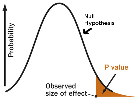
When conducting Frequentist null hypothesis significance testing, the p-value represents the probability that we would observe a result as extreme or more (this was left out of the loose definition in the podcast) than our result IF the null hypothesis were true.  So, obtaining a very small p-value implies that our result is very unlikely under the null hypothesis.  From this, our logic extends to the decision statement:

“If the data is unlikely under the null hypothesis, then either we observed a low probability event, or it must be that the null hypothesis is not true.”

It is important to note that only one of these options can be correct.  The p-value tells us something about the likelihood of the data, in a world where the null hypothesis is true.  If we choose to believe the first option, the p-value has direct meaning as per the definition above.  However, if we choose to believe the second option (which is traditionally done when p<0.05), we now believe in a world where the null hypothesis is not true.  The p-value is never a statement about the probability of hypotheses, but rather is a statement about data under hypothetical assumptions. Since the p-value is a statement about data when the null is true, it cannot be a statement about the data when the null is not true.
How does this pertain to what was said  in the episode?  The host stated that:

“…you could be 93% confident that the results didn’t happen by chance, and still not reach statistical significance.”

Referring to the case where you have observed a p-value of 0.07.  The implication is that you would have 1-p=0.93 probability that the null is not true (ie that your observations are not the result of chance alone).  From the discussion above, we can begin to see why this cannot be the case.  The p-value is a statement about your results only when the null hypothesis is true, and therefor cannot be a statement about the probability that it is false!

An example:

With our complete definition of the p-value in mind, lets look at an example. Consider a hypothetical study similar to those analyzed by the Cochrane group, in which a thousand or so individuals participated. In this hypothetical study, you observe no mean difference in mortality between the high salt and low salt groups. Such a result would lead to a p-value of 0.5, or 50%. Meaning that if there is no real effect, there is a 50% chance that you would observe a result greater than zero, however slightly. Using the incorrect logic, you would say:

“I am 50% confident that the results are not due to chance.”

Or, in other words, that there is a 50% probability that there is some adverse effect of salt. This may seem reasonable at first blush, however, consider now another hypothetical study in which you have recruited just about every adult in the population, (maybe you’re giving away iPads or something), and again you observe zero mean difference in mortality between groups. You would once again have a p-value of 0.5, and might again erroneously state that you are 50% confident that there is an effect. After some thought, however, you would conclude that the second study provided you with more confidence about whether or not there is any effect than did the first, by virtue of having measured so many people, and yet your erroneous interpretation of the p-value tells you that your confidence is the same.

The solution:

I have heard this fallacious interpretation of p-values everywhere from my undergraduate Biometry students, to highly reputable peer reviewed research publications.  Why is this error so prevalent?  It seems to me that the issue lies in the fact that what we really want to be able to say is not a statement about our results under the assumption of no effect (the p-value), but rather a statement about hypotheses given our results (which we do not get directly through the p-value).

One solution to this problem lies in a statistical concept known as power. Power is the calculation of how likely it is that you would observe a p-value below some critical value (usually the canonical 0.05), for both a given sample size and the size of the effect that you wish to detect. The smaller the size of the real effect that you wish to measure, the higher the sample size required if you want to have a high probability of finding statistical significance.

This is why it is important to distinguish, as was done in the episode, between statistical significance, and biological, or practical significance. A study may have high power, due to a large sample size, and this can lead to statistically significant results, even for very small biological effects. Alternatively the study may have low power, in which case it may not find statistically significant results, even if there is indeed some real biologically relevant effect present.

Another solution is to switch to a Bayesian perspective.  Bayesian methods allow us to make direct statements about what we are really interested in – namely, the probability that there is some effect (general hypotheses), as well as the probability of the strength of that effect (specific hypotheses).

In short:

What we really want is the probability of hypotheses given our data (written as P(H | D) ), which we can obtain by applying Bayes rule.

What we get from a p-value is the probability of observing something as extreme or more than our data, under the null hypothesis ( written as P(x>=D | Ho) ).  Isn’t that awkward? No wonder it is so commonly misrepresented.

So, my word of caution is this: We have to remember that the p-value is only a statement of the likelihood of making an observation as extreme or more than your observation, if there is, in fact, no real effect present. We must be careful not to perform the tempting, but erroneous, logical inversion of using it to represent the probability that a hypothesis is, or is not true. An easy little catch phrase to remember this is:

A lack of evidence for something is not a stack of evidence against it.