Monty Hall by simulation in R

(Almost) every introductory course in probability introduces conditional probability using the famous Monte Hall problem. In a nutshell, the problem is one of deciding on a best strategy in a simple game. In the game, the contestant is asked to select one of three doors. Behind one of the doors is a great prize (free attendance to an R workshop, lets say), and there is a bum prize behind each of the other two doors. The bum prize is usually depicted to be a goat, but I don’t think that would be such a bad prize, so let’s say that behind two of the doors is a bunch of poorly collected data for you to analyse. Once the contestant makes her first selection, the host then opens one of the other two doors to reveal one of the bum prizes.

At this point, the contestant is given the choice to either stay with her original selection, or switch to the other remaining unopened door. What should she do?

If you’re reading this blog, you no doubt gleefully shouted “Switch! Switch! Daddy needs a ticket to that R workshop!”. And you also, no doubt, can prove this to be the best strategy using the logic of probability. You reason that the contestant’s chance of selecting the winning door from the onset was 1/3, giving her a 2/3 probability of being wrong. Once one door with a bum prize has been opened, the contestant is now choosing between two doors. Knowing that there was only a 1/3 chance that original selection was correct, there is now a 2/3 chance that the alternate door is the winner.

As I have mentioned in previous posts, I have found that engaging students to think through logical reasoning problems can be greatly enhanced by appealing to their desire to see it in action. To that end, I whipped up this little script to simulate repeatedly playing the Monte Hall game.


#####################################################
# Simulation of the Monty Hall Problem
# Demonstrates that switching gives you better odds
# than staying with your initial guess
#
# Corey Chivers, 2012
#####################################################

rm(list=ls())
monty<-function(strat='stay',N=1000,print_games=TRUE)
{
 doors<-1:3 #initialize the doors behind one of which is a good prize
 win<-0 #to keep track of number of wins

for(i in 1:N)
 {
 prize<-floor(runif(1,1,4)) #randomize which door has the good prize
 guess<-floor(runif(1,1,4)) #guess a door at random

## Reveal one of the doors you didn't pick which has a bum prize
 if(prize!=guess)
 reveal<-doors[-c(prize,guess)]
 else
 reveal<-sample(doors[-c(prize,guess)],1)

 ## Stay with your initial guess or switch
 if(strat=='switch')
 select<-doors[-c(reveal,guess)]
 if(strat=='stay')
 select<-guess
 if(strat=='random')
 select<-sample(doors[-reveal],1)

## Count up your wins
 if(select==prize)
 {
 win<-win+1
 outcome<-'Winner!'
 }else
 outcome<-'Losser!'

if(print_games)
 cat(paste('Guess: ',guess,
 '\nRevealed: ',reveal,
 '\nSelection: ',select,
 '\nPrize door: ',prize,
 '\n',outcome,'\n\n',sep=''))
 }
 cat(paste('Using the ',strat,' strategy, your win percentage was ',win/N*100,'%\n',sep='')) #Print the win percentage of your strategy
}

Students can then use the function to simulate N games under the strategies ‘stay’, ‘switch’, and ‘random’. Invoking the function using:


monty(strat="stay")
monty(strat="switch")
monty(strat="random")

Hey, look at that – it is better to switch! Feel free to use this in your own class, and let me know if you use it or adapt it in an interesting way!

Edit: Thanks to Ken for pointing out that saying that ‘switching is always better’ is not quite right (you will loose 1/3 of the time, after all), but rather that switching is a rational best strategy, given your state of knowledge.

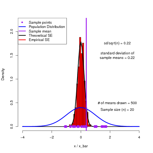
Visualizing Sampling Distributions

Teacher: “How variable is your estimate of the mean?”

Student: “Uhhh, it’s not. I took a sample and calculated the sample mean. I only have one number.”

Teacher: “Yes, but what is the standard deviation of sample means?”

Student: “What do you mean means, I only have the one friggin number.”

Statisticians have a habit of talking about single events as though they’ve happened (or could happen) over and over again.  This is the basis of the Frequentist paradigm, and I’ve found that it really irks early students of statistics. Questions of the type: “How variable is that estimate?” asked by a statistician translates to “How variable would our collection of estimates be if we were to draw samples of the same size from the population, over and over again?”

As a way to help students get into this way of thinking, I have found simulations to be quite useful.  Here is an R script to demonstrate the sampling distribution of means and how we can reproduce the theoretical standard error of the mean.


## This script plots a histogram of sample means from a known population and compares this
## distribution against the theoretical Standard Error of the Means distribution.

## You can play around with sample size (n) to see how the standard error distribution changes.

rm(list=ls())

var_ <- new.env()
n<-20            ## Sample n individuals at a time
p_mean<-0        ## Population mean
p_sd<-1            ## Population standard deviation
N<-500            ## Number of times the experiment (sampling) is replicated

pdf('SE.pdf')

for(i in 1:N)                                ## do the experiment N times
{
smp<-rnorm(n,p_mean,p_sd)                 ## sample n data points from the population

var_$x_bar<-c(var_$x_bar,mean(smp))         ## keep track of the mean (x_bar) from each sample

hist(var_$x_bar,probability=TRUE,col="red",xlim=c(-4,4),xlab="x / x_bar",main="",ylim=c(0,2.2))  # Plot a histogram of x_bar values
points(mean(smp),0,pch=19,cex=1.5,col='black')
curve(dnorm(x,p_mean,p_sd/sqrt(n)),lwd=3,add=TRUE)

text(2.5,1.75,labels=paste('sd/sqrt(n) = ',round(p_sd/sqrt(n),2),sep=''))
text(2.5,1.5,labels=paste('standard deviation of\nsample means = ',round(sd(var_$x_bar),2),sep='') )

curve(dnorm(x,p_mean,p_sd),main="",ylab="",xlim=c(-4,4),xlab="X",col="blue",lwd=3,add=TRUE) ## Plot the sample

text(2.5,0.5,labels=paste('# of means drawn = ',i,sep=''))
text(2.5,0.35,labels=paste('Sample size (n) = ',n,sep=''))
points(smp,rep(0,n),pch=19,cex=1.5,col='purple')
abline(v= mean(smp),col='purple',lwd=4)

legend("topleft",legend=c('Sample points','Population Distribution','Sample mean','Theoretical SE','Empirical SE'),
lty=c(0,1,1,1,1,1,1),lwd=c(0,3,3,3,3,3,3),pch=c(16,NA,NA,NA,NA,NA,NA),col=c('purple','blue','purple','black','red'))

print(paste(i," of ",N))
}
dev.off()

############################################################################################
############################################################################################

The output of the script is a multi-page pdf which can be flipped through to show the building of a histogram of sample means converging on the theoretical sampling distribution.


Visualizing Bayesian Updating

One of the most straightforward examples of how we use Bayes to update our beliefs as we acquire more information can be seen with a simple Bernoulli process. That is, a process which has only two  possible outcomes.

Probably the most commonly thought of example is that of a coin toss. The outcome of tossing a coin can only be either heads, or tails (barring the case that the coin lands perfectly on edge), but there are many other real world examples of Bernoulli processes. In manufacturing, a widget may come off of the production line either working, or faulty.  We may wish to know the probability that a given widget will be faulty.  We can solve this using Bayesian updating.

I’ve put together this little piece of R code to help visualize how our beliefs about the probability of success (heads, functioning widget, etc) are updated as we observe more and more outcomes.


## Simulate Bayesian Binomial updating

sim_bayes<-function(p=0.5,N=10,y_lim=15)
{
  success<-0
  curve(dbeta(x,1,1),xlim=c(0,1),ylim=c(0,y_lim),xlab='p',ylab='Posterior Density',lty=2)
  legend('topright',legend=c('Prior','Updated Posteriors','Final Posterior'),lty=c(2,1,1),col=c('black','black','red'))
  for(i in 1:N)
  {
    if(runif(1,0,1)<=p)
        success<-success+1

    curve(dbeta(x,success+1,(i-success)+1),add=TRUE)
    print(paste(success,"successes and ",i-success," failures"))
  }
  curve(dbeta(x,success+1,(i-success)+1),add=TRUE,col='red',lwd=1.5)
}

sim_bayes(p=0.6,N=90)

The result is a plot of posterior (which become the new prior) distributions as we make more and more observations from a Bernoulli process.

With each new observation, the posterior distribution is updated according to Bayes rule. You can change p to see how belief changes for low, or high probability outcomes, and N for to see how belief about p asymptotes to the true value after many observations.

Real-time data collection and analysis in class

As September draws nearer, my mind inevitably turns away from my lofty (and largely unmet) summer research goals, and toward teaching.  This semester I will be trying out a teaching technique using live data collection and analysis as a tool to encourage student engagement.  The idea is based on the electronic polling technology known as ‘clickers‘. The technology allows you to get instant feedback from students, check for understanding, and when used appropriately it can facilitate active engagement and peer learning.

Because I will be teaching in a computer lab, where all of the students will be sitting at a computer, I have the advantage of being able to bypass the little devices, and instead gather student responses using a web based interface.  The advantages, as I see them, are:

  1. Students can enter more complex input than the 1-9 provided by clickers. Instead, students can enter any number or character vector response.
  2.  Students can instantly download, plot, and analyze the class data.  This step is facilitated by the read.csv("http://data_url.csv") function in R, which allows data import directly from the web.

The first exercise I have planned using this technology is to have students enter their height, then have them plot a histogram of the data to introduce the normal distribution.  Using the simple online interface I have created, this exercise can be done very quickly. I am calling the tool I am one of n.

If you have any suggestions for learning activities that could make effective use of this technology in an undergraduate Biostatistics (or other) course, drop me a note!

Using simulation to demonstrate theory: Hardy-Weinberg Equilibrium

One of my teaching roles is in an introductory Genetics course, where first year students are presented with a wide range of new ideas at a relatively fast pace.  It seems that often, students choose to take a memorization approach to learning the material, rather than taking the chance to think about how and why these genetic concepts actually work.  It is my conviction that, as teachers, it is our role to provide students with the opportunities to engage with the course material, and construct a solid understanding that will serve them as they proceed on to higher specialization.

When it comes to bang for my pedagogical buck, I have found that you really can’t beat the use of simulation as a platform for providing the opportunity for students to engage with theoretical concepts.  Here is an R script which I have written and used to allow students to explore how random mating in a population leads to the well known Hardy-Weinberg (HW) distribution.

For those who need a refresher, HW describes the genotype frequencies in randomly mating population. For the simple two allele case (A >> a), the frequencies are denoted by p and q; freq(A) = p; freq(a) = q; p + q = 1. If the population is in equilibrium, then freq(AA) = p2 for the AA homozygotes in the population, freq(aa) = q2 for the aa homozygotes, and freq(Aa) = 2pq for the heterozygotes.

What doesn’t usually get mentioned in introductory courses, is that the HW formula provides the expected frequencies of each genotype.  Of course, in real, finite populations, there will be variability around these values.  The seeming exactness of HW obscures the random processes at play.  To help students see how HW arises in finite populations (as opposed to the theoretical infinite populations required for the strict solution), I let them play with this simulation (R script).

Students can play around with the population size (N) and the number of generations (num_generations), to see how well the simulated populations correspond to the predicted HW.  Here is a plot of 200 simulated populations of size N=200, which are initiated out of the HW equilibrium and then randomly mated for one generation:

Feel free to try it out in your own class!

-BayesianBiologist

Teaching Bayes using something students get: Grades.

When it comes to teaching Bayesian reasoning, I am always searching for new ways to relate the process of formal belief updating to students.  One idea I had, was to use something that is no doubt on the minds of many students most of the time: their grades.

This worksheet (pdf) allows students to place prior probabilities on their grade outcomes in a course.  They can then use their observations (grades on assignments, quizzes, etc) to update their grades probability distribution. As my students use R in the lab, they can then plot their posteriors as the course progresses.  The exercise can also be used to explore the idea that any prediction/inference made in this way is always conditional on the model.

Feel free to try it out in your class!